Weekly Shaarli
clearfix, centering, font-size
Let’s start with the ground rules. For every open job on your team, you need to spend one hour a day on recruiting-related activities. Cap that investment at 50% of your time. No open reqs? There’s still important and ongoing work you need to do on a regular basis that I’ll describe below.
Preparation
Although I’m interested in machine learning positions, the positions at the five companies are slightly different in the title and the interviewing process. Three are machine learning engineer (LinkedIn, Google, Facebook), one is data engineer (Salesforce), and one is software engineer in general (Airbnb). Therefore I needed to prepare for three different areas: coding, machine learning, and system design.
I mainly used Leetcode and Geeksforgeeks for practicing, but Hackerrank and Lintcode are also good places. I spent several weeks going over common data structures and algorithms, then focused on areas I wasn’t too familiar with, and finally did some frequently seen problems. Due to my time constraints I usually did two problems per day.
I want to clarify my priorities
by defining my goals and the path to reach them.
The DIY Toolkit has been especially designed for development practitioners to invent, adopt or adapt ideas that can deliver better results.

This updated 2018 list features 10 websites that offer the best coding challenges and resources to help new and intermediate developers improve their skills, prepare for interviews, and progress in their careers. The ordering of the list is based on level of difficulty (beginner to advanced).

"User experience is the net sum of every interaction a person has with a company, be it marketing collateral, a customer service call, or the product or service itself. It is affected by the company’s vision and the beliefs it holds and its practices, as well as the service or product’s purpose and the value it holds in a person’s life."
"Every detail of a company and its product says something about it. User experience strategy and design ensures that these messages are put forth with intention and purpose. Design extends into each and every detail, and each and every detail can indeed be designed."
"The job of a designer, just like that of a writer, is to twist and stretch and shape a conceptualized piece of work over and over again until it becomes the masterpiece the world needs it to be."
"A user's experience belongs to the user. An experience cannot be designed. It can, however, be influenced. A designer’s job is to be the influencer."
Instead I’m going to show you a simple color workflow that you can use in your next web project.
Here are the rules:
Light comes from the sky (see Part 1)
Black and white first (see Part 1)
Double your whitespace (see Part 1)
Learn the methods of overlaying text on images
Make text pop— and un-pop
Only use good fonts
Steal like an artist
Page Layers is a website screenshot app for Mac OS X. It converts web pages to Photoshop files with separate layers for all page elements.
It enables you to open web pages in Photoshop and saves you lots of time when re-designing or improving existing web page designs.
Just open any page in the embedded browser and save the page as PSD with layers or as plain PNG image. In the HTML to PSD conversion every web page element (every image, link, block, ...) will be rendered as separate, named layer. Layer groups will be created according to the site structure.

- What does success look like for this project?
- How can failure be avoided with this project? What are you worried might go wrong?
- What will happen to your business if nothing changes?
- Where do you see your business a year from now? Three years from now? Ten years from now?
- What is the single hardest thing in your business right now?

The pen is mightier than the laptop
Ditch the computer and break out the paper for more effective, interesting, and visually stimulating note-taking
Creating a logo is design distilled. You need to make this little piece of branding that forges a connection with the people who come into contact with it. I find that challenge immensely fun. You get to be the storyteller of a brand. You get to help shape many people’s perception of an entity. You get to make a difference for someone– all with the use of your creativity.
- Breathe
- Focus on your body
- Try saying a mantra
- Acknowledge and label your feelings
- Take a break
The jQuery plugin for hierarchical display animation effect
Hierarchical Timing is a meaningful transition introduced in Google Material Design that focuses your users attention in an app or how an app element got from point A to point B.

The aspect of using dark colors and shades in backgrounds of user interfaces still belongs to highly debatable issues. No wonder it's so actual: choosing appropriate background plays vital role on all the product efficiency as it can become a key factor enhancing or, vice versa, killing other design solutions around the layout and functionality. Today our article will be devoted to benefits and pitfalls of using dark background in UI design, so let's move on the dark side.

Imagine my surprise when he called me into his office that day and admonished me for being too efficient. My zeal to do everything on my to-do list—along with my reserved, even shy nature—made me come across as abrupt and cold. I started every meeting by jumping right in and left with every action under control.
"You have to wallow in it," he said. "Take time to get to know people. Understand where they are coming from, what is important to them. Make sure they are with you."

- They’re Smarter Than You Think
- They Have Other Things To Do
- They Have a “Doing Mode”
- They “Satisfice”
- They Don’t Use Your Software The Way You Intended
- They Rely On Patterns
- They See What’s There
- They Lie
- They Don’t Know What’s Possible
- If You Improve Their Lives, They’ll Love You
- They Blame Themselves for Mistakes When It’s Your Fault
- Their User “Experience” Is Based On Far More Than Your Website
“Writing is thinking. To write well is to think clearly."
Writing intrinsically champions and improves creativity, critical thinking, and clarity.

Today, we’re happy to introduce Dorota, an artist who created a fun little project last year that was inspired by Twitter’s new logo based on 13 circles. Below you’ll find the lessons Dorota has learned along the process, so maybe you’d like to embark on a similar journey as well?

To help further this exploration, Reas and his colleague Ben Fry (a principal of Fathom, a design and software consultancy in Boston) in 2001 developed their own software, called Processing, that bridges the divide between programming and art, making both processes more intuitive.

-
"If" -- improves performance when describing a hypothetical positive.
"What would you say if you did know?" -
"Could" -- boosts creativity when used instead of "should."
-
"Together" -- makes teams work harder and smarter
-
"Choose to" -- reframing from "have to" makes a big difference.
-
"And" -- the best way to state a contrary opinion.
"Here's what I'm thinking."
"My perspective is based on the following assumptions... "
"I came to this conclusion because... "
"I'd love to hear your reaction to what I just said."
"Do you see any flaws in my reasoning?"
"Do you see the situation differently?" -
"Because" -- makes whatever you ask sound objective and rational.
-
"(Your name)" -- we prefer things connected to ourselves.
-
"Willing" -- can turn a "no" into a "yes."
7 Words to Avoid:
Need Must Can't Easy Just Only Fast

Color and shape are powerful communicators in design and illustration — and this class will hone your skills.
Join famed illustrator Olimpia Zagnoli for an insightful class exploring her thoughtful, unexpected use of color. Inspired by her Italian upbringing and artists she admires, her illustrations are the perfect vehicle for exploring the interplay of inspiration and techniques — and ways you can combine them in your own graphic illustration work.
- Garamond
- Gill Sans
- Lato
- Didot
- Avenir
Bit manipulation in JavaScript is complicated by the way that it attempts to be completely type free. One of the consequences of this type free approach is that numbers are always stored as 64-bit floating point values - i.e. double precision floating point.
Yes - that's correct JavaScript doesn't have an integer type that you can make use of. When needed JavaScript will perform an internal conversion to a 32-bit value but you can't gain access directly to this integer and it is converted back to floating point format as soon as it is possible.

We asked some of our favorite professors and lecturers who use InVision in their classrooms to share their thoughts on design. Here’s what the educators shaping the next generation of designers had to say.

Digital experiences are emulating real life more and more every day. This may seem counterintuitive, considering the hate that rains down on skeuomorphic visual design, but there’s a lot more to emulating real life than aesthetics. Interface designers can emulate real-life physics and movement on a digital screen. This type of motion is becoming more common, which is why it’s becoming easier for people to understand computers. We’re not getting better, the interfaces are!

The first step is always the hardest.
Good things take time.
Being busy does not equal being productive.
You will always have less control than you want.
You're only as good as those you associate with.
Your biggest problems are mental.
Your self-worth must come from within.
Not everyone will support you.
Perfection doesn’t exist.
Fear is the number one source of regret.
I built this tutorial to serve as a guide to creating a hybrid mobile application combining both native iOS controls and Cordova/PhoneGap components to leverage the best of both worlds as an alternative to picking one over the other. Developers may choose to do this if they want to use specific native UI features but still code the bulk of their business logic in JavaScript or reuse existing JavaScript logic by embedding it as a Cordova component while maintaining the rest of the native scaffolding. There are also benefits to using this approach in making an application feel more native.
I’ve gathered the cornerstone elements into a template you can copy:
Theme:
Concept:
Hero:
Villain:
Act 1 - Hook:
Inciting Incident:
Act 2 - Build:
Escalation:
All is Lost:
Breakthrough:
Act 3 - Payoff:
Climax:
I think the “killer app” framework is the correct one. While there are many cutting-edge applications that technologists will find exciting (myself included), the major drivers of blockchain’s value are relatively narrow.
Amidst the hype-train of ICOs, “decentralizing the Internet,” and bullshit artists trying to hoist everything they can think of onto a blockchain, it’s instructive to take the 1000-foot view and remind ourselves of the big picture.
I argue there are four killer apps for blockchains:
Dark web and black market payments
Digital gold
Payments (macro and micro)
Tokenization
How to add contrast in a non-destructive, easy way.
How to sharpen an image using some keyboard shortcuts to see what exactly is being sharpened.
How to edit the color of certain parts of a sunset or landscape image.
A way to clean up skin, although I'm not convinced I'll use this method.
How to change the color of anything, especially if you have a piece of clothing you want to suit the other colors in the image.
How to apply a trendy faded effect.
How to digitally relight an image.
How to convert an image to black and white while still being able to change the contrast of the image.
How to apply lens flares to an image, even if you don't have any in the image.
How to apply cinematic colors and tones to your images, just like in the movies.
Like a swatch book, HSB provides a great scale for finding a color. It can be useful for pinning down a match for the color you’ve seen in your head, on a screen, or in the real world. Like a painter’s palette, RGB provides a great space for mixing color. It can be used to create organic and harmonious relationships between two or more colors in a palette.

In this tutorial you’ll learn about using gradients on the web. I’ll give you some examples, some exercises (such as how to create gradients for borders), and I’ll also throw in some useful resources which will make creating gradients a lot easier.

Nagging is the dispiriting, unpleasant, counter-productive but wholly understandable and poignant version of a hugely noble ambition: the desire to change other people.
The beginning of hand-lettering journey, I started by tracing fonts to familiarize myself with typography. I started with the Learn Lettering course with Seanwes and did some other one’s as well.
In Learn Lettering, Sean McCabe suggested to trace fonts, and suggested some basic ones as well. I set out into the woods (you can do it from home) and started with Baskerville, Geogrotesque and Museo Slab.
If you are looking for fonts that have a hand-lettering style, that’s a different conversation but you can find those here.

After immersing myself in it for a year, I find Swift to be deeply web in its soul. From its expressive, functional syntax and its interpretive playgrounds to its runtime performance and recent foray into open source, Swift is the web developer’s compiled language (with the mature and convenient safeguards characteristic of the compiled environment).
Everything you need to get you started is here. It’s free. And the community is amazing.
When I review icons submitted to Iconfinder, I have a responsibility to our designers and to our customers to make sure all premium icons on the site are the highest possible quality. But the difference between “not quite good enough” and “premium quality” is often very small and usually involves minimal changes. In this article I have distilled my design guidelines into Six Easy Steps to Better Icon Design. The steps follow the basics of sound icon design and should be seen as a guide, not a dogmatic rule book. The savvy designer knows when he or she can break the rules for the greatest benefit.

The most productive engineers I’ve ever worked with aren’t the engineers who pull all-nighters or clock in 80 hour work weeks. Nor are they the engineers who can effortlessly craft an elegant five lines of x86 assembly to succinctly and efficiently solve a problem.
Focus on the problem – each and every time
You Are My Sunshine
House of Rising Sun
Four Leaf Clover
A styleguide is a set of standards, principles and rules every developer or designer should follow in order to improve the digital presence of the product.
In this article we will walk through effective techniques used in designing a reliant style guide.
When we released Lottie six months ago, we never imagined it would be embraced by the community as it has been. It is inspiring to hear from people in person, through emails, on Twitter, and on GitHub about how happy they are to have an animation solution for their apps. We’ve read articles written by designers and engineers whom we respect — such as Nick Butcher, Valentina Berois, Chris Basha, Christopher Deane, and many others — that tell us specifically how Lottie has allowed them to create animations more easily.

Making your notes more interesting doesn’t have to be a huge undertaking. It’s not like learning to play the piano or taking up diving. If you think sketchnoting looks fun, I have some tips to get you started.
Congratulations. From this day forward, you will no longer squander your time trying to work out the perfect regex to validate email addresses. You will also never again run the risk of rejecting what is, in fact, a strange, valid email address.
The upshot
There is no point in trying to work out if an email address is ‘valid’. A user is far more likely to enter a wrong and valid email address than they are to enter an invalid one.
Therefore, you are better off spending your time doing literally any other thing than trying to validate email addresses.
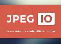
Convert any major image format into a highly optimized JPEG
Drag your image into the dropspace below, and we'll convert it into a progressive JPEG
and then optimize it using an advanced JPEG optimization technology.

I recently came across an article titled “Web typography is broken. Here’s how we can fix it”. A mix of emotions rushed through me while I read through it. I realized that the biggest argument Tom was making in the article was that web typography is broken because type doesn’t sit perfectly on a baseline grid.
You’ve probably used the Clone Stamp tool in Adobe Photoshop CC to remove small distractions from photos. Did you know that the same tool also works on video frames? In this tutorial, I’ll show you how I removed a pesky seagull from a Golden Gate Bridge time-lapse by cloning from a good frame and painting over the bird.
Stop using this, it, that in your writing — next time you write, try to remove the words “this”, “it” and “that” your writing will be easier to understand and read.
Punch above your weight class
Say People not Users
Save time, use patterns
You are not Aaron Draplin. find your own Futura Bold
Always talk to the person next to you
Design one for the stakeholder and one for you
Sidework leads to your next job
Be impeccable with your word
Success = 80% Sell, 20% Design
15 Minute Meetings
Follow Up
Everyone’s job is hard
One big thing each day
Drink water — you will feel more alert, kind and patient.
Welcome to the D3 gallery! More examples are available on bl.ocks.org/mbostock. If you want to share an example and don't have your own hosting, consider using Gist and bl.ocks.org. If you want to share or view live examples try vida.io.
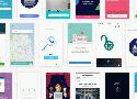
How’s it going, compadres? This month’s roundup hand-picked from all across the web includes icons, design assets, illustrations, vector artwork, UI kits, some really cool code snippets, fonts, templates, some awesome tools, and much much more.

SEO has gotten a bad rap; but much of it deservedly so. Here’s a guide to how modern SEO should be done
When it comes to relational databases, I can’t help thinking that something is missing. They’re used everywhere. There are many different databases: from the small and useful SQLite to the powerful Teradata. But, there are only a few articles that explain how a database works.
Everybody knows about web forms, right? Make a
In user experience design we’re familiar with user research techniques like workshops and interviews. We synthesise our research into user stories and process flows. We communicate our thinking and solutions to our teams with artefacts like personas and wireframes. But somewhere in all of this lies the real people for whom we’re designing. In order to make our product better, we must understand what’s going on in their worlds and how our product can make their lives better. And that’s where storyboards come in.
Invisible space in the story of ‘The Purloined Letter’. Focused on the relationship between events, characters and the signifier
A boilerplate for creating superb style guides
The homepage of a style guide should provide high-level information around what the design system is, what benefits it provides, who it’s for, and how to get started with it. Like any good index page, it should provide clear navigation to key parts of the website.
There are two basic questions you need to ask yourself at the start of any UX project. Let’s break it down.
WHAT DOES THE USER WANT?
WHAT DOES THE CLIENT WANT?
DESIGN FOR THE USER
Have you come across designers who seem to design for other designers, but not for the end user? I know I have. I’ve also come across designers who design for the client instead of the end user. And, if we’re going to be completely honest here, I’ve also come across designers who design for their own ego exclusively. It fills me with cringe.

Social media have so thoroughly infused our everyday lives that calling them “ubiquitous” seems inadequate. Facebook, Twitter, Instagram, YouTube, Snapchat, and others take up an astonishing amount of our time, bandwidth, and attention, and have become indispensable business and marketing tools as well.
Menu -> X transition

If you could go back in time and tell yourself to read a specific book at the beginning of your career as a developer, which book would it be?
1125px × 2436px (375pt × 812pt @3x)
Participants in each one hour workshop will have the opportunity to build their own field journal from start to finish.
Print your own cover on our antique press, then fold and assemble the interior pages with a saddle stitch staple, and finally trim the book and round the corners for a soft-cover journal to record all of your observations, ideas, and sketches about the world around you.
Limited to 10 participants in each time slot. Family friendly.
Four sessions, starting at 11am, 12:30pm, 2pm, and 3:30pm
Cost: $20, register online in advance
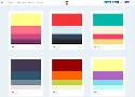
Mineral UI color provides themes built on inspiring hues and grounded in usable grays. Mineral UI is committed to providing an easy path to creating accessible palettes and themes.

Why Being A Modern Polymath Is The New Normal
Polymath Advantage 1: Combining two or more skills can make you world-class.
Polymath Advantage 2: Most creative breakthroughs come via making atypical combinations of skills.
Polymath Advantage 3: It’s easier and faster than ever to become competent in a new skill.
Polymath Advantage 4: It’s easier than ever to pioneer a new field, industry, or skill set.
Polymath Advantage 5: It Future-proofs Your Career
Polymath Advantage 6: It Sets You Up To Solve More Complex Problems
Polymath Advantage 7: Being a polymath helps you stand out and compete in the global economy.

Ramit Sethi has called this the “Briefcase Technique,” saying that the best job applicants wait for a moment right after the pleasantries have ended and the basic information about the position has been explained. It is here, after they have answered just enough questions to establish comfort and trust, that they reveal how much research they have done prior to showing up, by explaining all the things they’ve learned about the business, how they intend to improve it and exactly why they’re the right person for the job. This move, done politely but confidently, immediately separates them from all the other potential hires.
Due to my belief in learning through self-discovery and my ongoing creative evolution, I've long put off doing any tutorials. However, after making pixel art for over 3 years I've established many solid techniques worth laying out in a concrete fashion. While I'm excited by the prospect of helping others with my experience, I still urge artists to explore things their own way. The wonderful thing about art is the unlimited number of solutions to a problem. I offer you solutions that have worked for me and I hope they work for you, but I will be even more thrilled if you discover a better solution along the way.
Carbon is the design system for IBM Cloud products. It is a series of individual styles, components, and guidelines used for creating unified UI.
Carbon components is supported in the following browsers:
IE11
IE Edge latest
Firefox latest
Chrome latest
Safari latest
Wedged between boomers and millennials, Gen X has been the quiet, get-things-done generation nobody paid much attention to. Now they’re getting pushed out of their jobs—and boy, is Boston gonna miss them. —By Kris Frieswick
Shadows And User Interface Discoverability Link
There’s a reason GUI designers incorporate shadows into their designs — they help create visual cues in the interface which tell human brains what user interface elements they’re looking at.
What if I told you there was an image format like GIF, but it worked with vectors? What if I said it was possible to reverse the direction of its animation? What if you could take one base image and animate different parts of it separately, at different speeds? Well, the image format, SVG, already exists. It just needs a little gentle encouragement.
So I became a bit obsessed about how further we can push the limits of what we can draw with CSS only. Basically, I noticed that you can play around with basic shapes like circles, rectangles and triangles to draw virtually anything. You can even put some drop-shadows and CSS filters to get some pretty cool effects as well.
In this pocket guide I'll write some examples from really easy to more complex things you can do to create cool drawings and animations with CSS.

Here are some ways people ask questions the wrong way -- and how you can ask the right way:
-
Don't Lead the Witness
"What do you think we should do about that order?" -
Don't Stick to Either/Or Questions
"There are defects throughout the whole order. What do you think we should do?" -
Look for Clarification
"That sounds really good. Let me make sure I don't miss anything, though. Can you walk me through it one more time?"
Talk as little as possible. You already know what you know.
Inter UI is a typeface specially designed for user interfaces with focus on high legibility of small-to-medium sized text on computer screens.
The family features a tall x-height to aid in readability of mixed-case and lower-case text. Several OpenType features are provided as well, like contextual alternates that adjusts punctuation depending on the shape of surrounding glyphs, slashed zero for when you need to disambiguate "0" from "o", tabular numbers, etc.
Magnific Popup is a responsive lightbox & dialog script with focus on performance and providing best experience for user with any device
(for jQuery or Zepto.js).

The Art of Designing With Heart
How to make useful, friendly software for real people.
One of the things I love about making software is that it’s a deeply mental exercise, chock full of heady processes, abstractions, and interconnected pathways.
YOUR SOFTWARE EXISTS TO HELP PEOPLE!
A look at the colour trend taking the world by storm
The modern web is full of colour-from subtle to bright ‘in your face’ tones. I’ll be taking a look at the latter. Meet duotone-the hottest colour style of 2016.
Pure duotone & other tonal groupings
Love it or loathe it-duotone is everywhere right now. As the name suggests, duotone is an image made up of two colours, usually vibrant shades are used but you can select more subdued ones if you wish.
Why would we limit the effectiveness of body text by minimizing its size to a browser-default that’s now over 20 years old, even on large displays?
Just a list of 20 (now 28) tools for the command line. Some are little-known, some are just too useful to miss, some are pure obscure -- I hope you find something useful that you weren't aware of yet! Use your operating system's package manager to install most of them. (Thanks for the tips, everybody!)
It has come to my attention that one of the more noticeable traits in my design work is my willingness to use what is perceived to be an excessive number of typefaces. I’ve seen countless articles written on typeface pairing and systems, and nearly all of them push towards using fewer families in any given design. I’ve seen similar comments made towards my own work, implying that they are pleasing despite the number of typefaces they use.
I’ve tried to show the relationships between all of these resources in the diagram below. As you can see, a Style Guide is it’s own entity, which overlaps the CSS framework, design principles, design assets, and documentation.
- Kern upside down
- Blur it
- Kern with balloons
- Use 'o' to space words
- Rough out headlines
- Forget about small caps
The book, and its successors like Machine Code for Beginners and Practical Things to Do With a Microcomputer were major hits–but they were largely forgotten until recently when Usborne published them online as free PDFs, as Cory Doctorow first pointed out this week.
By developing your taste and ability to identify strengths and weaknesses in designs, you end up setting a high bar for your work.
Creativity: A Systems Approach
First, an individual must master her craft in a given domain (art, science, mathematics). Then, this person must offer the creative work to a field of influencers in that domain who are trusted experts. Finally, the gatekeepers decide if the work is worth being accepted as authoritative into the domain.

- "It's not fair."
- "This is the way it's always been done."
- "No problem."
- "I think ... /This may be a silly idea ... /I'm going to ask a stupid question."
- "This will only take a minute."
- "I'll try."
- "He's lazy/incompetent/a jerk."
(There is no upside to making a disparaging remark about a colleague.) - "That's not in my job description."
- "It's not my fault."
- "I can't."
(If you really can't do something because you truly lack the necessary skills, you need to offer an alternative solution.) - "I hate this job."
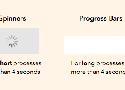
4-Second Rule
If you want users to stay on your app, don’t use spinners for processes that take longer than 4 seconds to load. A research study has found that most users’ tolerable wait time is 4 seconds. This means that their behavioral intentions begin to change after 4 seconds.
Check out our design articles, interactive tutorials and awesome tips.
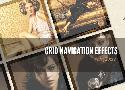
Today we want to share some neat grid navigation effects using jQuery. In our examples we will show you ten ways how to navigate through a set of thumbnails. We’ll take a look at some of the possibilities and how to apply the effect.
Alda’s ambition is to be a powerful and flexible music programming language that can be used to create music in a variety of genres by typing some code into a text editor and running a program that compiles the code and turns it into sound. I’ve put a lot of thought into making the syntax as intuitive and beginner-friendly as possible. In fact, one of the goals of Alda is to be simple for someone with little-to-no programming experience to pick up and start using. Alda’s tagline, a music programming language for musicians, conveys its goal of being useful to non-programmers.
In a way or another, pretty much everyone has used Bootstrap at least once. Millions of websites, prototypes, and themes for well-known CMSs (such as WordPress) are based on Bootstrap. The framework is simple to install, easy to use, and incredibly time-saving. It's built on high quality HTML, CSS, and JavaScript that allows you to create good-looking designs with a minimal effort.

We run through the 11 steps of logo design, giving tips and tricks on how best to harness these themes in logos.