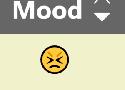
Button Design — UI component series

The button state communicate its status to the user
Creating correct interactions and styles for your buttons is one of the most important parts of the process. Each state must have clear affordances that distinguish it from other states and the surrounding layout, but should not drastically alter a component or create a lot of visual noise.
Free Font Alternatives: The Ultimate Guide – Learn UI Design
Free, high-quality alternatives to: Apercu · Avenir · Circular · DIN · Futura · Gotham · Helvetica · Proxima Nova · Times New Roman
Sortable Table Columns | Adrian Roselli
An accessible sortable table is not necessarily the same as a usable sortable table. Outline: Basics Let The User Know This Thing Has Sorted Screen Reader Announcement Sort Arrows Column Background Let The User Know This Thing Sorts SVGs Layout Windows High Contrast Mode Screen Readers
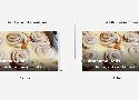
Optimal Overlay Finder - Readable Text on a Background Image
If you want to make text better stand out against a background image, there’s a little trick: You can use a CSS linear-gradient overlay with a certain opacity on top of the image to improve color contrast.
How to determine the opacity to use for the overlay? The Optimal Overlay Finder helps you find out. You upload an image, enter your text and choose your overlay and text colors, and the tool shows you a preview of what the overlay looks like when applied to your image, as well as the optimal overlay opacity.
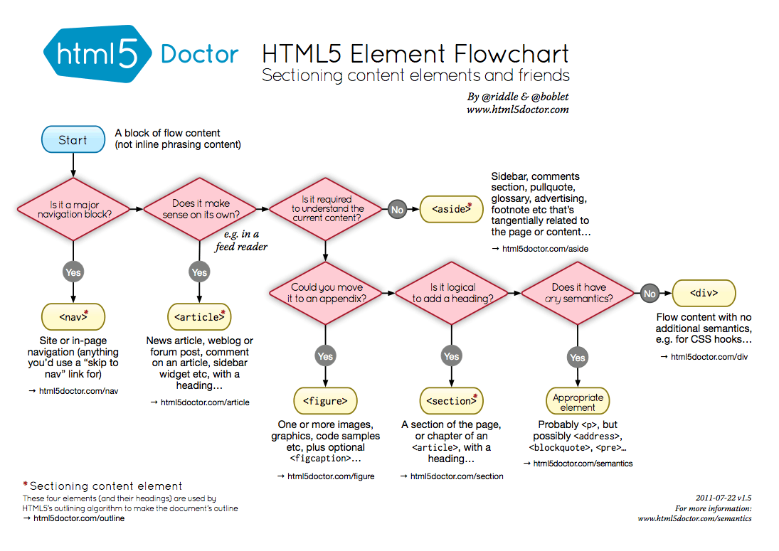
7 Alternatives to the <div> HTML Tag
- The Main Element
- The Section Element
- The Aside Element
- The Article Element
- The Nav Element
- The Footer Element
HTML5 Doctor has a really handy flowchart to help answer that question:
http://html5doctor.com/downloads/h5d-sectioning-flowchart.png
Make your CSS Readable and Maintainable with the CSS “Enabling” Pattern
Instead of using “Disabling” selectors, you should focus on writing “Enabling” selectors.
a:not(:last-child) {
  margin-bottom: 1rem;
}
or
a + a {
  margin-top: 1rem;
}Handling Text Over Images in CSS
Learn how to handle text over images in CSS by taking accessibility in mind
MVC Tutorials Are Broken - DEV Community

Note: The Model, View, Controller pattern, or “MVC”, actually comes in many flavors.
Model—The application.
View—What the consumer (user) sees. Often HTML, JSON, or XML.
Controller—A thin layer connecting the View and the Model.
And that’s it! There’s nothing fancy, but it often requires explanation. The controller, as shown above, should be as thin as possible. The view should only have display logic and the model is ... what, exactly?
8 Easy Ways to Improve Your Website Typography in Under 30 Minutes | Webdesigner Depot Webdesigner Depot » Blog Archive

2. Tighten Heading Spacing
3. Loosen Non-Word Spacing
4. Use System Fonts for Inputs
ButtonBuddy - Accessible button contrast generator
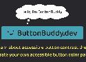
Learn what it takes to ensure your buttons or button-styled links have accessible contrast across all states and surfaces, then use the generator to check and adjust your button palette.
50+ Fresh Resources for Designers, March 2016 | Webdesigner Depot Webdesigner Depot » Blog Archive
How’s it going, compadres? This month’s roundup hand-picked from all across the web includes icons, design assets, illustrations, vector artwork, UI kits, some really cool code snippets, fonts, te
The Principles of UX Choreography

Disney developed 12 Principles of Animation which I find to be so important because of the way they depict realistic movement and emotional engagement.
Feedback
Feedforward
Spatial Awareness
User Focus
Brand Tone of Voice
10 CSS Tricks You Need to Know About (Part 2) | by Before Semicolon | Jan, 2021 | Medium
2 — Text tooltips
https://codepen.io/beforesemicolon/pen/BaKLeRL
6 — Extend the clickable area
The following example simply extends the type circle dot button click area by 2(two) by positioning a pseudo-element on top and centered.
8 — Frosted glass effect
.container {
   background-color: rgba(255, 255, 255, .15);
   backdrop-filter: blur(5px);
}
9 — Image grid with random height (Mansory Layout)
This is the famous Pinterest layout that you can use the old column property to accomplish quite easily.
10 — Math with Calc
Nothing in this world requires no math and the CSS calc function is magical.
Why Tailwind Isn't for Me - DEV Community

I think the folks building Tailwind are talented and nice people. But at a pure technical level, I simply don't like Tailwind. Whoever it was built for, it was not built for me.
- Reason 1: Tailwind promotes ugly-ass HTML.
- Reason 2: @apply is fundamentally incompatible and non-standard (and largely unnecessary).
- Reason 3: Tailwind's focus on design systems and tokens could mostly be replaced by CSS Custom Properties (aka variables)—which IS a standard.
- Reason 4: Tailwind forgets that web components exist.
- Reason 5: Finally, Tailwind encourages div/span-tag soup.
...using <div> and <span> tags everywhere in your markup is an anti-pattern. We live in a world where custom elements (aka <whatever-you-can-dream-of>) are fully supported and enabled by modern browsers.
How to Favicon in 2023: Six files that fit most needs — Martian Chronicles, Evil Martians’ team blog

Instead of serving dozens of icons, all you need is just five icons and one JSON file.
In your HTML, for the browser:
<link rel="icon" href="/favicon.ico"><!-- 32×32 -->
<link rel="icon" href="/icon.svg" type="image/svg+xml">
<link rel="apple-touch-icon" href="/apple.png"><!-- 180×180 -->
<link rel="manifest" href="/manifest.webmanifest">
And in your web app manifest:
// manifest.webmanifest
{
  "icons": [
    { "src": "/192.png", "type": "image/png", "sizes": "192x192" },
    { "src": "/512.png", "type": "image/png", "sizes": "512x512" }
  ]
}Optimizing Image Depth | CSS-Tricks

By default, lots of image editing tools save PNGs with 2^24 color depth, just in case.
So in Acorn, my image editor of choice, I’ve been taking special care to crank down the bit depth on PNGs in the export dialog. In many cases, I’ve cut image weight 80% or more by indexing colors to a palette of 256 or fewer values, with no loss of visual fidelity.
That PNG at full-color depth is about 379KB. Restricted to a palette of 32 colors, it’s 61KB. And that’s just at the export time: once I run them through ImageOptim, the optimized sizes are 359KB and 48KB.
CSS Grid full-bleed layout tutorial · Josh W Comeau
Back in the day, there was a gold-standard website layout that everyone strived to create, but that was notoriously difficult to get right…
I recently discovered an elegant solution to this problem using CSS Grid. In this post, we'll learn how it works!
A Complete Guide to CSS Media Queries | CSS-Tricks
There are lots of other things we can target beside viewport width. That might be screen resolution, device orientation, operating system preference, or even more among a whole bevy of things we can query and use to style content.
7 All-Too-Common Landing Page Errors You Must Avoid | Webdesigner Depot

1. Unclear Value Statement
- Is there a compelling, visible headline that expresses the end benefits clearly and succinctly?
- Is there a subheadline explaining your offering in more detail?
- Are there supporting graphics that pull the eye toward your headline and subheadline?
2. Poor Signposting
Your landing page isn’t just there to be pretty. It’s meant to convince people to take action. If you don’t make it easy to find your call to action, most viewers won’t look for it.
4. Only One Landing Page
A company with three profiles and four content sets would need 12 landing pages. And yes, it’s worth that kind of effort.
5. Insufficient Visuals
“A picture is worth 1,000 words” is ancient wisdom, but it’s far from true in the internet world – it’s actually worth more.
7. No Trust Elements
Offering some type of authentic customer referral or testimonial is important.