Why some designs look messy, and others don’t

Meet the Extendabox-rule
The four strokes making up a box end at each intersection. But in our unconsciousness, every one of those lines draws out an imaginary line much further, through the entirety of your design.
A grid works the other way around: you define a set of columns, gutters, and rows to make up certain sections of your design, and you then position all of your objects onto that grid.
Bulma: Free, open source, and modern CSS framework based on Flexbox

Bulma is a free, open source CSS framework based on Flexbox and built with Sass. It's 100% responsive, fully modular, and available for free.
For the best results using Bulma, it's recommended to use the control element as often as possible.
<div class="field">
  <label class="label">Username</label>
  <div class="control has-icons-left has-icons-right">
    <input class="input is-success" type="text" placeholder="Text input" value="bulma">
    <span class="icon is-small is-left">
      <i class="fas fa-user"></i>
    </span>
    <span class="icon is-small is-right">
      <i class="fas fa-check"></i>
    </span>
  </div>
  <p class="help is-success">This username is available</p>
</div>A 4-step process for testing the accessibility of your designs
Setting up your screen reader
For this guide, I’m going to use VoiceOver on Mac, a screen reader program that comes on new Mac computers, iPhones, and iPads. If you’re on Windows, you can use JAWS or NVDA. I’ll provide guiding questions and examples of good and bad interactions, so your OS shouldn’t matter.
The first step is to enable your screen reader and get familiar with its keyboard shortcuts.
- Tab
- Ctrl-Option- ← →
- Ctrl-Option-Cmd-H
- Ctrl–Option–Cmd–G
Bonus: disabled buttons
Concentric Circle Spinner - Frontend Horse

A cool spinner made only with divs, some border tricks, and one CSS animation.
I really enjoyed digging into this pen by Luke Richardville. You wouldn’t think it had much to teach, seeing as it’s only 12 lines of Pug and 32 lines of SCSS.
Negative Space – How Best to Use It in Website and App Design
In this post, UXPin looks at using negative space in design and how you can use it to create more engaging websites and apps.
Good web design with tall line-height
Get illustrations for Websites and applications
100 Colorful vector illustration to design website banners and landing pages, commercial license and SVG FIGMA SKETCH AI files included
The secret of CSS triangles. If you ever wanted to create triangles… | by Mathilde E. | Achiev | Medium
If you ever wanted to create triangles using CSS, you probably found code samples on stack-overflow or css-tricks. But how do they really work ? Understanding the process behind creating triangles…
My current HTML boilerplate - Manuel Matuzović
Every element I use for the basic structure of a HTML document, with explanations why.
Usually when I start a new project, I either copy the HTML structure of the last site I built or I head over to HTML5 Boilerplate and copy their boilerplate.
Cache-Control for Civilians – CSS Wizardry – Web Performance Optimisation
What does Cache-Control really do? In basic terms? Let’s find out!
How To Use Help Elements To Improve Your Designs — Smashing Magazine

When designing a website, the most important thing is to make it as usable and convenient as possible. On a website on which users could possibly get confused, it is best to include help elements. Help elements come in all different shapes and sizes: an entire page, a suggestion box or a quick tip. But they all have one thing in common: besides doing the obvious (i.e. helping the user), help elements provide an extra convenience that brings the website closer to that sought-after usability.
Responsive Grid Design: Ultimate Guide
I find working with the grid helpful. The grid helps to maintain consistency across the different layouts and make faster design decisions. Grids give more precise control over alignments and layout on different screen sizes.
Fixed-Width Layout Grid Setup
To set up a fixed-width grid, we use fixed numeric value for gutters and columns. I recommend 74px wide columns, 32px wide gutters and 16px side margins on each side.
Mobile View
For mobile devices, we use a fluid grid where gutters and side margins have fixed numeric values. I recommend 16px wide gutters and 16px wide side margins on each side.
We can design mobile interfaces at 360×640 sized artboard.
Mobile devices have a small screen resolution. If we display the 12 separate columns, gutters, and side margins on such a small resolution, it becomes quite cumbersome to design at scale.
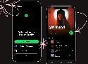
Better in Black: Rethinking our Most Important Buttons | Spotify Design
If there's one button you use every time you open Spotify, it’s the play button. Today, we’re updating it significantly for better accessibility.
iOS Design Guidelines: Illustrated Patterns (+ free templates)
iPhone design guidelines for UI elements, typography, navigation, design patterns, and more · Downloadable resources · iPhone Sketch template
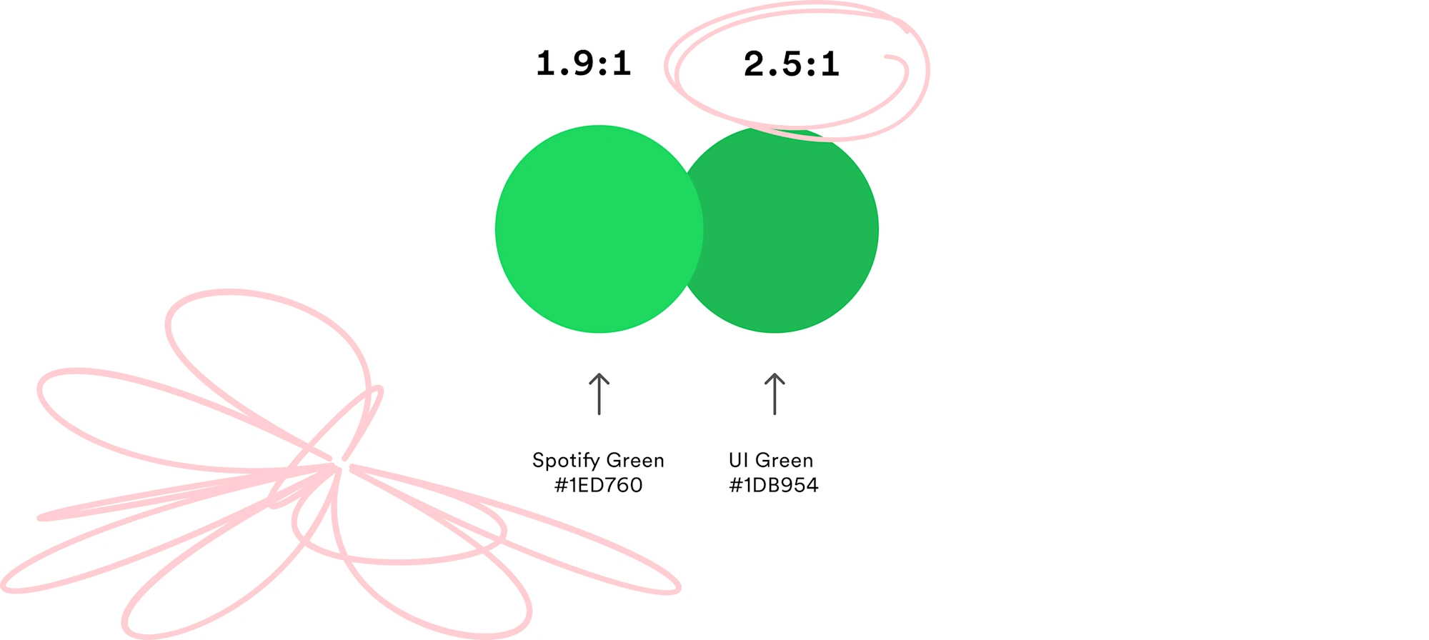
How to pick more beautiful colors for your data visualizations - Datawrapper Blog
Choosing good colors for your charts is hard. This article tries to make it easier.
01 Broaden your understanding of colors
02 Don’t dance all over the color wheel
03 Use saturation and lightness to make your hues work
04 Use warm colors & blue
05 When using green, make it a yellow or blue one
06 Avoid pure colors
07 Avoid bright, saturated colors
08 Combine colors with different lightness
09 Make your colors similarly “colorful”
10 Avoid too little contrast to the background
11 Avoid too much contrast to the background
12 Choose a background that’s desaturated enough
13 Copy colors, or understand them
A Modern CSS Reset - Post - Piccalilli
In this modern era of web development, we don’t really need a heavy-handed reset, or even a reset at all, because CSS browser compatibility issues are much less likely than they were in the old IE 6 days. That era was when resets such as normalize.css came about and saved us all heaps of hell. Those days are gone now and we can trust our browsers to behave more, so I think resets like that are probably mostly redundant.
Design is more than problem solving | by Dennis Hambeukers | Design Leadership Notebook
Design is problem solving
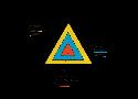
In a previous essay, I visualized it like this:
By focussing on the thinking part of design, design could move into a broader problem solving space. Hence the statement that design is problem solving. It is. Design solves design problems.
Design is making the world more beautiful
Design is question finding
But design is even more than problem solving and making the world more beautiful.
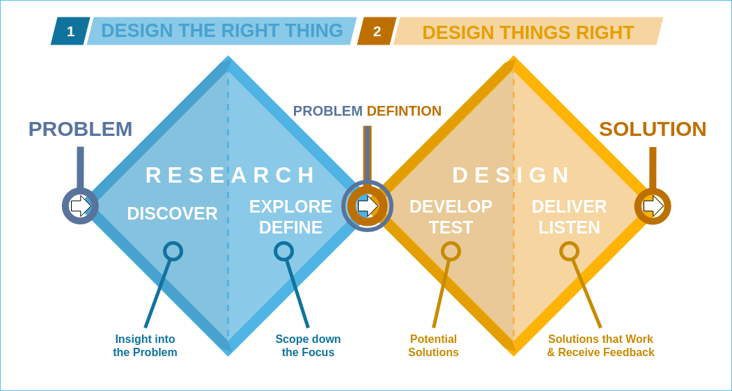
Most people see design as just the second diamond: problem solving. Most clients approach a designer with a problem definition a.k.a. a design brief. They already know what the problem is and w(previous essay)ant a (team of) designer(s) to solve it for them. If that is actually the right problem, great. Experience tells us that that is not always the case. More often than not, new insights about the problem at hand arise during the solving of the problem. That is why designers often propose to go into the first diamond first to investigate the problem and possibly redefine the problem. This prevents them from designing a brilliant solution for the wrong problem. That can be very expensive. The goal of the first diamond is to make sure we are solving the right problem, find the right question. Most innovations and complex problems benefit hugely from going through the first diamond. In his recent Harvard Business Review article, Art Markman argues that the quality of our problem framing determines the success of your solution.
Color Schemes | Modern Color Palette Collections 2020 & 2021
It's that time of year again – where we consider what the color trends have been for the past couple years, and how those might change going into 2021.

Complete Guide to Libre Franklin • Beautiful Web Type

Complete guide to the free font Libre Franklin. See beautiful examples, recommended pairings, OpenType features, and more.
https://larahogan.me/blog/we-need-to-talk-about-your-q3-roadmap/