22 CSS Libraries For Website Design | by Niemvuilaptrinh | Dec, 2021 | Medium


Normalize.css is a library that helps you build all elements more consistently when displayed in today’s popular browsers. I hope that the article will provide you with useful CSS libraries for web…
https://philipwalton.github.io/solved-by-flexbox/
https://tobiasahlin.com/spinkit/
https://connoratherton.com/loaders
https://github.com/AllThingsSmitty/css-protips
https://csslayout.io/close-button/
https://bansal.io/pattern-css
https://github.com/codrops/PageTransitions
https://lokesh-coder.github.io/pretty-checkbox/#basic-checkbox
UI Design Best Practices for Better Scannability | Toptal

Sixty percent of first-time visitors leave a website in less than fifteen seconds. Yet, there is an often overlooked usability factor that improves visitor retention—scannability. These UI design tips for using research, science, and strategy to layout content help convert short-term visitors to long-lasting users.

Web Design in 4 minutes

Learn the basics of web design in 4 minutes with this interactive tutorial.
iPhone Templates - Eric Kennedy

It’s got:
- Horizontal rulers at the top of the frame showing where (1) page actions, (2) page title, and (3) the search bar (if applicable) go
- Horizontal rulers at the bottom of the page showing where the tab bar goes
- Vertical rulers at (1) the standard iOS side margins and (2) the centerline
- A single-layer status bar – easy to delete or change to white, as needed
- A single layer device outline (including notch)
And it makes it dead simple to lay out apps in a “typical” iOS style.
Getting Deep Into Shadows | CSS-Tricks - CSS-Tricks

Let’s talk shadows in web design. Shadows add texture, perspective, and emphasize the dimensions of objects.
There are two kinds of shadows that occur when a light shines on an object, a drop shadow and a form shadow.
Form design: from zero to hero all in one blog post – Adam Silver – Designer, London, UK.

90 percent of the problems found in forms solved in a few hundred precious words.
-
Use sentence case for labels, hints and error messages. It’s easier to read and spot nouns. Use a verb for button text because the user is doing something.
-
Be tolerant of mistakes like extra spaces, dashes and slashes. Do the hard work so users don’t have to.
-
Prefix the word “Error:” to the document’s title. It’s the first thing announced by screen readers when the page loads.
-
Tell users what they need and how long the form will take to complete before they start.
DoodleCSS

A simple hand drawn HTML/CSS theme.
This stylesheet is heavily inspired by the Hand Drawn Vector UI Kit by Tony Thomas. I wanted a CSS theme that looked just like that, so I drew a bunch of similar components and got them working on the web.
https://medialoot.com/item/hand-drawn-vector-ui-kit/
HTML coverage using HTML Kitchen Sink.
https://github.com/dbox/html5-kitchen-sink/
The font is Short Stack.
The power of CSS attribute selectors

In general, the attribute selector can target any attribute that's attached to an HTML element. By default, the selector is case sensitive and has a lower specificity than id's and classes.
CSS attribute ends with
Conversely to looking for matched at the start, we can also look at the very end of an attribute's value by useing the $ operator. We'd match something value but not value something. This is especially interesting because we know that files always have a certain extension and by passing the full name into a data-attribute, we'd be able to match elemenets that represent PDF documents like this a[href$="pdf"].
[data-attribute$="value"] {
  /* ... */
}CSS Shadow Palette Generator
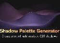
Create a set of lush, realistic CSS shadows.
https://www.joshwcomeau.com/css/introducing-shadow-palette-generator/
Modern CSS Reset / Global Styles
I have a set of baseline CSS styles that come with me from project to project. In the past, I'd use a typical CSS reset, but times have changed, and I believe I have a better set of global styles!
The tortuous journey of enhancing our color palette | by Jérôme Benoit | Doctolib | Oct, 2021 | Medium

Colors are always a tricky topic to address for many reasons. First, it’s a key pillar of a brand’s identity and has a clear impact on the perception of the brand by both the user and employees, and…
- Clutter & Legacy
- Simplify our designer’s journey
- Accessibility
Tint and Shade Generator

Easily make tints and shades that match the output of Chrome DevTools, PostCSS, and Sass.
Pure CSS Custom Styled Radio Buttons | Modern CSS Solutions
Learn to create custom, cross-browser, theme-able, scalable radio buttons in pure CSS and ensuring styles remain accessible across states.
Also checkboxes:
https://moderncss.dev/pure-css-custom-checkbox-style/
https://www.sarasoueidan.com/blog/inclusively-hiding-and-styling-checkboxes-and-radio-buttons/
Jorge Arango | Information architect, author, and educator

Information architect, author, and educator
A Universal Way to Set Up a Harmonious Line Spacing | by Onchky | Medium
Your Instagram feed may tell you that the line spacing should be 20% more than the font size. You may see that the difference should be as much as 50% as well.
There is no magic ratio. Text blocks will look different with different typefaces because of differences in Cap Height and X-height. While 120% is very likely to work for interface fonts — because they were created with a certain Cap to X-height ratio — the rest are problematic.
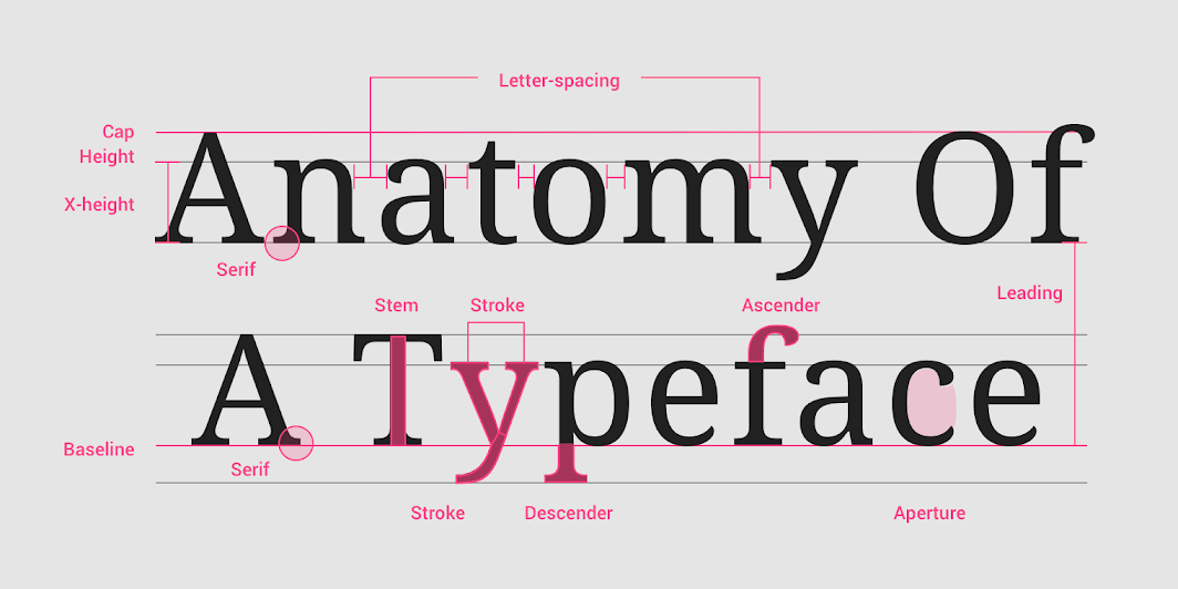
To solve the problem, you should not use a common index for all fonts, but an individual one, depending on its X-height. It is necessary to take a lowercase letter without extensions — for example, N — of the same point size as the typed text, and put it between two lines of text so that the upper boundary of the letter touches the typing line of the first line, and the lower boundary touches the upper height of the uppercase letter.
9 Types of Top CSS Frameworks In 2021 - 1stWebDesigner

The benefit of a CSS framework is that it helps you create a number of eye-catching layouts without having to start from scratch.
-
For Simple Needs, Use Class-less
Some examples of classless frameworks include sakura, watercss, holiday.css, bamboo css, attricss, and basic.css. -
To Build on Mobile, Opt for Very Lightweight
Examples of very lightweight CSS include pure, chota, and milligram. -
For an Open-and-Go Solution, Use General Purpose
Examples of general purpose CSS include bootstrap, primer, foundation, and base. -
For Niche Needs, Opt for Specialized
An example of a specialized CSS is bojler, which is used for developing lightweight and responsive email templates. It’s no secret that developing email templates is a pain. -
Looking to Skip Javascript? Material Design is the Way to Go
Material design CSS frameworks include newer versions of UI controls such as check boxes, text fields, column layouts ,and typography. MD is can be used across browsers by anyone who wants to create more portable and usable web pages. -
For Greater Attention to Detail Utility-Based Frameworks Are Best
Some examples of utility-based frameworks include tachyons and tailwind CSS. -
For Web App Development and Mobile-First, Look to Base/Reset/Normalize
Some great examples of base css frameworks include sanitize.css, ress, minireset.css, normalize.css, modern normalize, and natural selection. -
For More Flexibility, Toolkits Work Well
An example of a toolkit CSS is Bourbon. Bourbon aims for clarity, is pure Sass and lacks visual opinion. -
Honorable Mentions Are Those with Stalled Development
Some examples of stalled development frameworks include flexbox grid, semantic UI, materialize, neat, wing, and propeller.
Centering checkboxes with multi-line labels
Checkboxes are the worst
But I'm here to help make them better.
Here's an approach I use to always perfectly center them with the first line of text, no matter the text length or size
Home | Laws of UX
Laws of UX is a collection of best practices that designers can consider when building user interfaces.
Aesthetic-Usability Effect
Users often perceive aesthetically pleasing design as design that’s more usable.
Why the GOV.UK Design System team changed the input type for numbers - Technology in government

We take a look at why the GOV.UK Design System changed the element it uses for inputting numbers, making it more accessible and easier to use.
Using <input type="text" inputmode="numeric" pattern="[0-9]*"> allows for a degree of separation between how the user enters data (“input mode”), what the browser expects the user input to contain (type equals number), and potentially how it tries to validate it.