CSS Grid Generator

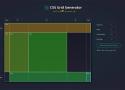
built with 🌮 by sarah_edo
You can set the numbers, and units of your columns and rows, and I'll generate a CSS grid for you! Drag within the boxes to create divs placed within the grid.
Though this project can get a basic layout started for you, this project is not a comprehensive tour of CSS Grid capabilities. It is a way for you to use CSS Grid features quickly.
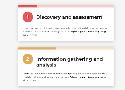
iOS Design Guidelines: Illustrated Patterns (+ free templates)
For the first 5 or 6 years of iPhone releases, screen sizes were pretty manageable. If your design worked on a 320x480 screen, you were golden. Now, it’s the wild west out there. Every year seems to come with at least another screen size 🙄…
37 Easy Ways to Spice Up Your UI Designs – Learn UI Design
Illustrated tips for making your UI and web designs more visually interesting · Backgrounds · Borders & dividers · Shadows · Text · Other techniques
Responsive HTML/CSS Image Gallery Using “Columns”, No Extra Markup Needed! | by Jason Knight | CodeX | Nov, 2022 | Medium

I came across this article by Miguel Nunez about making a flexbox based gallery that’s well thought out and well written, but has one major flaw. The markup reeks of still thinking in the “table…
AutoAnimate - Add motion to your apps with a single line of code
A zero-config, drop-in animation utility that automatically adds smooth transitions to your web app. Use it with React, Vue, Svelte, or any other JavaScript application.
6+5 ways to make a two-column layout: from pretty reasonable to completely wrong — Vadim Makeev
Imagine you need to create a two-column layout. Yes, the simplest one: a column on the left, a column on the right, and some gap in-between. There’s an obvious modern solution for that:
.columns {
    display: grid;
    grid-template-columns: 1fr 1fr;
    gap: 20px;
}Web Development recently got a whole lot easier (and you might not have noticed yet) | by Janko Hofmann | Sep, 2022 | Medium

A lot of things that required hacks, workaround and custom code are now supported natively in all major browsers. We take a look at them. Now that the security and support lifecycle for Internet…
9 Side Hustle Tools That Will Blow Your Mind | by Nitin Sharma | The Startup | Aug, 2022 | Medium

Previously, individuals were focused on making money through factories (such as the textile industry), and then businesses; subsequently, they were focused on startups, and now on building side…
-
Medusa
allows developers to create scalable and sophisticated commerce setups with less work and a high level of developer experience, and it is free forever.
You can use Gumroad if you have no programming skills. I use it to effortlessly sell my digital items, and it just takes a commission on each sale. -
Mixkit
The majority of my friends who upload videos to YouTube pay an annual subscription cost since they aren’t even aware of Mixkit.
You may also utilize Pexels, which I’ve tried before and think is worth mentioning. -
Canva
5.Quillbot
UX Design Challenges | UX Tools
A set of real-world challenges to practice crucial UX design skills. Train yourself in product design and take away portfolio-worthy deliverables.
New in Chrome: CSS Overview | CSS-Tricks - CSS-Tricks

Here’s a fancy new experimental feature in Chrome! Now, we can get an overview of the CSS used on a site, from how many colors there are to the number of unused declarations… even down to the total number of defined media queries.
10 Useful Firefox Developer Tools You Should Know - Hongkiat

Firefox being "developer's browser" has many great tools to help make our work easier. You can find more on its tool collection on the Firefox
- View horizontal and vertical rulers
- Take screenshots using CSS selectors
- Pick colors from web pages
- View page layout in 3D
- Disable JavaScript for current session
GitHub - n3r4zzurr0/svg-spinners: A collection of 24 x 24 dp SVG spinners! (CSS & SMIL)

A collection of 24 x 24 dp SVG spinners! (CSS & SMIL) - GitHub - n3r4zzurr0/svg-spinners: A collection of 24 x 24 dp SVG spinners! (CSS & SMIL)
Creative list styling
A look at some useful and creative ways to style a list.
Custom markers with ::before #
Styling the ::before pseudo-element was a common way to create custom list markers before ::marker came along. But even now, it can allow us more flexibility, when we need it, for visually complex list styling.
Like ::marker, we can add our own custom bullet styles using the content attribute. Unlike using ::marker, we need to do some manual positioning, as we don't get the automatic benefits offered by list-style-position. But we can position it relatively easily with flexbox, and it does open up a greater number of possibilities for alignment. For instance, we could alternate the position of the marker:
Creating Custom Icon Webfonts. Webfont icons — what typographers would… | by Jason Knight | CodeX | Aug, 2022 | Medium
Webfont icons — what typographers would traditionally refer to as dingbats — are an important part of modern web development. There are so many advantages to them:
Comment:
I've used https://icomoon.io for years, because of its great selection of free icon fonts and also because it's quite easy to import self designed svgs and turn them into glyphs. It's easy to use and all relevant functionalities are free of charge.
https://web.dev/optimize-webfont-loading/#customize-the-text-rendering-delay
-apple-system and BlinkMacSystemFont are now both obsolete and covered by system... | Hacker News
Never, ever use system-ui as the value of font-family
Explore DOM Events 👩🔬
A visualizer to help you learn how the DOM Event system works through exploration. Explore event phases, stopping events, canceling events, passive events and more.
accent-color - CSS: Cascading Style Sheets | MDN

The accent-color CSS property sets the accent color for user-interface controls generated by some elements.
Loaders | UI Ball

Free loaders & spinners for your next project. Built with HTML, CSS and a soupçon of SVG. Available for copypasta or as a tree-shakeable React component library.
Best Practices to Reduce Cognitive Effort on Checkout Forms
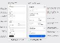
Filling out a form can frustrate anyone if it requires a high cognitive effort. A high cognitive effort causes users to think and work harder, increasing the time to complete the task. This experience can lead to page abandonment and lower conversion rates on a checkout form. To prevent this, apply these best practices to […]
CSS { In Real Life } | Aspect Ratio is Great
aspect-ratio is a great example of a humble property that fills a long-awaited need in the CSS community. It’s simple to use and behaves in a way that respects content, without the need for any extra CSS.