A Universal Way to Set Up a Harmonious Line Spacing | by Onchky | Medium

Your Instagram feed may tell you that the line spacing should be 20% more than the font size. You may see that the difference should be as much as 50% as well.
There is no magic ratio. Text blocks will look different with different typefaces because of differences in Cap Height and X-height. While 120% is very likely to work for interface fonts — because they were created with a certain Cap to X-height ratio — the rest are problematic.
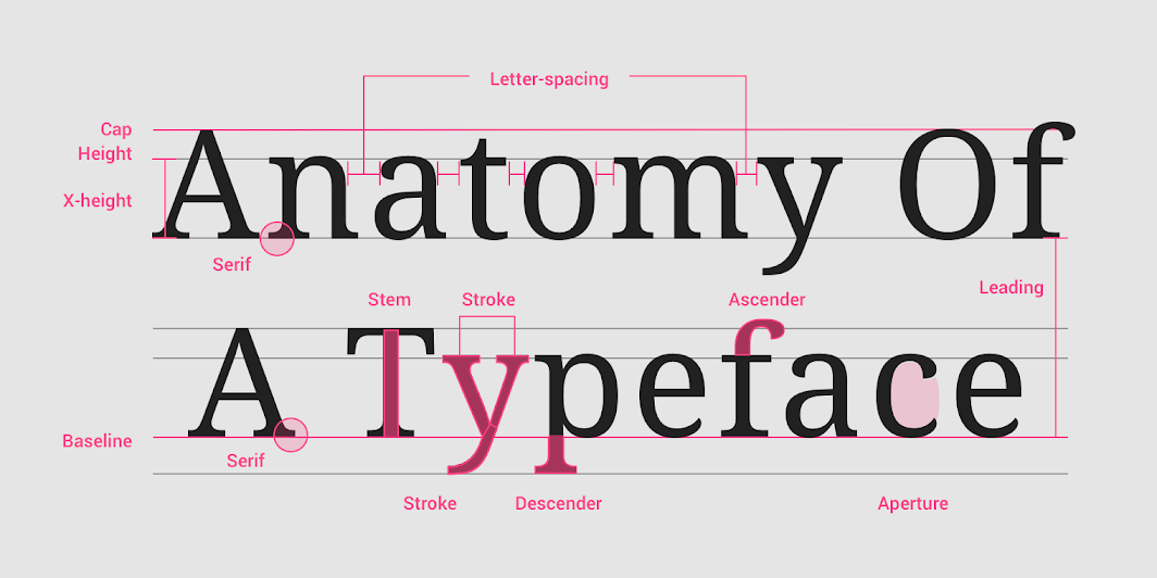
To solve the problem, you should not use a common index for all fonts, but an individual one, depending on its X-height. It is necessary to take a lowercase letter without extensions — for example, N — of the same point size as the typed text, and put it between two lines of text so that the upper boundary of the letter touches the typing line of the first line, and the lower boundary touches the upper height of the uppercase letter.