Building Website Headers with CSS Flexbox

In this article, I will explain how we can use CSS flexbox to successfully build a website header, and show you some of the important tips and tricks.
ColorBox by Lyft Design
Application to create shades and colorschemes from a single color
GitHub - xz/new.css: A classless CSS framework to write modern websites using only HTML.
new.css
A classless CSS framework to write modern websites using only HTML. It weighs 4.8kb.
All it does is set some sensible defaults and styles your HTML to look reasonable. It's perfect for:
- A dead-simple blog
- Collecting your most used links
- Making a simple "about me" site
- Rendering markdown-generated HTML
Checkboxes make excellent buttons | Christian Heilmann
I like to use checkboxes as buttons. And here’s how.
A checkbox is a binary state. It is checked or not. So instead of reading out the state in an event handler, I tend to read the checked property.
Essential Cheat Sheet: Convert jQuery to JavaScript

After reading your article, I am more convinced than ever to stick with jQuery.
17 Open Source Fonts You'll Actually Love | Webdesigner Depot
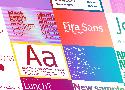
Gidole
DIN – the font we all love, the font that looks great at every size. Gidole is extremely close to DIN, but designers with a keen eye will spot very few minor differences. Overall, if you’re looking to use DIN, try Gidole out before going live.
Overpass
Overpass was created by Delvefonts and sponsored by Redhat, it was designed to be an alternative to the popular fonts Interstate and Highway Gothic. Did we mention it also has a monospace version?
Public Sans
Public Sans is a project of the United States Government, it’s used widely on their own department websites and is part of their design system. The font is based on the popular open-source font Libre Franklin.
Object Sans
Object Sans (formally known as Objectivity) is a beautiful geometric font family that can be used in place of quite a few premium fonts out there. The font brings together the top qualities of both Swiss neo-grotesks and geometric fonts. The font works beautifully as large headings but can be used for body content as well.
Jost
When you want a change from the typical Futura, then Jost is a great option with its variable weighting as well as multilingual support.
Introducing Mono Icons – Mono
Designing our own icon set is an idea that’s been going through our minds for a while, so we’ve finally taken the leap and decided to come up with our own open-source, extendable icon set. We introduce you to Mono Icons! 🙌
7 Practical Tips for Better Microcopy | Learn UXD

- Use personal pronouns
- Start with a verb
- Prevent concerns
- Use natural language
- Default to active voice
- Show useful error messages
- Write iteratively
How to Achieve Soft, Friendly and Consistent UI Design
General visual consistency
How to make our design look sleek and consistent? Start with preparing this:
- Choose colors you want to use
- Choose a font(s) you want to use
- Decide on how deep/blurred you want your shadows to be.
- If you are using icons, decide whether you want to use solid or outlines. Try not to mix them.
By now, you created your little design-system. How cool! 😎
Now you should stick to it.
If you want your shadows to look even more fanciful, make the shadow have the same color as the element that casts it, then lower the opacity. Ideally, the background would have a similar tone, too.
Making gradients look more smooth and delicate
Choose the right color for the font, so it matches the background.
Nobody told me UX would be like this
The first pass will almost always suck.
In Creativity, Inc.: Overcoming the Unseen Forces That Stand in the Way of True Inspiration, Ed Catmull equates new ideas to newborns. They need care and nurturing — space to breathe. Think of your initial ideas (read: designs) as a garden in the early stages. It will need constant watering and tending until the plants are strong enough to survive on their own and bear fruit. A garden doesn’t look like much in the early stages. But it has tremendous potential with the right care.
Artists work with an idea. They nurture it. This does not require ingenuity or creative genius. Forget about all of that. It doesn’t necessarily require a lot of experience either. It simply requires hard work to push through iteration after iteration. You are essentially watering the plants (the idea) and nurturing them.
“Quality is a probabilistic function of quantity.”
A genius is a genius, Simonton maintains, because he can put together such a staggering number of insights, ideas, theories, random observations, and unexpected connections that he almost inevitably ends up with something great.
Your job is not to come up with the best idea.
Your job, then, is to take the best part of others' ideas and shape them into the best idea. I always have ideas and want to be the first to get them out in the open where they can be evaluated (and hopefully adored). This is my ego at play — talking to me, telling me to show everyone just how clever I am. I’ve had to learn to keep my mouth shut and temper my ego. My job isn’t to come up with the best idea. It’s to listen and watch.
Go beyond your industry.
Creatively find the time to be creative.
Your ability to sell is often far more important than your design skills.
Decoding Google’s secret UX weapon
A peek into the brain of Scott Jenson, Google’s UX strategist.
- Sweat the small stuff.
- Build ugly prototypes, fast.
He calls it Assertive Instinct — the state where you are so hyped about your idea you can’t even imagine a world where it could be wrong or insufficient or simply incompatible with what people actually need. - Look for ideas in weird places.
- Don’t criticize. If you do, ask one thing, politely.
Modern CSS grid solutions to common layout problems
Dynamic centered layout
We all know margin: 0 auto to center a layout. Ideal for article pages, right? But what if you want elements like images to exceed the maximum width of the article?
a11y.css
This CSS file intends to warn developers about possible risks and mistakes that exist in HTML code. It can also be used to roughly evaluate a site's quality by simply including it as an external stylesheet.
The Designer's Guide to Letter-Spacing | Webdesigner Depot
There are a lot of different typefaces and a single rule doesn’t apply to all of them. Experiment with letter-spacing and do what seems right to you. There are some simple guidelines that will lead you in the right direction, especially when working with body text:
Letter-Spacing Headlines
If you are using well designed fonts, you can be sure that they are calibrated well, and you won’t need to make any major adjustments to them. However, the problem with headlines is that at larger scales the space between letters looks unbalanced. It can be fixed by increasing or decreasing the letter-spacing value.
There are no strict rules for letter-spacing — there are a lot of typefaces and all of them require an individual approach — but if you look at how big companies like Google and Apple treat their typefaces, you can find a lot of valuable information there.
How to make Perfect Drop Shadows in UI Design | by Thalion | Jun, 2020 | Prototypr
box-shadow: 0px 8px 24px rgb( 0, 0, 0, .15 );
x: 0px
y: 8px
Blur: 24px
Alpha: 15%
Color: #000000
6 (more) tips to quickly improve your UIs | by Marc Andrew | Jul, 2020 | UX Collective
1-Line Layouts
*10 Modern CSS layout and sizing techniques that highlight just how robust and impactful a single-line of styling code can be. [Watch the Video]
Learn Z-Index Using a Visualization Tool
Let’s quickly go over the basics. The default position value of any HTML element is static. Any element with the default value of static is a non-positioned element.
- Positioned elements with positive z-index values are placed in front of non-positioned elements.
- Positioned elements with negative z-index values are placed behind non-positioned elements.
- A z-index can be any positive (or) negative number including zero. It has no effect on a non-positioned element — position value of static.
Here is the key part - a child’s z-index has no effect outside its group. div3’s z-index determines its position in the stacking order only among its siblings and has no effect outside its group. This is the reason setting even a large value like 99999 to div3 won't place it in front of div1.