9 tips to quickly improve your UI designs - UX Collective

-
Make your elements appear more defined
Use Multiple Drop Shadows, or a very subtle border (just a shade darker than your actual shadow) around certain elements to make those elements appear a little sharper, more defined, and help avoid those muddy shadows. -
Creating long-form content? Give 20pt, and up a try
#18pt is sooo last decade.# -
Your shadows are coming from one light source right?
-
Improve Contrast between Text and Images with a subtle, but simple Overlay
Depending on where the text may be positioned over your image, you can either opt for a tried, and tested full image overlay, or a more subtle (bottom to top, or top to bottom) gradient overlay to achieve a simple contrast between the two elements.
8 (more) tips to quickly improve your UIs - UX Collective
-
Lighten up your text if it looks a little on the heavy side
-
The smaller the font size, the more generous the line height
As your font size decreases, increase the line height for better, all-round legibility. -
Choose a Base Colour, and then use Tints & Shades to add uniformity
-
Always make your ‘Call to Action’ the most prominent item on the screen
-
Add an extra visual aid to your Form Errors
Adding an Error Message close to the action that the user has just taken can be a simple, but helpful, extra visual aid for when they’re filling out Forms of any kind. -
Give Prominence to the most frequently used action in a Menu
A short history of body copy sizes on the Web
When I started working on Web stuff around 2005, there were two extremely popular font styles for body copy:
- 10px Verdana
- 11px Arial
Text that is too small takes more time to read. Users may have to lean towards the screen, hold mobile devices closer, squint, or just concentrate more. As designers and developers, we strive to not ask for such extra effort from people who use or read our work.
What to Use Instead of Number Inputs
Hanna Laakso documents the problems for GOV.UK. This is what they landed on:
<input type="text" inputmode="numeric" pattern="[0-9]*">The inputmode attribute is pretty great, and we have a deep dive on that.
Phil Nash came to (almost) same exact conclusion, and blogged about improving the experience of a two-factor auth code input on the Twilio blog:
<input
  type="text"
  name="token"
  id="token"
  inputmode="numeric"
  pattern="[0-9]*"
  autocomplete="one-time-code"
/>
That last attribute is interesting and new to me. It means you get this super extra useful experience on browsers that support it:
Responsive Images the Simple Way - Cloud Four

Long-time Cloud Four readers will be familiar with Jason’s definitive series on responsive images. This article is meant as a shorter companion piece focused on the most common responsive image use case: resolution switching.

CSS Viewport Units
To solve that issue, we need to give the title a minimum font size that it can’t go below it. CSS calc() to the rescue!
.title {
font-size: calc(14px + 2vw);
}
The calc() CSS function will have a base 14px value, and it will add 2vw to it. With that in hand, the font-size value won’t become too small.
Single-direction margin declarations – CSS Wizardry – Web Performance Optimisation
I’m not sure how I arrived at this rule, but I’m really glad I did and I would likely never ever change it. The basic premise is that you should try and define all your margins in one direction. This means always use margin-bottom to push items down the page, and margin-left to push them across the page. I’m going to focus mainly on margin-bottom throughout this article as it’s the most obvious to explain, but this can be applied to both directions (top/bottom, right/left).
Stop using Material Design text fields! - Matsuko Friedland
Note: Although it is common on the web, and is in some of the images below, you should never make visible form fields without a visible label.
Learn Box Alignment
Are you ready to learn how box alignment works for CSS Grid and Flexbox? This article is for you.
How the Illustration Design Trend Caught Fire & Why Every SaaS Is Rebranding

Nobody wants their brand to look like it hasn’t been updated in years. You only get one chance to make a first impression … and most marketers and designers will do anything to make a good first impression. Especially if your competitors are all out there looking fresh and up-to-date.
Font Sizes in UI Design: The Complete Guide – Learn UI Design
If you have, dear reader, bookmark the crap out of this page. These are up-to-date (2019) guidelines and best practices for font sizes across all major platforms – iOS 12, Android/Material Design, and responsive web. Here’s a handy table of contents for ya:
Visual Dividers in User Interfaces: Types and Design Tips | Tubik Studio

Visual Kinds of Dividers
Talking about dividers, we can analyze them in two aspects: their appearance and their functions. Starting with the visual part, there are five basic and broadly used methods of dividing content in user interfaces:
- lines
- color
- negative space
- shadows/volume
- images
The Evolution of Material Design’s Text Fields - Google Design - Medium
The results of the two studies showed that these elements of text fields were of most value:
- Enclosed text fields with a rectangular (box) shape performed better than those with a line affordance
- The text field box should be represented with a semi-transparent fill and a bottom line or with a fully transparent fill and an opaque stroke.
- Color contrast of the text field’s lines or strokes met the minimum 3:1 contrast ratios with the background
- Label text should be placed within the bounds of the text field box
- Text fields should have rounded corners
Build a Classic Layout FAST in CSS Grid - YouTube
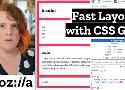
For years, we've struggled to build resilient layouts on the web, but CSS Grid promises to change all that — and you can start using it now, with only a few properties and basic concepts. Learn how to build some previously-complex layouts in under 10 minutes, with only a few lines of code. Miriam Suzanne walks you through a practical demo.
Optimizing images for the web - an in-depth guide - DEV Community 👩💻👨💻

Table Of Contents
- Calculating JPG image file size
- Online image optimization
- Automated solutions
- Image loading optimization
- Using CDN
- WebP image format
- Optimization for higher pixel density screens
- Conclusion - Optimization priority
Google HTML/CSS Style Guide
- Specifying type attributes in these contexts is not necessary as HTML5 implies text/css and text/javascript as defaults. This can be safely done even for older browsers.
5 Rules for Choosing the Right Words on Button Labels
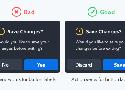
- Use Action Verbs (not generic yes/no)
- Use Precise Diction (Remove vs. Delete)
- Use Task-Specific Language (Publish vs Submit)
- Use the Active Imperative Form (Read Details vs Click Here for Details)
- Use Sentence-Style Capitalization (Friendlier than Title Case)
Comment:
If you test people on an app the first time they use it, Title Case will slow you down, just as it probably did just now. However, it is much easier to see the shape of Title Case text in buttons than sentence case buttons.
Everything You Ever Wanted to Know About inputmode | CSS-Tricks

The inputmode attribute that helps browsers on devices with on-screen keyboards decide which keyboard to display (e.g. telephone, numeric, email, search) has been around for long, but it wasn’t until a few months ago that Safari for iOS and Chrome for Android adopted it. Time to get familiar with the concept. Christian Oliff’s article “Everything You Wanted To Know About inputmode” is a great primer to dive deeper into the attribute and how to make use of it. (cm)
This Ain’t Disney: A practical guide to CSS transitions and animations
The answer is physics. Specifically Newtonian physics, the branch of science dedicated to apples falling from trees onto scientists, also referred to as classical mechanics.
Button differentiation done right – UX Collective
Buttons normally have those traits in common: font style, font size, font color, button color, button size, borders, rounded corners, drop shadow or glow effects, hover state and animations.
If we try to change too many of these traits, the buttons might feel too foreign to the general design of the project, and in this case the user will just click the most distinct one, and we’re basically back to just one CTA button.