Doodle Ipsum

Illustration placeholders for developers. Powered by Blush
The Power Of Pen And Paper Sketching — Smashing Magazine
When designing for digital spaces, it’s natural to default to digital mockup tools, but doing so cuts out a world of possibilities. Analog drawing can unleash your imagination and allow you to focus on what’s most important at the start: the ideas.

Visual design rules you can safely follow every time
- Use near-black and near-white instead of pure black and white
- Saturate your neutrals
- If you saturate your neutrals you should use warm or cool colours, not both
- Use high contrast for important elements
- Everything in your design should be deliberate
- Optical alignment is often better than mathematical alignment
- Lower letter spacing and line height with larger text. Raise them with smaller text
- Container borders should contrast with both the container and the background
- Everything should be aligned with something else
- Colours in a palette should have distinct brightness values
- Closer elements should be lighter
- Make drop shadow blur values double their distance values
- Keep container colours within brightness limits
- Make horizontal padding twice the vertical padding in buttons
- Nest corners properly
- Don’t put two hard divides next to each other
5 Illustrator TIPS and TRICKS to IMPROVE your Digital Illustrations!
5 ADOBE ILLUSTRATOR HACKS to improve your illustrations in Adobe Illustrator CC.
Shape Builder Tool for Beginners: https://youtu.be/AMqc3sRQ_-M
Pen Tool Tutorial for Beginners: https://youtu.be/SlUZaoGO9zU
- Sketch and gather references
- Use the tools Illustrator has to offer
- Plan out your color palette
- Add contrasting shadows and highlights
POSTERS — Weinberg Art & Design
Revolutionary Snake Ensemble poster
James Weinberg is a designer, illustrator, and screenprinter out of Somerville MA. With a hands on approach he creates everything from illustration, brand identity, bookjackets, hand silkscreened posters, packaging and murals. His work has been featured in The AIGA BoNE Show, Communication Arts, Print and Uppercase.
37 Easy Ways to Spice Up Your UI Designs – Learn UI Design
Illustrated tips for making your UI and web designs more visually interesting · Backgrounds · Borders & dividers · Shadows · Text · Other techniques
Blending Modes | Dan Hollick 🇿🇦
When you have Screen and Multiply, there is no good reason to use Lighten or Darken.
UX Design Challenges | UX Tools
A set of real-world challenges to practice crucial UX design skills. Train yourself in product design and take away portfolio-worthy deliverables.
Get started with Motionity
Create animated videos in your browser like never before 🎥
Motionity is a free & open source motion graphics editor for the web 🙌 Browse assets, add keyframes with easing, mask layers, apply filters, text animations, Lotties, audio, and much more.
Sonuum is an upcoming feature-packed audio editor for the web 👀 Contextual feedback, shared team libraries, sleek design, collaborative features, and much more.
Color Lisa - Color palette masterpieces of the world’s greatest artists.
Color Lisa is a curated list of inspiring color palettes based famous work of the world's greatest artists. Each palette was painstakingly created by color obsessed designers, artists, museum curators, and masters of color theory.
107 - Book Cover Mistakes That Can Sabotage Your Marketing - Author Media
Any one of these 11 book cover mistakes could ruin all your other book marketing efforts. Learn how to avoid them.
lousybookcovers.com
What is Poka-Yoke? Mistake & Error Proofing | ASQ
Mistake-proofing or Poka-Yoke is a process analysis tools that either makes it impossible for an error to occur or makes the error immediately obvious once it has occurred.
More broadly, the term can refer to any behavior-shaping constraint designed into a process to prevent incorrect operation by the user.
"Idiot-proof"
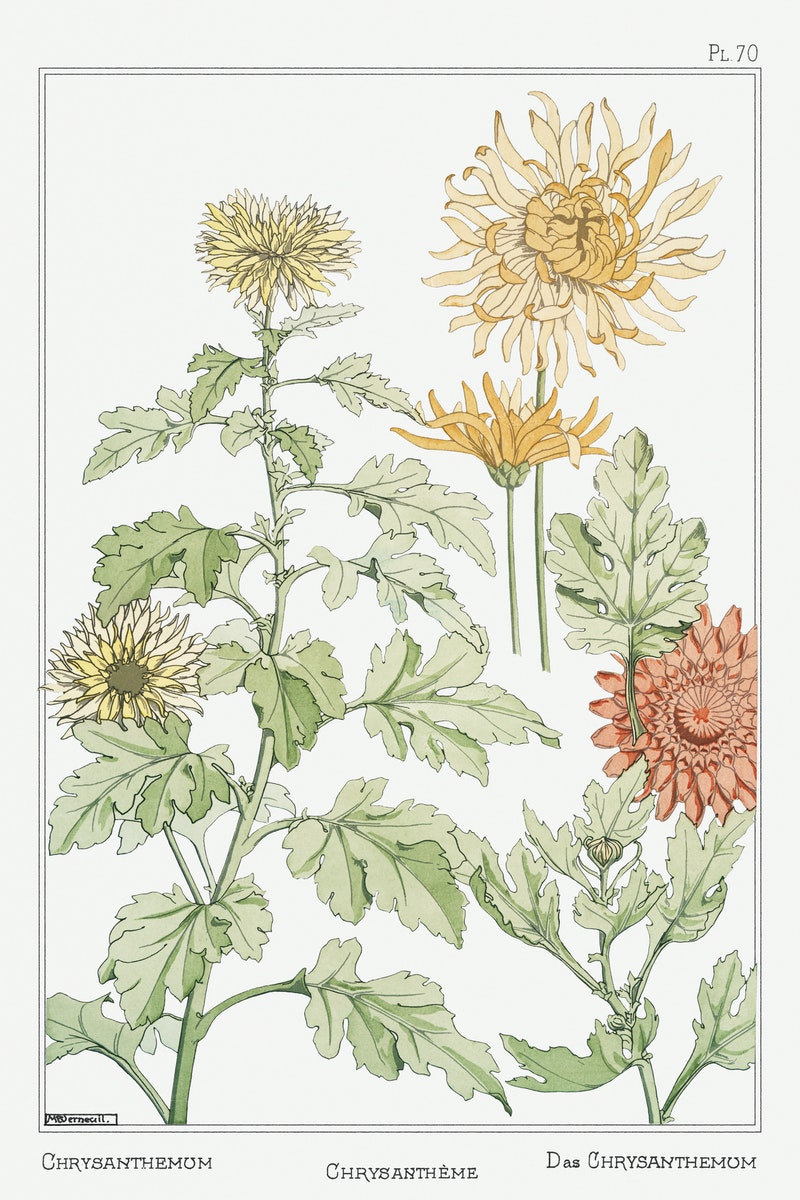
A Beautiful 1897 Illustrated Book Shows How Flowers Become Art Nouveau Designs | Open Culture
Graphic designer Eugène Grasset’s 1897 book, Plants and Their Application to Ornament, vividly demonstrates the ways in which nature was distilled into popular decorative motifs at the end of the 19th-century.
The secret to creating amazing work? You have to hate it first
What I have come to realize is that the trough of despair isn’t just normal, it’s essential. The negative feelings you experience in the trough tell you whether the work you’re doing is hard or complex enough to deserve your full creative attention. Only challenges that don’t have easy answers require you to take the kinds of difficult creative leaps that lead to breakthroughs. Only work that requires you to push yourself to develop new skills—not just deploy the ones you already have—keeps you on the edge of your own learning curve and, therefore, reaching toward your full potential.
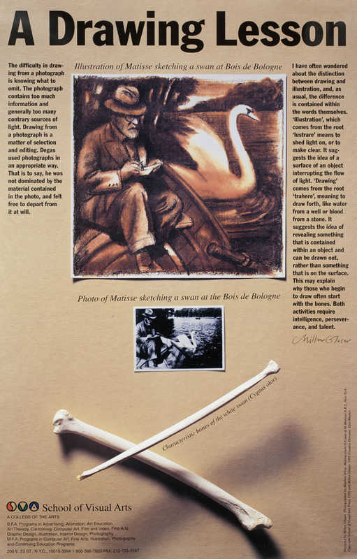
Milton Glaser’s SVA Subway Posters - SVA
The difficulty in drawing from a photograph is knowing what to omit. The photograph contains too much information and generally too many contrary sources of light. Drawing from a photograph is a matter of selection and editing. Degas used photographs in an appropriate way. That is to say, he was not dominated by the material contained in the photo, and felt free to depart from it at will.
Illustration means to shed light on, or to make clear. Drawing suggests the idea of revealing something that is contained within an object and can be drawn out, rather than something that is on the surface. This may explain why those who begin to draw often start with the bones. Both activities require intelligence, perseverance, and talent.
Why some designs look messy, and others don’t
Meet the Extendabox-rule
The four strokes making up a box end at each intersection. But in our unconsciousness, every one of those lines draws out an imaginary line much further, through the entirety of your design.
A grid works the other way around: you define a set of columns, gutters, and rows to make up certain sections of your design, and you then position all of your objects onto that grid.
Budi Tanrim - Making sense of your design project by writing
Do yourself a favor. Write down the story of your project.
By writing, you’re making sense of things.
You will untangle what is on your head and make it explicit.
Creating an Urban Sketch Journal • Concepts App • Infinite, Flexible Sketching
Designer Amin Zakaria shares his impressions on Urban Sketching.
My notes are my journal. Sometimes they are findings of a study I did, and sometimes they are merely my personal thoughts and design ideas. The sketches below reflect the different methods I use when drawing, based on what I am exploring.
Learn to draw:
https://www.youtube.com/watch?v=TOZxfVp_fSc&list=PLco-b9POdcG5WbrEW8KSDGrXh95q0-CWa&index=2
Jovan Rocanov – Medium
Read writing from Jovan Rocanov on Medium. Visual storyteller. Passionate about guiding people through the maze of narratives, symbols, and meanings. Every day, Jovan Rocanov and thousands of other voices read, write, and share important stories on Medium.
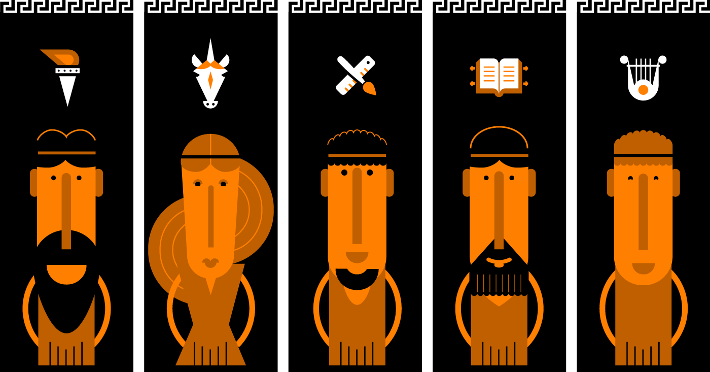
Greek illustrations
Negative Space – How Best to Use It in Website and App Design
In this post, UXPin looks at using negative space in design and how you can use it to create more engaging websites and apps.
Good web design with tall line-height