Geometric composition - Programming Design Systems

Programming Design Systems is a free digital book that teaches a practical introduction to the new foundations of graphic design.
Grids
Consistency in Design is the Wrong Approach — UX Articles by UIE

Current Knowledge is a much better way to think about the problem.
Consistency in design is about making elements uniform—having them look and behave the same way. We often hear designers talk about consistent navigation, consistent page layouts, or consistent control elements.
the right question is, “Will the user’s current knowledge help them understand how to use what I’m designing?”
Bacon Ipsum - A Meatier Lorem Ipsum Generator
Does your lorem ipsum text long for something a little meatier? Give our generator a try... it's tasty!
Nulla aliqua boudin beef culpa adipisicing. Ut pancetta non pork loin nulla filet mignon. Sint ut ut turkey non. Meatball adipisicing pastrami laborum pork belly spare ribs aliqua laboris veniam jerky. Prosciutto spare ribs andouille, picanha tri-tip irure est aute pork belly in adipisicing esse fatback. Pork chop kevin tail kielbasa. Cow excepteur pork chop pork, veniam deserunt chuck capicola burgdoggen do kielbasa venison nostrud pork belly.
ColorBox by Lyft Design
Application to create shades and colorschemes from a single color
Create a Color Scheme Around Any Color in 8 Easy Steps
-
Set your color model to HSL
-
Pick a color, any color
-
Make variations of the L value
Create a set of L values with differences of 10. Ranging from 0 to 100. -
Create 10 copies of your original color
-
Replace the L values
-
Find your partner in crime
To create your secondary color, add 30, 120, 150, 180, 210, 240, or 300 to the H value of your primary color. For this example, I added 30.
Repeat steps 4 and 5 for your secondary color scheme. -
Select a primary and secondary variant
-
Choose your side kicks
Nobody told me UX would be like this
The first pass will almost always suck.
In Creativity, Inc.: Overcoming the Unseen Forces That Stand in the Way of True Inspiration, Ed Catmull equates new ideas to newborns. They need care and nurturing — space to breathe. Think of your initial ideas (read: designs) as a garden in the early stages. It will need constant watering and tending until the plants are strong enough to survive on their own and bear fruit. A garden doesn’t look like much in the early stages. But it has tremendous potential with the right care.
Artists work with an idea. They nurture it. This does not require ingenuity or creative genius. Forget about all of that. It doesn’t necessarily require a lot of experience either. It simply requires hard work to push through iteration after iteration. You are essentially watering the plants (the idea) and nurturing them.
“Quality is a probabilistic function of quantity.”
A genius is a genius, Simonton maintains, because he can put together such a staggering number of insights, ideas, theories, random observations, and unexpected connections that he almost inevitably ends up with something great.
Your job is not to come up with the best idea.
Your job, then, is to take the best part of others' ideas and shape them into the best idea. I always have ideas and want to be the first to get them out in the open where they can be evaluated (and hopefully adored). This is my ego at play — talking to me, telling me to show everyone just how clever I am. I’ve had to learn to keep my mouth shut and temper my ego. My job isn’t to come up with the best idea. It’s to listen and watch.
Go beyond your industry.
Creatively find the time to be creative.
Your ability to sell is often far more important than your design skills.
Motion Periodic Table
Motion graphics is an expression method that is positioned between a graphic expression of a moving image and a graphic design of a still image, or both.
It is used for moving corporate logos in commercials and movies, news program tickers, and user interfaces for applications, and is a video that is often touched on a daily basis.
Therefore, the more sophisticated the design of motion graphics, the greater the richness of everyday vision.
Why are you not designing your day-to-day experience?
Defining your personal KPIs
Design is all about making decisions that prioritize one metric over another.
What metrics are important to you?
- Less time spent
- Less forgetting:
- Less decision-making
- Less cognitive load
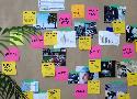
Dear designer, it’s time to rediscover your whiteboard
You should draw.
Sometimes a problem seems too big or too abstract to fit into a neatly formatted list of requirements. It’s difficult to hold and pick apart a series of steps in your head. You want to connect ideas, follow many series of steps in different directions, while also considering constraints and stress cases. But your brain wants to follow one train of thought from beginning to end. Anything that looks like it’ll take you off track gets brushed aside, “We’ll come back to it.” You end up in a battle with your own mental capacity. You need to explore all sides of a problem while simultaneously looking for weak points. There comes a real concern of things slipping through the cracks because your brain can’t hold them all or remember them for long.
Visualizing problems on a canvas gets them out of your head and into the real world. You can put all the pieces in front of you so you — and everyone else — knows what you’re working with. Every time a new idea, challenge, or path comes up, make a note. You may not solve it at the same time, but it’s there, waiting until you’re ready. This frees up mental space to start challenging your ideas and working towards solutions that include everyone — instead of barrelling down one track to the obvious, happy-path conclusion.
Your team should draw.
Because whiteboards are part of our physical space, they can be gathering places. We sit together with our teams, but each facing our own personal, digital canvases: our monitors. Work is only shared when you as an individual feel it’s ready, or a colleague has asked you to share. When we work at the whiteboard, we share our work while we work .
Everyone should draw.
The whiteboard is not a canvas for designers, it’s a canvas for discussion.
Flare by 2dimensions
Bring Your Apps and Games to Life with Real-Time Animation
Flare is a powerful design and animation tool, which allows designers and developers to easily add high-quality animation to their apps and games.
How to use your client’s design ideas — and why this is important
Clients are in love with their own ideas. When I say ‘client’ I mean the person or team to which you report. This may be your supervisor, boss, customer, or project manager. For simplicity, we’ll refer to that person as your client. That person will get more excited about their own idea than anything else.
- Alienating a client via too much prescribing
Download Classic Japanese Wave and Ripple Designs: A Go-to Guide for Japanese Artists from 1903 | Open Culture
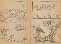
Called Hamonshū, the books were produced by the artist Mori Yuzan, "about whom not a lot is known," adds the Public Domain review, "apart from that he hailed from Kyoto, worked in the Nihonga style" — or the "Japanese painting" style of Japanese painting, which emerged during the Meiji period, a time of rapid Westernization in Japan.
Want better ideas? – Jeffrey Harris – Medium
Ideas on a little slip of paper are cheap. They flow. There’s no cost to being wrong, so there’s no reason to self-edit. It’s easier to stay generative.
The minute you turn on the screen, you’re not generating. You’re editing.
How To Design Emotional Interfaces For Boring Apps — Smashing Magazine
Humans can’t endure boredom for a long time, which is why products that are built for non-exciting, repetitive tasks so often get abandoned and gather dust on computers and phones. But boredom, according to psychologists, is merely lack of stimulation, the unfulfilled desire for satisfying activity. So what if we use the interface to give them that stimulation?
- Gameification
- Humor
- Animation
- Art
National Geographic Has Digitized Its Collection of 6,000+ Vintage Maps: See a Curated Selection of Maps Published Between 1888 and Today | Open Culture
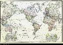
As some of the finest fictional world-builders have understood, few things excite the imagination like a map. And despite the geographical limitation implied by its title, National Geographic’s maps have surveyed the entire globe and beyond. The magazine’s articles have not always presented an enlightened point of view, but for all its historical failings, the richly-illustrated monthly has excelled as a showcase for cartography, over which readers might spend hours, projecting themselves into unknown lands, journeying through the carefully-drawn topographies, cityscapes, and celestial charts.
The Inspiration Stream | Veerle's blog 3.0 - Webdesign - XHTML CSS | Graphic Design
Theory of Change – Development Impact and You
I want to clarify my priorities
by defining my goals and the path to reach them.
The DIY Toolkit has been especially designed for development practitioners to invent, adopt or adapt ideas that can deliver better results.
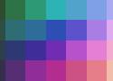
Pixelblog - 1 - Color Palettes — SLYNYRD
Due to my belief in learning through self-discovery and my ongoing creative evolution, I've long put off doing any tutorials. However, after making pixel art for over 3 years I've established many solid techniques worth laying out in a concrete fashion. While I'm excited by the prospect of helping others with my experience, I still urge artists to explore things their own way. The wonderful thing about art is the unlimited number of solutions to a problem. I offer you solutions that have worked for me and I hope they work for you, but I will be even more thrilled if you discover a better solution along the way.
How can digital designers mix RGB colors more effectively?
Like a swatch book, HSB provides a great scale for finding a color. It can be useful for pinning down a match for the color you’ve seen in your head, on a screen, or in the real world. Like a painter’s palette, RGB provides a great space for mixing color. It can be used to create organic and harmonious relationships between two or more colors in a palette.