Physical values and human perception


In a dark room, lighting a single candle may feel like a drastic change. But in a room already lit by ten candles, adding one more might not feel as significant. Or, while the intensity of sound is determined by the amplitude of the sound wave, doubling the amplitude does not make it feel twice as loud to humans.
This idea can apply to graphic design, for example, typographic scale or making contrast of sizing between visual elements in general.
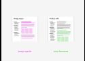
Compare two type scale examples below. The left increases the font size by 6 points each step, while the right increases the size by the ratio of 1.2x (each step is 20% larger than the previous). You can see the change between each step appear to decrease as the size increases in the left example, while the change feel more consistent in the right example.
$fontsize = b \cdot r^{(step - 1)}$

$\begin{aligned} step = \log_{1.2} \frac{fontsize}{b} + 1\end{aligned}$100 Maps of Moby Dick | kaleidoscopebrain.pdf - Google Drive
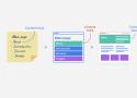
I read Moby-Dick in April 2020. For weeks afterward, I couldn’t stop thinking about it. I started making maps and diagrams as a way to figure it out.
Designed by Peter Gorman, 2021
www.barelymaps.com
@barelymaps
The Content Brick Method: A quicker way of creating a website structure | Octopus.do
How to use the Content Brick Method to create a website structure in an easier and faster way? Why is this Method better for creating visual sitemaps than using mind map tools?
Even before Octopus, we knew from years of developing websites that the best way to prototype a website structure is using stickers or some other kind of paper stickers.
Lifehack
You don’t need to spend too much time thinking which wireframe goes to which content block, we’ve taken care of that for you. There aren’t too many (just 21), but they’re the most widely used. All you need to do is pick the right one for you.
The Gulf Between Design and Engineering / Design Systems International

A new set of principles for better workflows when making digital products
“Ready for dev”
It’s safe to say that there is a natural tension between the fields of design and engineering. Traditionally, the role of design is to question, create meaning, and to argue for solutions that make for a better user experience. The role of engineering is to systematize, solve technical problems, and to argue for solutions that make for a simple, scalable, and future-proof implementation. The design process begins before we know what we want, and engineering usually happens when there is a clear notion of what is being built.
"Unfortunately, these projects often do more harm than good if the organization uses the design system as yet another initiative to centralize the decision-making process..."
- Flatten your waterfalls
- Make code the design product
- Operate like an open source project
- Increase visibility through automation
- Plan like a farmer
archives.design
A curated, easier to browse graphic design repository for the Internet Archives
Barely Maps

Minimalist maps by Peter Gorman.
A few years ago, I took a one-year, solo bicycle trip around the U.S. and Canada. I rode over 11,000 miles in one big loop.
After the trip, I designed some graphic maps inspired by the places I visited, and opened an online shop called Barely Maps.
visual frameworks – A language of patterns
Visual frameworks are patterns to help you think creatively, reframe challenging situations, and imagine possible strategies and solutions.
There are three ways to search the library:
You can search by typing in the search bar at the top right of every page.
You can explore the tag cloud to see common themes and questions.
You can search visually. Think of a situation or challenge that’s on your mind right now and click on a visual below.
Hardik Pandya

What good design managers do
A good design manager focuses on 5 key responsibilities to build a healthy and happy team:
- Ensure a steady stream of challenging and meaningful work for you & your team
- Show where the quality bar is, by doing exemplary work yourself
- Protect time and focus of your reports so they can do their best work
- Communicate timely & clear feedback to every team member
- Create a personalised growth path for every member in the team
SVGHub
Squiggles, scribbles, shapes and... other stuff.
A library of over 70 custom-color elements ready to paste into your project.
Color & Contrast
Color & Contrast is a comprehensive guide to color for user interface designers.
A comprehensive guide for exploring and learning about the theory, science, and perception of color and contrast.
Nate Baldwin
Download Free Essential eBooks for Unicorn Designers - Lapa.Ninja

Download Free Essential eBooks for Unicorn Designers - Lapa.Ninja
Last Week Tonight | Trollbäck+Company

A branding and design studio empowering cultural change
Typography Manual by Mike Mai

A set of rules that will improve your typography 10x.
Use Traditional Point Sizes
Display     Double Canon    4.666
Heading 1   Canon   3.999
Heading 2   Double Great Primer 2.999
Heading 3   Double English  2.333
Heading 4   Double Pica 2.000
Heading 5   Paragon 1.666
Heading 6   English 1.166
Body        Pica    1.000
Fine Print 1    Small Pica  0.916
Fine Print 2    Bourgeois   0.750
Use Serif for Italic Text
Reduce Heading Spacing
The spacing between a heading and a paragraph should be less than the regular paragraph spacing. If regular paragraph spacing is used instead, the heading would seem too far away from the paragraph.
Use Thin Space
Thin Space might be the most underrated HTML entity. It can be used for a name like J. K. Simmons. Without spacing, the J and K would seem too close together; with a regular space, they seem too far apart. Insert a thin space and it is just perfect.
The HTML code is . You can go even further with Hair Space
Don’t Use Helvetica, Inter, & Roboto
Why do they ignore my awesome design documentation? | Slava Shestopalov | Design Bridges
Why they don’t read it
I’m a bit of a perfectionist. Several years ago, I believed the best documentation should be nicely formatted, concise, well-illustrated, and written in clear language — and this is not wrong. But all these features make little sense if the documentation isn’t regularly used by those for whom it has been created.
If the team doesn’t react to anything you publish, I have bad news: this documentation (specs, reports, guidelines, etc.) might be already “dead.” Here are several typical scenarios of what may have gone wrong:
-
“Approved and forgotten” — design guidelines were created without team involvement and then approved by stakeholders. After the official presentation, someone checked them out, while others didn’t. Since the guidelines were comprehensive, they looked like a huge reading that would take a lot of time.
-
“A perfect monolog” — amazing design knowledge base inspired lots of team ideas and questions, but commenting was either absent in the tool or disabled. As a result, the discussion occurred elsewhere, in Slack or MS Teams, and soon this chat became a more valuable “source of truth” than the knowledge base itself.
-
“Lone warrior” — design system documentation was detailed and well-structured but didn’t include any links to what other team members (engineers, QAs, UX researchers, etc.) were doing. As a result, it remained just the designers’ resource, and designers had to answer the same repeated questions in the chat or team meetings.
Documentation is a digital product no less than the actual product you are designing and being paid for.
Good design | About us | Vitsœ
Dieter Rams, Vitsœ's furniture designer. Ten principles for good design (sometimes referred to as the ‘Ten commandments’).
16 little UI design rules that make a big impact - Adham Dannaway

A UI design case study to redesign an example user interface using logical rules or guidelines
Use space to group related elements
Be consistent
Ensure similar looking elements function similarly
Create a clear visual hierarchy
Remove unnecessary styles
Use colour purposefully
Ensure interface elements have a 3:1 contrast ratio
Ensure text has a 4.5:1 contrast ratio
Don’t rely on colour alone as an indicator
Use a single sans serif typeface
Use a typeface with taller lower case letters
Limit the use of uppercase
Use regular and bold font weights only
Avoid pure black text
Left align text
Use at least 1.5 line height for body text
Doodle Ipsum

Illustration placeholders for developers. Powered by Blush
The Power Of Pen And Paper Sketching — Smashing Magazine
When designing for digital spaces, it’s natural to default to digital mockup tools, but doing so cuts out a world of possibilities. Analog drawing can unleash your imagination and allow you to focus on what’s most important at the start: the ideas.

Visual design rules you can safely follow every time
- Use near-black and near-white instead of pure black and white
- Saturate your neutrals
- If you saturate your neutrals you should use warm or cool colours, not both
- Use high contrast for important elements
- Everything in your design should be deliberate
- Optical alignment is often better than mathematical alignment
- Lower letter spacing and line height with larger text. Raise them with smaller text
- Container borders should contrast with both the container and the background
- Everything should be aligned with something else
- Colours in a palette should have distinct brightness values
- Closer elements should be lighter
- Make drop shadow blur values double their distance values
- Keep container colours within brightness limits
- Make horizontal padding twice the vertical padding in buttons
- Nest corners properly
- Don’t put two hard divides next to each other
5 Illustrator TIPS and TRICKS to IMPROVE your Digital Illustrations!
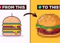
5 ADOBE ILLUSTRATOR HACKS to improve your illustrations in Adobe Illustrator CC.
Shape Builder Tool for Beginners: https://youtu.be/AMqc3sRQ_-M
Pen Tool Tutorial for Beginners: https://youtu.be/SlUZaoGO9zU
- Sketch and gather references
- Use the tools Illustrator has to offer
- Plan out your color palette
- Add contrasting shadows and highlights