Design lessons from guitar pedals | Clive Thompson

- When tech is rugged, it’s a joy to use
- UI shouldn’t focus only on your hands. Use the rest of your body too
- The best UIs have simple, bold visual cues
- Physical UIs can be more intuitive and usable than screens
- Don’t just make it functional. Make it beautiful too
UI Design Best Practices for Better Scannability | Toptal
Sixty percent of first-time visitors leave a website in less than fifteen seconds. Yet, there is an often overlooked usability factor that improves visitor retention—scannability. These UI design tips for using research, science, and strategy to layout content help convert short-term visitors to long-lasting users.

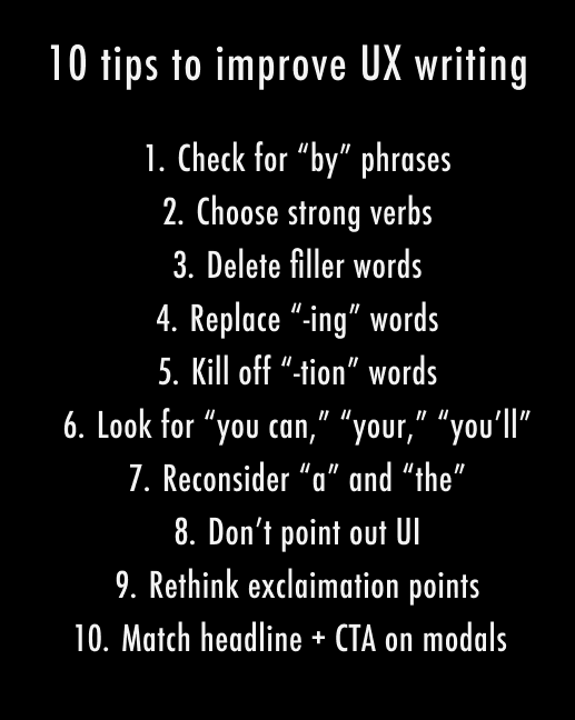
10 simple tips to improve your UX writing
If you’re a product designer, researcher, or marketer, UX writing is a tool in your content design arsenal to sharpen.
So what makes good UX writing? Copy that is clear, concise, useful, and consistent. Here are 10 tips to help you get there.
Home | Laws of UX
Laws of UX is a collection of best practices that designers can consider when building user interfaces.
Aesthetic-Usability Effect
Users often perceive aesthetically pleasing design as design that’s more usable.
What magic can teach you about interaction design
The more eloquent we are at communicating the story, the easier it will be for users/spectators to identify as a part of it.
How to Achieve Soft, Friendly and Consistent UI Design
General visual consistency
How to make our design look sleek and consistent? Start with preparing this:
- Choose colors you want to use
- Choose a font(s) you want to use
- Decide on how deep/blurred you want your shadows to be.
- If you are using icons, decide whether you want to use solid or outlines. Try not to mix them.
By now, you created your little design-system. How cool! 😎
Now you should stick to it.
If you want your shadows to look even more fanciful, make the shadow have the same color as the element that casts it, then lower the opacity. Ideally, the background would have a similar tone, too.
Making gradients look more smooth and delicate
Choose the right color for the font, so it matches the background.
Nobody told me UX would be like this
The first pass will almost always suck.
In Creativity, Inc.: Overcoming the Unseen Forces That Stand in the Way of True Inspiration, Ed Catmull equates new ideas to newborns. They need care and nurturing — space to breathe. Think of your initial ideas (read: designs) as a garden in the early stages. It will need constant watering and tending until the plants are strong enough to survive on their own and bear fruit. A garden doesn’t look like much in the early stages. But it has tremendous potential with the right care.
Artists work with an idea. They nurture it. This does not require ingenuity or creative genius. Forget about all of that. It doesn’t necessarily require a lot of experience either. It simply requires hard work to push through iteration after iteration. You are essentially watering the plants (the idea) and nurturing them.
“Quality is a probabilistic function of quantity.”
A genius is a genius, Simonton maintains, because he can put together such a staggering number of insights, ideas, theories, random observations, and unexpected connections that he almost inevitably ends up with something great.
Your job is not to come up with the best idea.
Your job, then, is to take the best part of others' ideas and shape them into the best idea. I always have ideas and want to be the first to get them out in the open where they can be evaluated (and hopefully adored). This is my ego at play — talking to me, telling me to show everyone just how clever I am. I’ve had to learn to keep my mouth shut and temper my ego. My job isn’t to come up with the best idea. It’s to listen and watch.
Go beyond your industry.
Creatively find the time to be creative.
Your ability to sell is often far more important than your design skills.
Decoding Google’s secret UX weapon
A peek into the brain of Scott Jenson, Google’s UX strategist.
- Sweat the small stuff.
- Build ugly prototypes, fast.
He calls it Assertive Instinct — the state where you are so hyped about your idea you can’t even imagine a world where it could be wrong or insufficient or simply incompatible with what people actually need. - Look for ideas in weird places.
- Don’t criticize. If you do, ask one thing, politely.
6 (more) tips to quickly improve your UIs | by Marc Andrew | Jul, 2020 | UX Collective
9 tips to quickly improve your UI designs - UX Collective
-
Make your elements appear more defined
Use Multiple Drop Shadows, or a very subtle border (just a shade darker than your actual shadow) around certain elements to make those elements appear a little sharper, more defined, and help avoid those muddy shadows. -
Creating long-form content? Give 20pt, and up a try
#18pt is sooo last decade.# -
Your shadows are coming from one light source right?
-
Improve Contrast between Text and Images with a subtle, but simple Overlay
Depending on where the text may be positioned over your image, you can either opt for a tried, and tested full image overlay, or a more subtle (bottom to top, or top to bottom) gradient overlay to achieve a simple contrast between the two elements.
8 (more) tips to quickly improve your UIs - UX Collective
-
Lighten up your text if it looks a little on the heavy side
-
The smaller the font size, the more generous the line height
As your font size decreases, increase the line height for better, all-round legibility. -
Choose a Base Colour, and then use Tints & Shades to add uniformity
-
Always make your ‘Call to Action’ the most prominent item on the screen
-
Add an extra visual aid to your Form Errors
Adding an Error Message close to the action that the user has just taken can be a simple, but helpful, extra visual aid for when they’re filling out Forms of any kind. -
Give Prominence to the most frequently used action in a Menu
Font Sizes in UI Design: The Complete Guide – Learn UI Design
If you have, dear reader, bookmark the crap out of this page. These are up-to-date (2019) guidelines and best practices for font sizes across all major platforms – iOS 12, Android/Material Design, and responsive web. Here’s a handy table of contents for ya:
5 Rules for Choosing the Right Words on Button Labels
- Use Action Verbs (not generic yes/no)
- Use Precise Diction (Remove vs. Delete)
- Use Task-Specific Language (Publish vs Submit)
- Use the Active Imperative Form (Read Details vs Click Here for Details)
- Use Sentence-Style Capitalization (Friendlier than Title Case)
Comment:
If you test people on an app the first time they use it, Title Case will slow you down, just as it probably did just now. However, it is much easier to see the shape of Title Case text in buttons than sentence case buttons.
Users Don’t Want Filters, They Want Better Content – Hopper – Medium
“[…] never solve the problem I am asked to solve. […] Because, invariably, the problem I am asked to solve is not the real, fundamental, root problem.” — Don Norman in The Design of Everyday Things
When we finally shipped the feature, however, we realized that filters weren’t what users wanted at all. They wanted something much more basic: content that was relevant to their unique situation, with the minimal number of steps required to get it. Giving our users what they wanted taught us this lesson the hard way.
The essentials of user experience design
User Experience Design is the study of user behaviour and understanding of user motivations, to design a better digital experience.
The biggest WTF in design right now
What are user flows and why you need to use them. An illustrated guide on going from “WTF, am I looking at”, to a clear design of how your app works.
All together now!
Let’s say you’re a billionaire and want to use your massive marketing and PR team to come across as a bored polymath who funds his crazy ideas with novel products like roofing torches. WTF!? Say it with me: what’s the flows?
Theory of Change – Development Impact and You
I want to clarify my priorities
by defining my goals and the path to reach them.
The DIY Toolkit has been especially designed for development practitioners to invent, adopt or adapt ideas that can deliver better results.
13 Tenets Of User Experience — Smashing Magazine

"User experience is the net sum of every interaction a person has with a company, be it marketing collateral, a customer service call, or the product or service itself. It is affected by the company’s vision and the beliefs it holds and its practices, as well as the service or product’s purpose and the value it holds in a person’s life."
"Every detail of a company and its product says something about it. User experience strategy and design ensures that these messages are put forth with intention and purpose. Design extends into each and every detail, and each and every detail can indeed be designed."
"The job of a designer, just like that of a writer, is to twist and stretch and shape a conceptualized piece of work over and over again until it becomes the masterpiece the world needs it to be."
"A user's experience belongs to the user. An experience cannot be designed. It can, however, be influenced. A designer’s job is to be the influencer."
How To Use Shadows And Blur Effects In Modern UI Design — Smashing Magazine
Shadows And User Interface Discoverability Link
There’s a reason GUI designers incorporate shadows into their designs — they help create visual cues in the interface which tell human brains what user interface elements they’re looking at.
7 Rules for Creating Gorgeous UI (Part 2)
Here are the rules:
Light comes from the sky (see Part 1)
Black and white first (see Part 1)
Double your whitespace (see Part 1)
Learn the methods of overlaying text on images
Make text pop— and un-pop
Only use good fonts
Steal like an artist