The 100% correct way to validate email addresses

Congratulations. From this day forward, you will no longer squander your time trying to work out the perfect regex to validate email addresses. You will also never again run the risk of rejecting what is, in fact, a strange, valid email address.
The upshot
There is no point in trying to work out if an email address is ‘valid’. A user is far more likely to enter a wrong and valid email address than they are to enter an invalid one.
Therefore, you are better off spending your time doing literally any other thing than trying to validate email addresses.
Duotone in Web Design
A look at the colour trend taking the world by storm
The modern web is full of colour-from subtle to bright ‘in your face’ tones. I’ll be taking a look at the latter. Meet duotone-the hottest colour style of 2016.
Pure duotone & other tonal groupings
Love it or loathe it-duotone is everywhere right now. As the name suggests, duotone is an image made up of two colours, usually vibrant shades are used but you can select more subdued ones if you wish.
Your Body Text Is Too Small Why website body text should be bigger, and ways to optimize it.
Why would we limit the effectiveness of body text by minimizing its size to a browser-default that’s now over 20 years old, even on large displays?
Is Web Typography Completely Broken? | Zell Liew

I recently came across an article titled “Web typography is broken. Here’s how we can fix it”. A mix of emotions rushed through me while I read through it. I realized that the biggest argument Tom was making in the article was that web typography is broken because type doesn’t sit perfectly on a baseline grid.
UX Reality Check: 14 Hard Truths About Users

- They’re Smarter Than You Think
- They Have Other Things To Do
- They Have a “Doing Mode”
- They “Satisfice”
- They Don’t Use Your Software The Way You Intended
- They Rely On Patterns
- They See What’s There
- They Lie
- They Don’t Know What’s Possible
- If You Improve Their Lives, They’ll Love You
- They Blame Themselves for Mistakes When It’s Your Fault
- Their User “Experience” Is Based On Far More Than Your Website
The Value of Multi-Typeface Design – About face – Medium
It has come to my attention that one of the more noticeable traits in my design work is my willingness to use what is perceived to be an excessive number of typefaces. I’ve seen countless articles written on typeface pairing and systems, and nearly all of them push towards using fewer families in any given design. I’ve seen similar comments made towards my own work, implying that they are pleasing despite the number of typefaces they use.
50+ fresh resources for designers, March 2016 | Webdesigner Depot

How’s it going, compadres? This month’s roundup hand-picked from all across the web includes icons, design assets, illustrations, vector artwork, UI kits, some really cool code snippets, fonts, templates, some awesome tools, and much much more.
Material Components
Create beautiful apps with modular and customizable UI components.
The 8 Commandments of Creating an Awesome User Experience - Daily UI Design Inspiration & Patterns - UI Garage
There are two basic questions you need to ask yourself at the start of any UX project. Let’s break it down.
WHAT DOES THE USER WANT?
WHAT DOES THE CLIENT WANT?
DESIGN FOR THE USER
Have you come across designers who seem to design for other designers, but not for the end user? I know I have. I’ve also come across designers who design for the client instead of the end user. And, if we’re going to be completely honest here, I’ve also come across designers who design for their own ego exclusively. It fills me with cringe.
Progress Bars vs. Spinners: When to Use Which
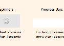
4-Second Rule
If you want users to stay on your app, don’t use spinners for processes that take longer than 4 seconds to load. A research study has found that most users’ tolerable wait time is 4 seconds. This means that their behavioral intentions begin to change after 4 seconds.
Grid Navigation Effects with jQuery

Today we want to share some neat grid navigation effects using jQuery. In our examples we will show you ten ways how to navigate through a set of thumbnails. We’ll take a look at some of the possibilities and how to apply the effect.
Using Motion For User Experience On Apps And Websites

Digital experiences are emulating real life more and more every day. This may seem counterintuitive, considering the hate that rains down on skeuomorphic visual design, but there’s a lot more to emulating real life than aesthetics. Interface designers can emulate real-life physics and movement on a digital screen. This type of motion is becoming more common, which is why it’s becoming easier for people to understand computers. We’re not getting better, the interfaces are!
Sass Burger
What’s New and What’s Changed in Bootstrap 4

In a way or another, pretty much everyone has used Bootstrap at least once. Millions of websites, prototypes, and themes for well-known CMSs (such as WordPress) are based on Bootstrap. The framework is simple to install, easy to use, and incredibly time-saving. It's built on high quality HTML, CSS, and JavaScript that allows you to create good-looking designs with a minimal effort.
Here’s a list of fun apps to build!

Here are 8 fantastic projects to train your coding muscles! The goal is to build each app with whatever technology stack you prefer. Keep it conflict free, use whatever you want!
Using Gradients In User Experience Design
Today you’ll learn how to use gradients for a website in Adobe XD through a very useful tutorial.
Always decide on a light source. This will help you decide which are the lighter and darker areas in the gradient.
How To Export SVGs For The Web From Illustrator by Colin Lord on CodePen
Chris Gannon:
Personally I prefer and use the Asset Export panel. It's quicker, produces cleaner SVGs and is more flexible (drag and drop several assets and it will export them all separately; drag and alt-drop several assets and it will export them as one).