7 Practical Tips for Cheating at Design – Refactoring UI – Medium

- Use color and weight to create hierarchy instead of size
- Don’t use grey text on colored backgrounds
- Offset your shadows
- Use fewer borders
- Don’t blow up icons that are meant to be small
- Use accent borders to add color to a bland design
- Not every button needs a background color
How to find great Natural Gradient
In my opinion the greatest inspiration for finding great natural gradients is nature. Specifically, the sky. It’s most basic colours are blue and red, but in truth, it’s so much more than just that. Subtle changes in hue emulate waves, the irregular and imperfect clouds simultaneously both ruin and enhance the big picture, and should the sun ever rise or set, the whole thing is thrown into complete disarray, that, while one would think would ruin the experience, everything still sets into a perfect harmony. I have never seen a sky that didn’t somehow inspire me to feel something bigger than all the artists of our civilization have ever managed to create.
Web Typography: Designing Tables to be Read, Not Looked At · An A List Apart Article
Set tables as text to be read
More Padding, Please! – Wayfair Design – Medium

If you overhear a design QA session between a product designer and an engineer, odds are you’ll hear the product designer say something like this:
“Can you add 8 pixels of padding here and also there? … Actually, let’s make it 16 pixels.”
Writing-first Design

Sketching is great, but before I start sketching, I start writing. Writing first has lots of advantages, regardless of the project you’re working on. Here are a few examples.
Skeuomorphism, Flat Design and The Rise of Type Design
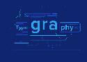
The Rules of Type Design
Here are my proposed rules for Type Design:
You can use lines or strokes.

You can use icons.

You can use typography.

You can change the color of the background.

You can use images.2017 Design Trends Guide
Each year we learn something new about design and 2016 was no different.
After last year’s article had such a success we decided to make some predictions for 2017, so let's get started!
Design trends are influenced by media, technology, the fashion industry and, lately usability. A trend emerges slowly, gradually, making its way into all design branches, and then disappears in exactly the same way. Basically a design trend's life is no longer than one or two years. Design in 2017 will continue the trends that materialized in 2016 while adding some new influences, but the feeling is well known and familiar and you may have seen it in the past couple of years. The main influencer remains Google's Material Design, that suffers a few changes.
Buttons in Design Systems – EightShapes – Medium
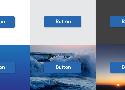
That’s why Buttons are arguably a design system’s most important component. Devilishly simple, they offer a simple label in a defined region I can press. As such, buttons are where you apply a design language’s base attributes in ways that’ll ripple throughout more complex component later.
Here’s 12 lessons I’ve learned when working the primary button, secondary buttons, and a whole host of other button types in an emerging system.
Build a Style Guide Straight from Sass
The Basics of Node-KSS
To achieve our goals of a platform agnostic, low-friction style guide, we landed on kss-node, which is itself a Node.js implementation of Knyle Style Sheets (KSS), a Ruby library that:
... provides a methodology for writing maintainable, documented CSS within a team. Specifically, KSS is a documentation specification and styleguide format.The basic principle is that your style guide is generated via comments you create in your CSS, SCSS, Sass, LESS, etc.
How to construct a design system
Tips for designing and building a consistent design system.
Without doubt, I get asked about design systems more than anything else. So, having spent the majority of the past few years thinking about how to design, build and present design systems for products like Marvel, Bantam and Modulz, I figured I’d share some of what I’ve learned along the way.
Static Site Generators Reviewed: Jekyll, Middleman, Roots, Hugo

Static site generators are quickly becoming a big part of the professional website builder’s toolbox. A new static website generator seems to pop up every week. Figuring out which one to use can be like a walk in the jungle.
Expert’s Weigh In: What’s Your Favorite CSS Trick? | Creative Cloud blog by Adobe
My favorite CSS “trick” would have to be these 3 lines of CSS:
- { background-color: rgba(0,255,0,0.1); }
I’ve been using this snippet for years! It makes debugging layouts a breeze and is quite insightful when dealing with the box model.
Design better data tables
The ingredients of a successful data table UI
Data is useless without the ability to visualize and act on it. The success of future industries will couple advanced data collection with a better user experience, and the data table comprises much of this user experience.
Good data tables allow users to scan, analyze, compare, filter, sort, and manipulate information to derive insights and commit actions. This article presents a list of design structures, interaction patterns, and techniques to help you design better data tables.

93 most popular premium fonts alternative google fonts (Updated) - Design The Way
Flexbox Cheatsheet
The not-so-great escape | The Incredible Journey [blogs.perl.org]
A couple of examples of modules which do the escaping correctly are
Mojo::Util
and
HTML::Entities
Building Production-Ready CSS Grid Layouts Today
Today, we are in the early stages of such a revolutionary shift, brought about by CSS Grid Layout. Much of what we know of the possibilities, limitations and best practices surrounding web layouts is effectively rendered obsolete by this new layout module, and in their place we find new possibilities, limitations and best practices that will take us into the next era of web design.