Free Frontend - CSS Menus

Hand-picked HTML and CSS code examples, tutorials and articles
What Happens When You Create A Flexbox Flex Container? — Smashing Magazine
In a short series of articles, I’m going to spend some time in detailed unpacking of Flexbox — in the same way I have done in the past with grid. We’ll have a look at the things Flexbox was designed for, what it really does well, and why we might not choose it as a layout method. In this article, we will take a detailed look at what actually happens when you add display: flex to your stylesheet.
The Responsive Website Font Size Guidelines (Updated for 2018) – Learn UI Design
Use a text input font size of at least 16px. If your text inputs have a smaller font size than that, iOS browsers will zoom in on the left side of the text input, often obscuring the right side and forcing the user to manually zoom out after using the text box.
When picking a base size for a desktop website or web app, you can break down most designs into one of two types:
Text-heavy pages. Articles, blogs, news, etc. These are pages where the primary purpose the user has on the page is to read. There is very little in terms of interaction – perhaps just clicking a few links.
Interaction-heavy pages. Apps that involve more hovering, clicking, searching for an item in a list or table, editing, typing, etc. There may be plenty of text on the page, but it’s not stuff you read straight through like a book.

How to use Chrome DevTools like a Pro | The JotForm Blog

- DOM Search by CSS Selectors
- Material and Page Color Palettes
- Multiple Cursor
- Get the current element with “$0”
- View Event Listeners
- Media Query
- Copy Response
- Run Predefined Snippets
Understanding CSS Layout And The Block Formatting Context
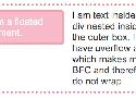
How a Block Formatting Context (BFC) behaves is easiest to understand with a simple float example. In the below example I have a box that contains an image that has been floated left and some text. If we have a good amount of text it wraps around the floated image and the border then runs around the whole lot.
There are two ways in which we ordinarily fix this layout problem. One would be to use a clearfix hack, which has the effect of inserting an element below the text and image and setting it to clear both. The other method is to use the overflow property, with a value other than the default of visible.
.outer {
overflow: auto;
}
Optimising mobile web navigation
Adding a hamburger menu was convenient, but removing it ultimately led to better business performance.
Whether that’s by making the hamburger toggle action more explicit, or removing it completely — the gains can be considerable.
We’ve taken the learnings from these tests forward and are avoiding hamburger menus where possible. One recent example is a relatively complex e-commerce site, for which we’ve designed a site structure tailored around mobile optimised navigation — allowing us to expose the menu items by default.
How To Design Emotional Interfaces For Boring Apps — Smashing Magazine
Humans can’t endure boredom for a long time, which is why products that are built for non-exciting, repetitive tasks so often get abandoned and gather dust on computers and phones. But boredom, according to psychologists, is merely lack of stimulation, the unfulfilled desire for satisfying activity. So what if we use the interface to give them that stimulation?
- Gameification
- Humor
- Animation
- Art
The biggest WTF in design right now
What are user flows and why you need to use them. An illustrated guide on going from “WTF, am I looking at”, to a clear design of how your app works.
All together now!
Let’s say you’re a billionaire and want to use your massive marketing and PR team to come across as a bored polymath who funds his crazy ideas with novel products like roofing torches. WTF!? Say it with me: what’s the flows?
Why you should use Google Font Superfamilies

A font superfamily is set of typefaces (example: merriweather and merriweather sans) that have been specifically designed to look good together.
Here are 10 Google Font superfamilies you should know about
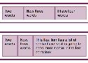
The Best Place for Error Messages on Forms
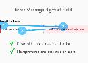
User Preference of Error Message Locations
Users rated which error message location they found most satisfying. There was a strong user preference and expectation for right of the field placement.
Error messages placed to the left of the field were rated the worst. Error messages placed above the field caused the highest cognitive load followed by error messages below the field.
The Top 14 Google fonts For Strong Headlines and Headings

As a web designer, you’re probably well aware that Great fonts are essential to great design.
This article is all about fonts. We have collected 14 unbelievable Google Web Fonts that makes your heading or headline of your website attaractive.
The fact is that the headlines are more important than you may think. and Many designers also agree this point.
Collection of CSS snippets | justmarkup
clearfix, centering, font-size
How to Use CSS Gradients on the Web

In this tutorial you’ll learn about using gradients on the web. I’ll give you some examples, some exercises (such as how to create gradients for borders), and I’ll also throw in some useful resources which will make creating gradients a lot easier.
13 Tenets Of User Experience — Smashing Magazine

"User experience is the net sum of every interaction a person has with a company, be it marketing collateral, a customer service call, or the product or service itself. It is affected by the company’s vision and the beliefs it holds and its practices, as well as the service or product’s purpose and the value it holds in a person’s life."
"Every detail of a company and its product says something about it. User experience strategy and design ensures that these messages are put forth with intention and purpose. Design extends into each and every detail, and each and every detail can indeed be designed."
"The job of a designer, just like that of a writer, is to twist and stretch and shape a conceptualized piece of work over and over again until it becomes the masterpiece the world needs it to be."
"A user's experience belongs to the user. An experience cannot be designed. It can, however, be influenced. A designer’s job is to be the influencer."
How To Use Shadows And Blur Effects In Modern UI Design — Smashing Magazine

Shadows And User Interface Discoverability Link
There’s a reason GUI designers incorporate shadows into their designs — they help create visual cues in the interface which tell human brains what user interface elements they’re looking at.
A Simple Web Developer's Color Guide — Smashing Magazine
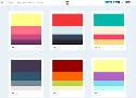
Instead I’m going to show you a simple color workflow that you can use in your next web project.
7 Rules for Creating Gorgeous UI (Part 2)
Here are the rules:
Light comes from the sky (see Part 1)
Black and white first (see Part 1)
Double your whitespace (see Part 1)
Learn the methods of overlaying text on images
Make text pop— and un-pop
Only use good fonts
Steal like an artist
The Art of Designing With Heart – Signal v. Noise

The Art of Designing With Heart
How to make useful, friendly software for real people.
One of the things I love about making software is that it’s a deeply mental exercise, chock full of heady processes, abstractions, and interconnected pathways.
YOUR SOFTWARE EXISTS TO HELP PEOPLE!
Dark Side of UI: When Dark Is Good for Users. – design4users

The aspect of using dark colors and shades in backgrounds of user interfaces still belongs to highly debatable issues. No wonder it's so actual: choosing appropriate background plays vital role on all the product efficiency as it can become a key factor enhancing or, vice versa, killing other design solutions around the layout and functionality. Today our article will be devoted to benefits and pitfalls of using dark background in UI design, so let's move on the dark side.