The magic of auto-fit and auto-fill (and the difference between them)


Grid's auto-fit and auto-fill are super useful, and while the declaration is pretty long, and can seem complicated, it's not so bad once you break it down.
✅ Auto-fill vs. auto-fit demo: https://codepen.io/kevinpowell/pen/yyLYoZO
✅ More on getting started with Grid: https://youtu.be/rg7Fvvl3taU
.grid {
display: grid;
gap: var(--gap, 1rem);
grid-template-columns: repeat(
var(--grid-type, auto-fit),
minmax(min(180px, 100%), 1fr)
);
grid-auto-rows: 120px auto auto;
container-type: inline-size;
}
⌚ Timestamps
00:00 - Introduction
00:25 - The basics of grid columns
02:30 - Using the repeat syntax
03:15 - Breaking down repeat auto-fit
05:45 - Preventing overflow
08:00 - Use a variable for the minimum value
08:45 - How to remember this declaration
11:25 - The difference between auto-fit and auto-fill
Grid Paper - daverupert.com
After 15 minutes of getting frustrated I said “I can build this.” And so I did using HTML, CSS, and the tiniest bit of JavaScript. And because it’s a webpage… why limit myself to one kind of grid? I’m able to support ~7 grids types using different kinds of background gradients:
Grids
Dot Grids
Isomorphic Grids
Isomorphic Dot Grids
Dual Hex Grids
Perspective Grids
Two-Point Perspective Grids
CSS Grid: A helpful mental model and the power of grid lines | WebKit
Grid is a powerful, flexible tool that brings complex layouts to life.
Everything you should know about 8 point grid system in UX design
The principle of 8pt Grid is that use multiples of 8 (8, 16, 24, 32, 40, 48, 56, etc.) to layout, dimensions, padding, and margin of elements.
Related Articles:
https://medium.com/swlh/the-comprehensive-8pt-grid-guide-aa16ff402179
https://medium.com/built-to-adapt/intro-to-the-8-point-grid-system-d2573cde8632
https://blog.prototypr.io/the-8pt-grid-consistent-spacing-in-ui-design-with-sketch-577e4f0fd520
Layout grids in the browser · Medienbäcker Thomas Günther

A simple guide to building keyboard-activated layout grid overlays with JavaScript and CSS for web development projects.
SVG Coding Examples: Useful Recipes For Writing Vectors By Hand — Smashing Magazine
Myriam Frisano explores the basics of hand-coding SVGs with practical examples to demystify the inner workings of common SVG elements. In this guide, you’ll learn about asking the right questions to solve common positioning problems and how to leverage JavaScript so that, by the end, you can add “SVG coding” to your toolbox. You’ll also be able to declare proudly, “I know how to draw literal pictures with words!”
CSS Grid Areas
A fresh look at the CSS grid template areas and how to take advantage of its full potential today.
An Interactive Guide to CSS Grid

CSS Grid is an incredibly powerful tool for building layouts on the web, but like all powerful tools, there's a significant learning curve. In this tutorial, we'll build a mental model for how CSS Grid works and how we can use it effectively. I'll share the biggest 💡 lightbulb moments I've had in my own learning journey.
CSS Grid Generator
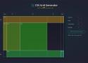
built with 🌮 by sarah_edo
You can set the numbers, and units of your columns and rows, and I'll generate a CSS grid for you! Drag within the boxes to create divs placed within the grid.
Though this project can get a basic layout started for you, this project is not a comprehensive tour of CSS Grid capabilities. It is a way for you to use CSS Grid features quickly.
6+5 ways to make a two-column layout: from pretty reasonable to completely wrong — Vadim Makeev
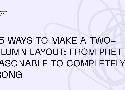
Imagine you need to create a two-column layout. Yes, the simplest one: a column on the left, a column on the right, and some gap in-between. There’s an obvious modern solution for that:
.columns {
    display: grid;
    grid-template-columns: 1fr 1fr;
    gap: 20px;
}Why some designs look messy, and others don’t
Meet the Extendabox-rule
The four strokes making up a box end at each intersection. But in our unconsciousness, every one of those lines draws out an imaginary line much further, through the entirety of your design.
A grid works the other way around: you define a set of columns, gutters, and rows to make up certain sections of your design, and you then position all of your objects onto that grid.
Responsive Grid Design: Ultimate Guide
I find working with the grid helpful. The grid helps to maintain consistency across the different layouts and make faster design decisions. Grids give more precise control over alignments and layout on different screen sizes.
Fixed-Width Layout Grid Setup
To set up a fixed-width grid, we use fixed numeric value for gutters and columns. I recommend 74px wide columns, 32px wide gutters and 16px side margins on each side.
Mobile View
For mobile devices, we use a fluid grid where gutters and side margins have fixed numeric values. I recommend 16px wide gutters and 16px wide side margins on each side.
We can design mobile interfaces at 360×640 sized artboard.
Mobile devices have a small screen resolution. If we display the 12 separate columns, gutters, and side margins on such a small resolution, it becomes quite cumbersome to design at scale.
Geometric composition - Programming Design Systems
Programming Design Systems is a free digital book that teaches a practical introduction to the new foundations of graphic design.
Grids
CSS Grid full-bleed layout tutorial · Josh W Comeau
Back in the day, there was a gold-standard website layout that everyone strived to create, but that was notoriously difficult to get right…
I recently discovered an elegant solution to this problem using CSS Grid. In this post, we'll learn how it works!
Modern CSS grid solutions to common layout problems
Dynamic centered layout
We all know margin: 0 auto to center a layout. Ideal for article pages, right? But what if you want elements like images to exceed the maximum width of the article?
1-Line Layouts
*10 Modern CSS layout and sizing techniques that highlight just how robust and impactful a single-line of styling code can be. [Watch the Video]
The Ultimate Guide To CSS Grid - JavaScript Teacher - Medium
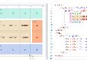
You are probably already familiar with CSS box model for regular elements. Let’s begin with a similar “bird’s eye view” representation for the CSS Grid:
Learn Box Alignment
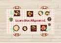
Are you ready to learn how box alignment works for CSS Grid and Flexbox? This article is for you.
Understanding CSS Grid: Grid Lines — Smashing Magazine

In the first article in this series, I took a look at how to create a grid container and the various properties applied to the parent element that make up your grid. Once you have a grid, you have a set of grid lines. In this article, you will learn how to place items against those lines by adding properties to the direct children of the grid container.
Build a Classic Layout FAST in CSS Grid - YouTube
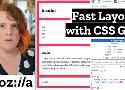
For years, we've struggled to build resilient layouts on the web, but CSS Grid promises to change all that — and you can start using it now, with only a few properties and basic concepts. Learn how to build some previously-complex layouts in under 10 minutes, with only a few lines of code. Miriam Suzanne walks you through a practical demo.