Kadinsky Bauhaus in CSS Grid

How To Align Things In CSS — Smashing Magazine

We have a whole selection of ways to align things in CSS today, and it isn’t always an obvious decision which to use. However, knowing what is available means that you can always try a few tactics if you come across a particular alignment problem.
Using CSS Grid the right way | hey it's violet

Use names. Use frs. Don't use a grid system. Wait, what? 2.17.2019
CSS Grid for Designers
How a new technology is changing layout on the web
We can create grids that better control the placement of elements both vertically and horizontally. All of this brings classic graphic design and art direction approaches back to web design.
CSS Grid in 45 Minutes!
Wes Bos
Published on Aug 23, 2018
SUBSCRIBE 65K
This is a talk I did at Laracon on CSS Grid. If you want to learn more about CSS Grid, take my free course at https://CSSGrid.io. Slides for this talk available at https://wesbos.github.io/css-grid-talk - Enjoy!
Learn CSS Grid in 5 Minutes
Grid layouts are fundamental to the design of websites, and the CSS Grid module is the most powerful and easiest tool for creating it.
The module has also gotten native support by the major browsers (Safari, Chrome, Firefox) this year, so I believe that all front-end developer will have to learn this technology in the not too distant future.
Enhancing Grid Design With GuideGuide, A Plugin For Photoshop And Illustrator
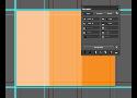
Almost five years ago, I had the honor of writing a post on Smashing Magazine about my Photoshop panel GuideGuide. Since then it has seen wild success as the most installed third-party Photoshop extension, an achievement I’m quite proud. In that time, I’ve added some powerful features and, most recently, expanded it to Illustrator. This post will give you a taste of how GuideGuide can change the way you use guides in Photoshop and Illustrator.
Learn CSS Grid | Jen Simmons
People are starting to ask: where can I learn about CSS Grid?
There are a lot of fantastic resources out there. When it comes to the technical how-to, most of what’s out there was written by Rachel Andrew. If you don’t know her work, take some time to get to know her and follow her.
So here are the links to resources I recommend. I will keep updating this list:
Building Production-Ready CSS Grid Layouts Today
Today, we are in the early stages of such a revolutionary shift, brought about by CSS Grid Layout. Much of what we know of the possibilities, limitations and best practices surrounding web layouts is effectively rendered obsolete by this new layout module, and in their place we find new possibilities, limitations and best practices that will take us into the next era of web design.
Specifics 001: The 8-Point Grid
This guide is meant to help designers lay out UI quickly and consistently. It’s particularly helpful for designing mobile app UI where there are fixed constraints, though I find it useful for responsive web design as well.
As with many design guidelines, the examples may be more helpful while designing than read independently.
Intro to the 8-Point Grid System – Built to Adapt – Medium
As a designer you’ve probably heard the term grid whether you’re designing a website, a magazine, or a mobile app. We have grids for all sorts of content arrangements. We use column grids to align content horizontally. Baseline grids to vertically align bodies of text. Soft grids and hard grids to describe how strictly we adhere to them. I took interest in the 8pt grid system after hearing Bryn Jackson avidly talk about it. I decided to find out what, if any, benefits an 8pt system could give my designs.