A complete guide to the HTML number input

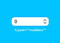
Styling, UX, validation
Choosing the right collection component
Use these guidelines to select a JET collection component based on your user tasks and the features you wish to include. You can choose between the following components:
- List (oj-list-view, 2007.0.0)
- Table (oj-table, 2007.0.0)
- Data grid (oj-data-grid, 2007.0.0)
Inclusively Hiding & Styling Checkboxes and Radio Buttons

When you hide an interactive element, make sure you choose a hiding technique that keeps it screen reader-accessible, position it on top of whatever is visually replacing it so that a user navigating by touch can find it where they expect to, and then make it transparent.
Beautiful focus outlines · Medienbäcker Thomas Günther

Here’s my starting point for custom focus outlines:
*:focus-visible {
outline-color: currentColor;
outline-style: solid;
outline-offset: .25rem;
outline-width: .25rem;
}
An HTML element id is a global variable

Little relatively unknown fact, if you have an id attribute on an element, you can reference it in this way:
<button id="yo">…</button>yo.onclick = ...Furthermore, child elements with a name attribute can be referenced in this way:
<form id="x">
  <input name="em">
</form>
x.em.onclick = ...CSS Button Styles You Might Not Know | David Bushell

Visual Focus
Accessibility is for everyone. I like using keyboard navigation to tab through interactive elements. Sadly I’ve lost count of how many clients have asked me to “remove that ugly border” around focused buttons.
Button focus state can be improved with two tricks:
.button {
  &:focus-visible {
    outline: 2px solid magenta;
    outline-offset: 2px;
  }
}
First, I replace the default focus pseudo-class with focus-visible. MDN has a long section on focus vs focus-visible. Basically it’s what the original should have been in hindsight.
https://developer.mozilla.org/en-US/docs/Web/CSS/:focus-visible#focus_vs_focus-visible
Second, I use outline-offset to give some breathing room between the focus ring and the button itself. If the button has a prominent border style the outline would sit flush against it looking like a double border. Adding an offset makes the focus state more visible.
One thing to note is that ::file-selector-button does not get focus, rather the parent input does, so apply styles there.
Designing better target sizes
An interactive guide on designing better target sizes on the web.
Design-Pattern Guidelines: Study Guide

Unsure how to design and implement user-interface patterns? Use this collection of links to our content about specific patterns.
- A Note on Interface Guidelines
- Input Controls
- Forms and Wizards
- Tooltips, Dialogs, Instructional Overlay
- Icons and Indicators
- Menu Design
- Site Navigation Elements
- In-Page Navigation
- Search
- Errors
- Privacy and Ethics
The hidden depths of the input element - HTMHell
Less typing is always better
Last but not least, my absolute favourite <input> attribute is the autocomplete attribute.
For controlling the available virtual keyboards use inputmode. To control whether an <input> can be updated, but also still read and submitted, choose readonly over disabled. You can trigger the camera on mobile devices using capture. Use the spellcheck attribtue to control whether spellchecking is activated on an input, and remember to set it to "false" on sensitive inputs. Save users time by using autocapitalize to control the capitalisation of text in an input. And finally, use autocomplete to help the browser fill in the contents of an input and save your users typing.
html - Valid to use <a> (anchor tag) without href attribute? (buttons) - Stack Overflow

The real question is whether the <a> element alone is an appropriate representation of a <button>. On a semantic level, there is a distinct difference between a link and a button.
A button is something that when clicked causes an action to occur.
A link is a button that causes a change in navigation in the current document. The navigation that occurs could be moving within the document in the case of fragment identifiers (#foo) or moving to a new document in the case of urls (/bar).
If you're concerned about the semantics and accessibility of using an <a> element (or <span>, or <div>) as a button, you should add the following attributes:
<a role="button" tabindex="0" ...>...</a>Boilerform

Boilerform is a little HTML and CSS boilerplate to take the pain away from working with forms.
3 useful CSS hacks | Kevin Powell
border-radius: 100vmax;
.full-width {
box-shadow: 0 0 0 100vmax var( --color );
clip-path: inset( 0 -100vmax );
}
UX Design Challenges | UX Tools
A set of real-world challenges to practice crucial UX design skills. Train yourself in product design and take away portfolio-worthy deliverables.
accent-color - CSS: Cascading Style Sheets | MDN
The accent-color CSS property sets the accent color for user-interface controls generated by some elements.
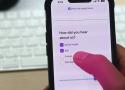
Best Practices to Reduce Cognitive Effort on Checkout Forms
Filling out a form can frustrate anyone if it requires a high cognitive effort. A high cognitive effort causes users to think and work harder, increasing the time to complete the task. This experience can lead to page abandonment and lower conversion rates on a checkout form. To prevent this, apply these best practices to […]
22 CSS Libraries For Website Design | by Niemvuilaptrinh | Dec, 2021 | Medium
Normalize.css is a library that helps you build all elements more consistently when displayed in today’s popular browsers. I hope that the article will provide you with useful CSS libraries for web…
https://philipwalton.github.io/solved-by-flexbox/
https://tobiasahlin.com/spinkit/
https://connoratherton.com/loaders
https://github.com/AllThingsSmitty/css-protips
https://csslayout.io/close-button/
https://bansal.io/pattern-css
https://github.com/codrops/PageTransitions
https://lokesh-coder.github.io/pretty-checkbox/#basic-checkbox
Form design: from zero to hero all in one blog post – Adam Silver – Designer, London, UK.

90 percent of the problems found in forms solved in a few hundred precious words.
-
Use sentence case for labels, hints and error messages. It’s easier to read and spot nouns. Use a verb for button text because the user is doing something.
-
Be tolerant of mistakes like extra spaces, dashes and slashes. Do the hard work so users don’t have to.
-
Prefix the word “Error:” to the document’s title. It’s the first thing announced by screen readers when the page loads.
-
Tell users what they need and how long the form will take to complete before they start.
Pure CSS Custom Styled Radio Buttons | Modern CSS Solutions
Learn to create custom, cross-browser, theme-able, scalable radio buttons in pure CSS and ensuring styles remain accessible across states.
Also checkboxes:
https://moderncss.dev/pure-css-custom-checkbox-style/
https://www.sarasoueidan.com/blog/inclusively-hiding-and-styling-checkboxes-and-radio-buttons/
Centering checkboxes with multi-line labels
Checkboxes are the worst
But I'm here to help make them better.
Here's an approach I use to always perfectly center them with the first line of text, no matter the text length or size