Why the GOV.UK Design System team changed the input type for numbers - Technology in government


We take a look at why the GOV.UK Design System changed the element it uses for inputting numbers, making it more accessible and easier to use.
Using <input type="text" inputmode="numeric" pattern="[0-9]*"> allows for a degree of separation between how the user enters data (“input mode”), what the browser expects the user input to contain (type equals number), and potentially how it tries to validate it.
How To Use Help Elements To Improve Your Designs — Smashing Magazine

When designing a website, the most important thing is to make it as usable and convenient as possible. On a website on which users could possibly get confused, it is best to include help elements. Help elements come in all different shapes and sizes: an entire page, a suggestion box or a quick tip. But they all have one thing in common: besides doing the obvious (i.e. helping the user), help elements provide an extra convenience that brings the website closer to that sought-after usability.
Checkboxes make excellent buttons | Christian Heilmann
I like to use checkboxes as buttons. And here’s how.
A checkbox is a binary state. It is checked or not. So instead of reading out the state in an event handler, I tend to read the checked property.
What to Use Instead of Number Inputs
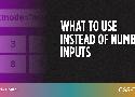
Hanna Laakso documents the problems for GOV.UK. This is what they landed on:
<input type="text" inputmode="numeric" pattern="[0-9]*">The inputmode attribute is pretty great, and we have a deep dive on that.
Phil Nash came to (almost) same exact conclusion, and blogged about improving the experience of a two-factor auth code input on the Twilio blog:
<input
  type="text"
  name="token"
  id="token"
  inputmode="numeric"
  pattern="[0-9]*"
  autocomplete="one-time-code"
/>
That last attribute is interesting and new to me. It means you get this super extra useful experience on browsers that support it:
Stop using Material Design text fields! - Matsuko Friedland
Note: Although it is common on the web, and is in some of the images below, you should never make visible form fields without a visible label.
The Evolution of Material Design’s Text Fields - Google Design - Medium
The results of the two studies showed that these elements of text fields were of most value:
- Enclosed text fields with a rectangular (box) shape performed better than those with a line affordance
- The text field box should be represented with a semi-transparent fill and a bottom line or with a fully transparent fill and an opaque stroke.
- Color contrast of the text field’s lines or strokes met the minimum 3:1 contrast ratios with the background
- Label text should be placed within the bounds of the text field box
- Text fields should have rounded corners
You probably don’t need input type=“number”
Time and time again, it seems like reaching for input type="number" is a good idea, but it almost always isn’t. While input type="number triggers numeric keyboards on touchscreens leading to better mobile UX, that can also be accomplished by configuring the pattern attribute in a certain way (Zach Leatherman has a great deep dive post into all of this).
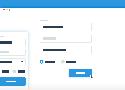
The Best Place for Error Messages on Forms
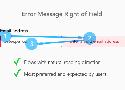
User Preference of Error Message Locations
Users rated which error message location they found most satisfying. There was a strong user preference and expectation for right of the field placement.
Error messages placed to the left of the field were rated the worst. Error messages placed above the field caused the highest cognitive load followed by error messages below the field.
Better Form Design: One Thing Per Page (Case Study)
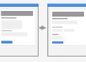
In 2008, I worked on Boots.com. They wanted a single-page checkout with the trendiest of techniques from that era, including accordions, AJAX and client-side validation.
Each step (delivery address, delivery options and credit-card details) had an accordion panel. Each panel was submitted via AJAX. Upon successful submission, the panel collapsed and the next one opened, with a sliding transition.
Links vs. Buttons in Modern Web Applications
Something that comes up again and again in front-end accessibility is the issue of links versus buttons. You know, the HTML elements that open links in new windows or submit forms?
Contact Form
A simple and easy to customize contact form.