Beautiful focus outlines · Medienbäcker Thomas Günther

Here’s my starting point for custom focus outlines:
*:focus-visible {
outline-color: currentColor;
outline-style: solid;
outline-offset: .25rem;
outline-width: .25rem;
}
How I build a button component - Piccalilli
A button is arguably the most likely component to find itself in your codebase so I’m going to show you how I approach building one.
CSS Button Styles You Might Not Know | David Bushell

Visual Focus
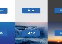
Accessibility is for everyone. I like using keyboard navigation to tab through interactive elements. Sadly I’ve lost count of how many clients have asked me to “remove that ugly border” around focused buttons.
Button focus state can be improved with two tricks:
.button {
  &:focus-visible {
    outline: 2px solid magenta;
    outline-offset: 2px;
  }
}
First, I replace the default focus pseudo-class with focus-visible. MDN has a long section on focus vs focus-visible. Basically it’s what the original should have been in hindsight.
https://developer.mozilla.org/en-US/docs/Web/CSS/:focus-visible#focus_vs_focus-visible
Second, I use outline-offset to give some breathing room between the focus ring and the button itself. If the button has a prominent border style the outline would sit flush against it looking like a double border. Adding an offset makes the focus state more visible.
One thing to note is that ::file-selector-button does not get focus, rather the parent input does, so apply styles there.
Designing better target sizes
An interactive guide on designing better target sizes on the web.
3 useful CSS hacks | Kevin Powell
border-radius: 100vmax;
.full-width {
box-shadow: 0 0 0 100vmax var( --color );
clip-path: inset( 0 -100vmax );
}
Neumorphism/Soft UI CSS shadow generator
CSS code generator that will help with colors, gradients and shadows to adapt this new design trend or discover its posibilities.
Pure CSS Custom Styled Radio Buttons | Modern CSS Solutions
Learn to create custom, cross-browser, theme-able, scalable radio buttons in pure CSS and ensuring styles remain accessible across states.
Also checkboxes:
https://moderncss.dev/pure-css-custom-checkbox-style/
https://www.sarasoueidan.com/blog/inclusively-hiding-and-styling-checkboxes-and-radio-buttons/
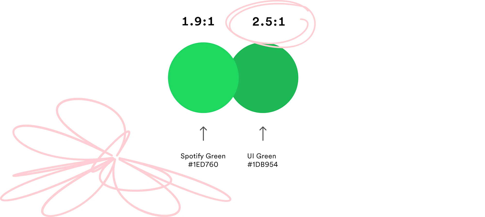
Better in Black: Rethinking our Most Important Buttons | Spotify Design
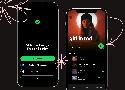
If there's one button you use every time you open Spotify, it’s the play button. Today, we’re updating it significantly for better accessibility.
Button Design — UI component series
The button state communicate its status to the user
Creating correct interactions and styles for your buttons is one of the most important parts of the process. Each state must have clear affordances that distinguish it from other states and the surrounding layout, but should not drastically alter a component or create a lot of visual noise.
ButtonBuddy - Accessible button contrast generator
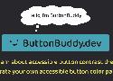
Learn what it takes to ensure your buttons or button-styled links have accessible contrast across all states and surfaces, then use the generator to check and adjust your button palette.
The Ultimate Guide to Bulletproof Buttons in Email Design - Litmus
Padding + Border-Based Buttons
The padding and border-based buttons combine elements of the previous two approaches.
Essentially, this approach uses the same structure of styling the link with both padding and at least a solid 1px border. Then, a background color is applied to the
<a> in this instance because Outlook does not recognize horizontal padding on the <a> tag (since it does not support such styling for non block-level HTML elements).
<table width="100%" border="0" cellspacing="0" cellpadding="0">
  <tr>
    <td>
      <table border="0" cellspacing="0" cellpadding="0">
        <tr>
          <td align="center" style="border-radius: 3px;" bgcolor="#e9703e"><a href="https://litmus.com" target="_blank" style="font-size: 16px; font-family: Helvetica, Arial, sans-serif; color: #ffffff; text-decoration: none; text-decoration: none;border-radius: 3px; padding: 12px 18px; border: 1px solid #e9703e; display: inline-block;">I am a button →</a></td>
        </tr>
      </table>
    </td>
  </tr>
</table>
Horizontal Padding Hack for Outlook
A quick hack that can be used to increase the horizontal “padding” for Outlook is to conditionally add inline non-breaking space(s) on each side of the link.
<!--[if mso]> <![endif]-->5 Rules for Choosing the Right Words on Button Labels
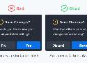
- Use Action Verbs (not generic yes/no)
- Use Precise Diction (Remove vs. Delete)
- Use Task-Specific Language (Publish vs Submit)
- Use the Active Imperative Form (Read Details vs Click Here for Details)
- Use Sentence-Style Capitalization (Friendlier than Title Case)
Comment:
If you test people on an app the first time they use it, Title Case will slow you down, just as it probably did just now. However, it is much easier to see the shape of Title Case text in buttons than sentence case buttons.
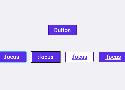
Button differentiation done right – UX Collective
Buttons normally have those traits in common: font style, font size, font color, button color, button size, borders, rounded corners, drop shadow or glow effects, hover state and animations.
If we try to change too many of these traits, the buttons might feel too foreign to the general design of the project, and in this case the user will just click the most distinct one, and we’re basically back to just one CTA button.
Designing button focus states for better usability - DEV Community 👩💻👨💻
Many people exclusively use keyboards to navigate, and rely on the focus state to know where they are on the page.
There's a huge variety of reasons why someone might use a keyboard over a mouse, and for many, using the mouse as a fallback just isn't an option.
Buttons in Design Systems – EightShapes – Medium
That’s why Buttons are arguably a design system’s most important component. Devilishly simple, they offer a simple label in a defined region I can press. As such, buttons are where you apply a design language’s base attributes in ways that’ll ripple throughout more complex component later.
Here’s 12 lessons I’ve learned when working the primary button, secondary buttons, and a whole host of other button types in an emerging system.
Color Picker - Explore Colors for HTML and CSS
Use 10% lighten and darken for hover/active states. Used the second darken for the button border
https://css-tricks.com/youtube-popup-buttons/
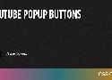
There is a certain style of button on the latest YouTube design (most easily found in the footer) where the default state of the button has a very subtle bevel to it, but on :hover and :focus states the button pops up, eager to be clicked.