The invisible layer of UX most designers ignore

Design with the screen reader layer in mind
Closing the gap between what you’ve designed and what’s announced by screen readers doesn’t require accessibility or production code expertise. It’s about being more intentional with the decisions you’re already making.
Though screen reader output depends on how the design was developed, designers have more influence over the screen reader experience than they think.
Think “role, name, state” while designing
You don’t need to memorize ARIA specs to improve accessibility. Just ask yourself three questions as you design elements like interactive or informative elements:
Role: What is this?
Name: What does it do?
State: What’s its current condition?
Style your underlines | Adactio: Journal

Make your links beautiful and accessible.
Inclusively Hiding & Styling Checkboxes and Radio Buttons

When you hide an interactive element, make sure you choose a hiding technique that keeps it screen reader-accessible, position it on top of whatever is visually replacing it so that a user navigating by touch can find it where they expect to, and then make it transparent.
Beautiful focus outlines · Medienbäcker Thomas Günther
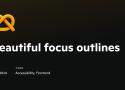
Here’s my starting point for custom focus outlines:
*:focus-visible {
outline-color: currentColor;
outline-style: solid;
outline-offset: .25rem;
outline-width: .25rem;
}
CSS Button Styles You Might Not Know | David Bushell

Visual Focus
Accessibility is for everyone. I like using keyboard navigation to tab through interactive elements. Sadly I’ve lost count of how many clients have asked me to “remove that ugly border” around focused buttons.
Button focus state can be improved with two tricks:
.button {
  &:focus-visible {
    outline: 2px solid magenta;
    outline-offset: 2px;
  }
}
First, I replace the default focus pseudo-class with focus-visible. MDN has a long section on focus vs focus-visible. Basically it’s what the original should have been in hindsight.
https://developer.mozilla.org/en-US/docs/Web/CSS/:focus-visible#focus_vs_focus-visible
Second, I use outline-offset to give some breathing room between the focus ring and the button itself. If the button has a prominent border style the outline would sit flush against it looking like a double border. Adding an offset makes the focus state more visible.
One thing to note is that ::file-selector-button does not get focus, rather the parent input does, so apply styles there.
Designing better target sizes
An interactive guide on designing better target sizes on the web.
11ty Slugs and Anchors | 11ty Rocks!

Enable anchor links on content headings
There are several plugins you can add to extend markdown-it, but in this example we are adding anchor links to our content headings. We're also extending the idea from our slug update to update which characters are removed and replaced to create anchors.
Template for accessibility guidelines - HTMHell

This template is opinionated and intended as a starting point for those who want to define how accessibility is dealt with in their company. It does not matter whether your title is developer, designer, project manager or something else.
Design pattern for custom tooltips - HTMHell

The title attribute is not particularly accessible.
Why You Should Use px Units for margin, padding, & Other Spacing Techniques | Ashlee M Boyer
When users increase their text size, they're not trying to make the space around text bigger.
Spectrum, Adobe’s design system

Spectrum provides interface components, resources, and tools to help teams work more efficiently and to make applications more consistent.
Nate Baldwin talk ~14:00
https://www.youtube.com/watch?v=Y9-aXiMSKa4
GitHub - KittyGiraudel/a11y-dialog: A very lightweight and flexible accessible modal dialog script.

A very lightweight and flexible accessible modal dialog script. - GitHub - KittyGiraudel/a11y-dialog: A very lightweight and flexible accessible modal dialog script.
The Contrast Triangle
A three-way color contrast checker for when you remove underlines from links.
https://chipcullen.com/the-contrast-triangle/
In order for your text and links to be accessible, they both need to have sufficient contrast from the background, as well as from each other. This creates a three-way design constraint.
UX Design Challenges | UX Tools
A set of real-world challenges to practice crucial UX design skills. Train yourself in product design and take away portfolio-worthy deliverables.
Accessibility Insights

Solve accessibility issues before they reach your customers.
Accessible Colors | WCAG 2.0 AA and AAA color contrast checker
Test your background and text contrast ratio based on Web Content Accessibility Guidelines (WCAG), and automatically find the closest accessible colors.
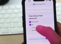
A 4-step process for testing the accessibility of your designs
Setting up your screen reader
For this guide, I’m going to use VoiceOver on Mac, a screen reader program that comes on new Mac computers, iPhones, and iPads. If you’re on Windows, you can use JAWS or NVDA. I’ll provide guiding questions and examples of good and bad interactions, so your OS shouldn’t matter.
The first step is to enable your screen reader and get familiar with its keyboard shortcuts.
- Tab
- Ctrl-Option- ← →
- Ctrl-Option-Cmd-H
- Ctrl–Option–Cmd–G
Bonus: disabled buttons
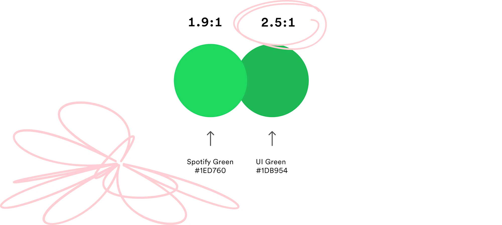
Better in Black: Rethinking our Most Important Buttons | Spotify Design
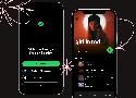
If there's one button you use every time you open Spotify, it’s the play button. Today, we’re updating it significantly for better accessibility.
Sortable Table Columns | Adrian Roselli
An accessible sortable table is not necessarily the same as a usable sortable table. Outline: Basics Let The User Know This Thing Has Sorted Screen Reader Announcement Sort Arrows Column Background Let The User Know This Thing Sorts SVGs Layout Windows High Contrast Mode Screen Readers
Why skip-links are important for accessibility

Skip-links play an important role in making a website accessible for everybody. Here I point out why and how you can implement them consistently.