CSS Grid full-bleed layout tutorial · Josh W Comeau

Back in the day, there was a gold-standard website layout that everyone strived to create, but that was notoriously difficult to get right…
I recently discovered an elegant solution to this problem using CSS Grid. In this post, we'll learn how it works!
A Complete Guide to CSS Media Queries | CSS-Tricks
There are lots of other things we can target beside viewport width. That might be screen resolution, device orientation, operating system preference, or even more among a whole bevy of things we can query and use to style content.
GitHub - xz/new.css: A classless CSS framework to write modern websites using only HTML.

new.css
A classless CSS framework to write modern websites using only HTML. It weighs 4.8kb.
All it does is set some sensible defaults and styles your HTML to look reasonable. It's perfect for:
- A dead-simple blog
- Collecting your most used links
- Making a simple "about me" site
- Rendering markdown-generated HTML
Things I Wish I’d Known About CSS | CSS For Designers

- img is inline by default
- Difference between nth-child and nth-of-type
Modern CSS grid solutions to common layout problems
Dynamic centered layout
We all know margin: 0 auto to center a layout. Ideal for article pages, right? But what if you want elements like images to exceed the maximum width of the article?
1-Line Layouts
*10 Modern CSS layout and sizing techniques that highlight just how robust and impactful a single-line of styling code can be. [Watch the Video]
Learn Z-Index Using a Visualization Tool
Let’s quickly go over the basics. The default position value of any HTML element is static. Any element with the default value of static is a non-positioned element.
- Positioned elements with positive z-index values are placed in front of non-positioned elements.
- Positioned elements with negative z-index values are placed behind non-positioned elements.
- A z-index can be any positive (or) negative number including zero. It has no effect on a non-positioned element — position value of static.
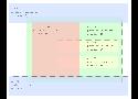
Here is the key part - a child’s z-index has no effect outside its group. div3’s z-index determines its position in the stacking order only among its siblings and has no effect outside its group. This is the reason setting even a large value like 99999 to div3 won't place it in front of div1.
What to Use Instead of Number Inputs
Hanna Laakso documents the problems for GOV.UK. This is what they landed on:
<input type="text" inputmode="numeric" pattern="[0-9]*">The inputmode attribute is pretty great, and we have a deep dive on that.
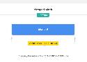
Phil Nash came to (almost) same exact conclusion, and blogged about improving the experience of a two-factor auth code input on the Twilio blog:
<input
  type="text"
  name="token"
  id="token"
  inputmode="numeric"
  pattern="[0-9]*"
  autocomplete="one-time-code"
/>
That last attribute is interesting and new to me. It means you get this super extra useful experience on browsers that support it:
Everything I Learned About min(), max(), clamp() In CSS
CSS Comparison Functions (min(), max(), clamp()) become supported in Firefox on 8 April 2020, which means that they are now supported in all major browsers. Those CSS functions will provide us with ways to have dynamic layouts and more flexible design components. They can be used for container sizes, font-size, padding. and a lot more. Even more, web designers might need to think differently while designing layouts because of these exciting CSS functions.
The Ultimate Guide To CSS Grid - JavaScript Teacher - Medium
You are probably already familiar with CSS box model for regular elements. Let’s begin with a similar “bird’s eye view” representation for the CSS Grid:
CSS Viewport Units
To solve that issue, we need to give the title a minimum font size that it can’t go below it. CSS calc() to the rescue!
.title {
font-size: calc(14px + 2vw);
}
The calc() CSS function will have a base 14px value, and it will add 2vw to it. With that in hand, the font-size value won’t become too small.
Single-direction margin declarations – CSS Wizardry – Web Performance Optimisation
I’m not sure how I arrived at this rule, but I’m really glad I did and I would likely never ever change it. The basic premise is that you should try and define all your margins in one direction. This means always use margin-bottom to push items down the page, and margin-left to push them across the page. I’m going to focus mainly on margin-bottom throughout this article as it’s the most obvious to explain, but this can be applied to both directions (top/bottom, right/left).
Learn Box Alignment
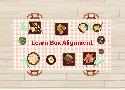
Are you ready to learn how box alignment works for CSS Grid and Flexbox? This article is for you.
CSS { In Real Life } | Optimising SVGs for the Web

Optimising SVGs (scalable vector graphics) for web projects has the dual benefits of reducing the file size and making them easier to work with. But plenty of times I’ve opened up a web project and found that SVG assets could be made significantly smaller with some straightforward optimisations. In this article I’ll share my process for optimising SVG assets, which may help you if you’re a designer or developer unfamiliar with working with SVG on the web.
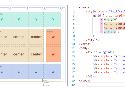
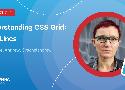
Understanding CSS Grid: Grid Lines — Smashing Magazine
In the first article in this series, I took a look at how to create a grid container and the various properties applied to the parent element that make up your grid. Once you have a grid, you have a set of grid lines. In this article, you will learn how to place items against those lines by adding properties to the direct children of the grid container.

GitHub - cssanimation/css-animation-101: Learn how to bring animation to your web projects
Learn how to bring animation to your web projects https://cssanimation.rocks
Google HTML/CSS Style Guide
- Specifying type attributes in these contexts is not necessary as HTML5 implies text/css and text/javascript as defaults. This can be safely done even for older browsers.
Everything You Ever Wanted to Know About inputmode | CSS-Tricks

The inputmode attribute that helps browsers on devices with on-screen keyboards decide which keyboard to display (e.g. telephone, numeric, email, search) has been around for long, but it wasn’t until a few months ago that Safari for iOS and Chrome for Android adopted it. Time to get familiar with the concept. Christian Oliff’s article “Everything You Wanted To Know About inputmode” is a great primer to dive deeper into the attribute and how to make use of it. (cm)
This Ain’t Disney: A practical guide to CSS transitions and animations
The answer is physics. Specifically Newtonian physics, the branch of science dedicated to apples falling from trees onto scientists, also referred to as classical mechanics.