The power of CSS attribute selectors


In general, the attribute selector can target any attribute that's attached to an HTML element. By default, the selector is case sensitive and has a lower specificity than id's and classes.
CSS attribute ends with
Conversely to looking for matched at the start, we can also look at the very end of an attribute's value by useing the $ operator. We'd match something value but not value something. This is especially interesting because we know that files always have a certain extension and by passing the full name into a data-attribute, we'd be able to match elemenets that represent PDF documents like this a[href$="pdf"].
[data-attribute$="value"] {
  /* ... */
}CSS Shadow Palette Generator
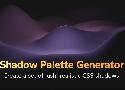
Create a set of lush, realistic CSS shadows.
https://www.joshwcomeau.com/css/introducing-shadow-palette-generator/
Modern CSS Reset / Global Styles
I have a set of baseline CSS styles that come with me from project to project. In the past, I'd use a typical CSS reset, but times have changed, and I believe I have a better set of global styles!
9 Types of Top CSS Frameworks In 2021 - 1stWebDesigner

The benefit of a CSS framework is that it helps you create a number of eye-catching layouts without having to start from scratch.
-
For Simple Needs, Use Class-less
Some examples of classless frameworks include sakura, watercss, holiday.css, bamboo css, attricss, and basic.css. -
To Build on Mobile, Opt for Very Lightweight
Examples of very lightweight CSS include pure, chota, and milligram. -
For an Open-and-Go Solution, Use General Purpose
Examples of general purpose CSS include bootstrap, primer, foundation, and base. -
For Niche Needs, Opt for Specialized
An example of a specialized CSS is bojler, which is used for developing lightweight and responsive email templates. It’s no secret that developing email templates is a pain. -
Looking to Skip Javascript? Material Design is the Way to Go
Material design CSS frameworks include newer versions of UI controls such as check boxes, text fields, column layouts ,and typography. MD is can be used across browsers by anyone who wants to create more portable and usable web pages. -
For Greater Attention to Detail Utility-Based Frameworks Are Best
Some examples of utility-based frameworks include tachyons and tailwind CSS. -
For Web App Development and Mobile-First, Look to Base/Reset/Normalize
Some great examples of base css frameworks include sanitize.css, ress, minireset.css, normalize.css, modern normalize, and natural selection. -
For More Flexibility, Toolkits Work Well
An example of a toolkit CSS is Bourbon. Bourbon aims for clarity, is pure Sass and lacks visual opinion. -
Honorable Mentions Are Those with Stalled Development
Some examples of stalled development frameworks include flexbox grid, semantic UI, materialize, neat, wing, and propeller.
Bulma: Free, open source, and modern CSS framework based on Flexbox

Bulma is a free, open source CSS framework based on Flexbox and built with Sass. It's 100% responsive, fully modular, and available for free.
For the best results using Bulma, it's recommended to use the control element as often as possible.
<div class="field">
  <label class="label">Username</label>
  <div class="control has-icons-left has-icons-right">
    <input class="input is-success" type="text" placeholder="Text input" value="bulma">
    <span class="icon is-small is-left">
      <i class="fas fa-user"></i>
    </span>
    <span class="icon is-small is-right">
      <i class="fas fa-check"></i>
    </span>
  </div>
  <p class="help is-success">This username is available</p>
</div>Documentation - Materialize
Materialize is a modern responsive CSS framework based on Material Design by Google.
Designing Beautiful Shadows in CSS
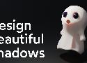
When I look around the web, most of the shadows I see are fuzzy grey boxes. It doesn't have to be this way, though! CSS gives us the tools to create rich, lush, lifelike shadows. In this tutorial, I'll show you how.
The secret of CSS triangles. If you ever wanted to create triangles… | by Mathilde E. | Achiev | Medium
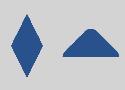
If you ever wanted to create triangles using CSS, you probably found code samples on stack-overflow or css-tricks. But how do they really work ? Understanding the process behind creating triangles…
Building hover menus in CSS
https://github.com/kenreilly/css-hover-menu-demo
This project demonstrates how to build various hover menus in pure HTML/CSS.
Examples include:
Standard basic hover menu
Hover menu with nested menus
Radial "pie" menu
A Modern CSS Reset - Post - Piccalilli
In this modern era of web development, we don’t really need a heavy-handed reset, or even a reset at all, because CSS browser compatibility issues are much less likely than they were in the old IE 6 days. That era was when resets such as normalize.css came about and saved us all heaps of hell. Those days are gone now and we can trust our browsers to behave more, so I think resets like that are probably mostly redundant.
Optimal Overlay Finder - Readable Text on a Background Image
If you want to make text better stand out against a background image, there’s a little trick: You can use a CSS linear-gradient overlay with a certain opacity on top of the image to improve color contrast.
How to determine the opacity to use for the overlay? The Optimal Overlay Finder helps you find out. You upload an image, enter your text and choose your overlay and text colors, and the tool shows you a preview of what the overlay looks like when applied to your image, as well as the optimal overlay opacity.
Make your CSS Readable and Maintainable with the CSS “Enabling” Pattern
Instead of using “Disabling” selectors, you should focus on writing “Enabling” selectors.
a:not(:last-child) {
  margin-bottom: 1rem;
}
or
a + a {
  margin-top: 1rem;
}Handling Text Over Images in CSS
Learn how to handle text over images in CSS by taking accessibility in mind
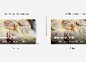
How to Make Badass Shadows
X 0
Y 5
Blur 12
Alpha 8%
Colro #004365
ButtonBuddy - Accessible button contrast generator
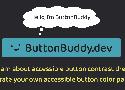
Learn what it takes to ensure your buttons or button-styled links have accessible contrast across all states and surfaces, then use the generator to check and adjust your button palette.
Gradient Magic - Fantastic and Unique CSS Gradients
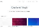
A Free Gallery of Fantastic and Unique CSS Gradients.
10 CSS Tricks You Need to Know About (Part 2) | by Before Semicolon | Jan, 2021 | Medium

2 — Text tooltips
https://codepen.io/beforesemicolon/pen/BaKLeRL
6 — Extend the clickable area
The following example simply extends the type circle dot button click area by 2(two) by positioning a pseudo-element on top and centered.
8 — Frosted glass effect
.container {
   background-color: rgba(255, 255, 255, .15);
   backdrop-filter: blur(5px);
}
9 — Image grid with random height (Mansory Layout)
This is the famous Pinterest layout that you can use the old column property to accomplish quite easily.
10 — Math with Calc
Nothing in this world requires no math and the CSS calc function is magical.
Why Tailwind Isn't for Me - DEV Community

I think the folks building Tailwind are talented and nice people. But at a pure technical level, I simply don't like Tailwind. Whoever it was built for, it was not built for me.
- Reason 1: Tailwind promotes ugly-ass HTML.
- Reason 2: @apply is fundamentally incompatible and non-standard (and largely unnecessary).
- Reason 3: Tailwind's focus on design systems and tokens could mostly be replaced by CSS Custom Properties (aka variables)—which IS a standard.
- Reason 4: Tailwind forgets that web components exist.
- Reason 5: Finally, Tailwind encourages div/span-tag soup.
...using <div> and <span> tags everywhere in your markup is an anti-pattern. We live in a world where custom elements (aka <whatever-you-can-dream-of>) are fully supported and enabled by modern browsers.
Minimal CSS Frameworks — dailydevlinks
Looking for a lighter framework for your next project? Here's a list of some of the best minimal CSS frameworks out there.
https://hakanalpay.com/bahunya/
Dark mode based on tacit
https://github.com/yegor256/tacit
https://purecss.io/
Pure builds on Normalize.css and provides layout and styling for native HTML elements, plus the most common UI components. It’s what you need, without the cruft.
🔗 https://picturepan2.github.io/spectre/index.html
Spectre.css is a lightweight, responsive and modern CSS framework for faster and extensible development.
https://andybrewer.github.io/mvp/
MVP styles your root HTML elements, so you don’t need to learn a new CSS framework or naming conventions.
It’s like an amped up CSS reset that you can toss into any project to get decent styling.
https://newcss.net/
new.css is a classless CSS framework to write modern websites using only HTML.
https://github.com/oxalorg/sakura
Wonderful for people not really good or interested with design as sakura is nothing but a set of reasonable defaults
https://watercss.kognise.dev/
Now you can write your simple static site with nice semantic html, and Water.css will manage the styling for you.
https://jenil.github.io/chota/
Magical 12 column grid
Comes with a handful of components & utilities
http://getskeleton.com/
You should use Skeleton if you're embarking on a smaller project or just don't feel like you need all the utility of larger frameworks. Skeleton only styles a handful of standard HTML elements and includes a grid, but that's often more than enough to get started. In fact, this site is built on Skeleton and has ~200 lines of custom CSS (half of which is the docking navigation).
How to make CSS Animations

CSS Animations is an amazing and powerful tool to make your website stand out among the competition. Learn how to do it and improve your user experience.