Creating Custom Icon Webfonts. Webfont icons — what typographers would… | by Jason Knight | CodeX | Aug, 2022 | Medium

Webfont icons — what typographers would traditionally refer to as dingbats — are an important part of modern web development. There are so many advantages to them:
Comment:
I've used https://icomoon.io for years, because of its great selection of free icon fonts and also because it's quite easy to import self designed svgs and turn them into glyphs. It's easy to use and all relevant functionalities are free of charge.
https://web.dev/optimize-webfont-loading/#customize-the-text-rendering-delay
10 Best Google Fonts for your website - Pepper Square
What makes the proper font selection important for a website? The right typography makes your users take a call to action and increases your website's conversion rate.
Font Friday Archives - Pimp my Type
Every Friday I recommend a typeface, write about for what digital appliations it works best, and where to better not use it. Subscribe to the Pimp my Type Newsletter and get them directly to your inbox.
Font redistribution FAQ - Typography | Microsoft Docs
Frequently asked questions about font redistribution
- We view creating graphic files as being essentially the same as printing from an output device.
Can I make a company logo using the fonts?
Unless you are using an application that is specifically licensed for home, student, or non-commercial use, we do not restrict you from making logos using the Windows-supplied fonts.
When can I use document embedding?
Font files contain flags that indicate if and how they can be embedded within a document file. Applications that support document font embedding look at these flags and determine if and how it may be embedded in a document file, and when they open a document containing embedded fonts, they will also look at these flags to determine if and how a document can be viewed or edited.
Type Scale Calculator
Beautiful font sizing for your web typography. Based on “The Typographic Scale” by Spencer Mortensen.
-apple-system and BlinkMacSystemFont are now both obsolete and covered by system... | Hacker News
Never, ever use system-ui as the value of font-family
5 Less-Known Google Fonts
Barlow
https://fonts.google.com/specimen/Barlow?query=barlow#glyphs
Barlow is a slightly rounded, low-contrast, grotesk type family. Drawing from the visual style of the California public, Barlow shares qualities with the state's car plates, highway signs, busses, and trains.
This is the Normal family, which is part of the superfamily along with Semi Condensed and Condensed, each with 9 weights in Roman and Italic.
Encode Sans
https://fonts.google.com/specimen/Encode+Sans?query=encode+sans#about
Encode Sans is a versatile workhorse sans-serif superfamily ready for all kinds of typographic challenges, offering a unique blend of warmth and practicality. Its humanist aspects of simple letterforms and open apertures keep it crisp and legible, while its geometric approach of rounded letters with partially-straightened sides delivers a friendly but precise tone.
It includes 5 widths from Condensed to Expanded, each with 9 weights from Light to Black. To simplify the use of smallcaps in word processors, there are also small-cap versions of each family.
Cabin
https://fonts.google.com/specimen/Cabin?query=cabin
Cabin is a humanist sans inspired by Edward Johnston's and Eric Gill's typefaces, with a touch of modernism. Cabin incorporates modern proportions, optical adjustments, and some elements of the geometric sans. It remains true to its roots, but has its own personality.
The Cabin font family comes in two variable fonts, roman and true italic, with a Weight range from Regular to Bold, and a Width range from normal to Condensed. The stroke contrast is almost monolinear, although top and bottom curves are slightly thinned. Counters of the b, g, p and q are rounded, and all are optically adjusted.
Sarabun
https://fonts.google.com/specimen/Sarabun
Sarabun is an open source multi-script webfont that supports both Latin and Thai. It is the "TH Sarabun New" font
Prompt
https://fonts.google.com/specimen/Prompt
Prompt in Thai means “ready,” the same as in English. Prompt is a loopless Thai and sans Latin typeface. The simple and geometric Latin was developed to work harmoniously with the loopless Thai that has wide proportions and airy negative space. It is suitable for both web and print usage, such as magazines, newspapers, and posters.
A Universal Way to Set Up a Harmonious Line Spacing | by Onchky | Medium
Your Instagram feed may tell you that the line spacing should be 20% more than the font size. You may see that the difference should be as much as 50% as well.
There is no magic ratio. Text blocks will look different with different typefaces because of differences in Cap Height and X-height. While 120% is very likely to work for interface fonts — because they were created with a certain Cap to X-height ratio — the rest are problematic.
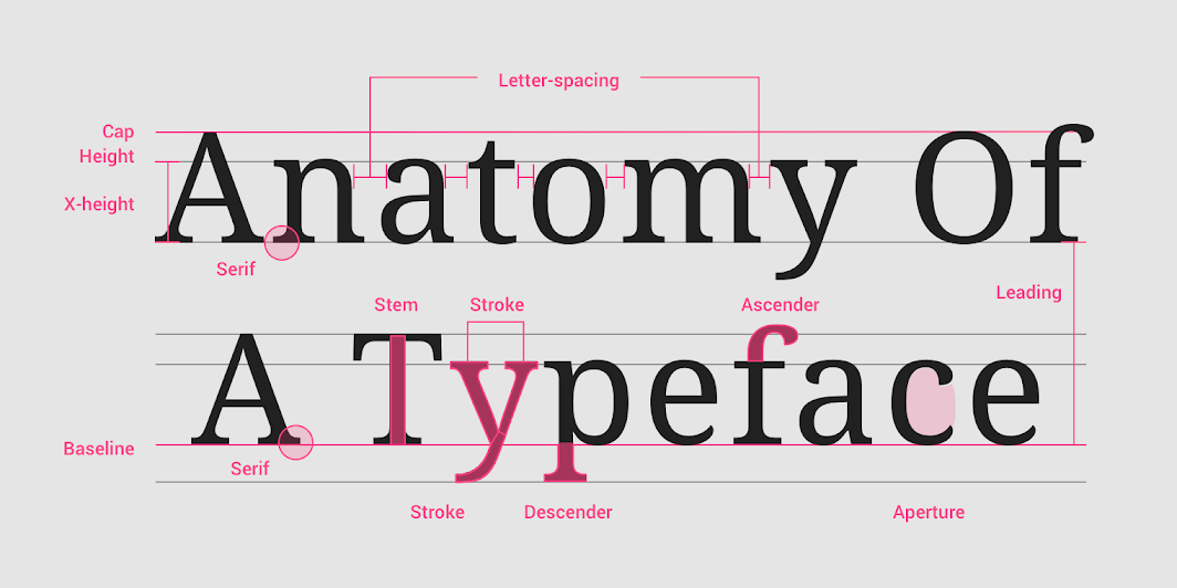
To solve the problem, you should not use a common index for all fonts, but an individual one, depending on its X-height. It is necessary to take a lowercase letter without extensions — for example, N — of the same point size as the typed text, and put it between two lines of text so that the upper boundary of the letter touches the typing line of the first line, and the lower boundary touches the upper height of the uppercase letter.
Complete Guide to Libre Franklin • Beautiful Web Type
Complete guide to the free font Libre Franklin. See beautiful examples, recommended pairings, OpenType features, and more.
https://larahogan.me/blog/we-need-to-talk-about-your-q3-roadmap/
Free Font Alternatives: The Ultimate Guide – Learn UI Design
Free, high-quality alternatives to: Apercu · Avenir · Circular · DIN · Futura · Gotham · Helvetica · Proxima Nova · Times New Roman
Uniwidth typefaces for interface design
Recursive by Arrow Type
Recursive is free for download from Google Fonts or Github and open-source, licensed under the SIL Open Font License 1.1.
PT Root UI by Paratype
PT Root UI is free for download under the SIL Open Font License (OFL) on Paratype’s website.
Golos UI by Paratype
Bahnschrift by Saja Typeworks
Bahnschrift is available as part of the Windows 10 operating system.
google webfonts helper
A Hassle-Free Way to Self-Host Google Fonts. Get eot, ttf, svg, woff and woff2 files + CSS snippets!
The 30 Best Google Fonts for Your Website
The best Google Fonts can add personality and functionality to your website. You can even use Google Fonts with UXPin prototypes.
17 Open Source Fonts You'll Actually Love | Webdesigner Depot
Gidole
DIN – the font we all love, the font that looks great at every size. Gidole is extremely close to DIN, but designers with a keen eye will spot very few minor differences. Overall, if you’re looking to use DIN, try Gidole out before going live.
Overpass
Overpass was created by Delvefonts and sponsored by Redhat, it was designed to be an alternative to the popular fonts Interstate and Highway Gothic. Did we mention it also has a monospace version?
Public Sans
Public Sans is a project of the United States Government, it’s used widely on their own department websites and is part of their design system. The font is based on the popular open-source font Libre Franklin.
Object Sans
Object Sans (formally known as Objectivity) is a beautiful geometric font family that can be used in place of quite a few premium fonts out there. The font brings together the top qualities of both Swiss neo-grotesks and geometric fonts. The font works beautifully as large headings but can be used for body content as well.
Jost
When you want a change from the typical Futura, then Jost is a great option with its variable weighting as well as multilingual support.
An attempt to make a font look more handwritten
OpenType lets you replace characters based on context
I started out being extremely confused about what OpenType even is. I still don’t know much, but I learned that you can write extremely simple OpenType rules to change how a font looks, and you don’t even have to really understand anything about fonts.
Here’s an example rule:
sub a' b by other_a;
What sub a' b by other_a; means is: If an a glyph is before a b, then replace the a with the glyph other_a.

Google Fonts by Tags

There are over 950 Google typefaces available. Probably, you don't know the majority of them. They vary in the number of variants and subsets.
The idea to tag Google Fonts born from our need to use less popular typefaces, with a strong identity.
Optimizing Google Fonts Performance — Smashing Magazine

Google Fonts are easy to implement, but they can have a big impact on your page load times. Let’s explore how we can load them in the most optimal way.
Introducing USWDS 2.0 | United States Web Design System

Public Sans