Inclusively Hiding & Styling Checkboxes and Radio Buttons


When you hide an interactive element, make sure you choose a hiding technique that keeps it screen reader-accessible, position it on top of whatever is visually replacing it so that a user navigating by touch can find it where they expect to, and then make it transparent.
CSS-Only Accessible Dropdown Navigation Menu | Modern CSS Solutions

This technique explores using: animation with CSS transition and transform, using the :focus-within pseudo-class, CSS grid, and accessibility considerations for dropdown menus.
Smooth Shadow
Make a smooth css shadow
https://tobiasahlin.com/blog/layered-smooth-box-shadows/
But with a simple CSS technique, we can expand our range of options. If we use layered box-shadows we can get more fine-grained control over how shadows are rendered:
Mesh Gradient Generator (SVG/Figma export) [+inspo gallery]

Create & export mesh gradients as SVG or to Figma. Quickly experiment with grainy noise and blur. Includes a one-click export to Figma for use in designs.
Problems solved by OpenType | Roel Nieskens | CSS Day 2024
About Roel: https://pixelambacht.nl
Depending on whether the information is technical or not, you might want different font features.
29:20 - "Never grab a Monotype font"
font-variant-numeric: tabular-nums;
@font-face {
size-adjust: 110%;
}
https://wakamaifondue.com/
(what can my font do?)
CSS Text balancing with text-wrap:balance
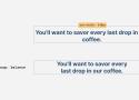
A look at text wrap balancing in CSS
Have you ever wished there is a native way in CSS to make two lines headlines consistent in the number of words per line? As a designer, I spot that a lot when dealing with varying content lengths while designing a website or a UI.
Layout grids in the browser · Medienbäcker Thomas Günther

A simple guide to building keyboard-activated layout grid overlays with JavaScript and CSS for web development projects.
A practical guide to using shadow DOM
How (and why) to use shadow DOM, now that the declarative syntax is here.
https://www.youtube.com/watch?v=8Z8H2NEbLtE
shadow DOM has lower precedence than regular styles
(X, Y, Z)
#id, classes and attrs, elements
[id="myid"] is (0,1,0) not (1,0,0)!
You can duplicate classes to increase specificity! (0, 4, 0)
.button.button.button.button
or
.button {
&&& {
}
}
is( .button, #hammertime )
.button:not(#id1#id2) -> "impossible" because two IDs, (2, 0, 0)!
Decreasing specificity
:where( .button) -> (0,0,0)
** Very useful for css reset!
input:where([type="checkbox"])
17:55 - meta keyword in sass
** Might need to use !important in layers (dialog: display:none)
An HTML element id is a global variable

Little relatively unknown fact, if you have an id attribute on an element, you can reference it in this way:
<button id="yo">…</button>yo.onclick = ...Furthermore, child elements with a name attribute can be referenced in this way:
<form id="x">
  <input name="em">
</form>
x.em.onclick = ...How I build a button component - Piccalilli
A button is arguably the most likely component to find itself in your codebase so I’m going to show you how I approach building one.
Styling Tables the Modern CSS Way - Piccalilli

Modern CSS makes styling HTML tables in a considered, responsive nature a breeze. Michelle Barker breaks it all down for you in this deep dive.
How not to use box shadows

So you think you know box shadows huh? I bet you didn't know they could do this.
CSS Grid Areas
A fresh look at the CSS grid template areas and how to take advantage of its full potential today.
Auto-margin works with absolute positioned elements | Stefan Judis Web Development

If you're defining absolute width or height for an absolute positioned element, you can use auto margin to lay out these elements.
https://www.joshwcomeau.com/css/center-a-div/
.box {
  position: absolute;
  inset: 0.5rem;
  width: 7rem;
  height: 7rem;
  margin: auto;
}The Modern Guide For Making CSS Shapes — Smashing Magazine

I get asked this question often, and my answer is always the same: Use SVG if you can! I have nothing against SVG. It’s just another approach for creating shapes using another syntax with another set of considerations. If SVG was my expertise, then I would be writing about that instead!
Hardest Problem in Computer Science: Centering Things @ tonsky.me

The text will be off! Even though rectangles are perfectly centered.
But even if font can have its metrics unbalanced, it doesn’t mean it does. What happens in reality?
In reality, most of the popular fonts have metrics slightly off. Many have it significantly off:
93 Beautiful CSS box-shadow examples - CSS Scan
🎨 Curated collection of 93 free beautiful CSS box-shadow, ready-to-use for your next projects. Click to copy.
How to take control of Flexbox

-
Flex children are just that:
display: blockordisplay: inlinedon't have any affect oncedisplay: flexis defined on the parent. -
Flexbox is controlled inside --> out: The size of the children affect the size of the parent. Grid is outside --> in: the size of the parent is specified and the children fit inside.
-
Defaults: flexbox by default uses the 'best' size for the children. It doesn't expand them, but it will shrink them if necessary.
flex-shrink: 1;
flex-grow: 0; -
If you have multiple rows and columns, and you want them consistent, grid is the better choice
-
width is the same as flex-basis IF you are using columns
CSS for printing to paper
At work, one of the things I do pretty often is write print generators in HTML to recreate and replace forms that the company has traditionally done handwritten on paper or in Excel. This allows the company to move into new web-based tools where the form is autofilled by URL parameters from our database, while getting the same physical output everyone's familiar with.
This article explains some of the CSS basics that control how your webpages look when printed, and a couple of tips and tricks I've learned that might help you out.
Modern CSS Tooltips And Speech Bubbles (Part 1) — Smashing Magazine
Tooltips are a very common pattern used in CSS for years. There are a lot of ways to approach tooltips in CSS, though some evoke headaches with all the magic numbers they require. In this article, Temani Afif presents modern techniques to create tooltips with the smallest amount of markup and the greatest amount of flexibility.