Daily Shaarli
I find working with the grid helpful. The grid helps to maintain consistency across the different layouts and make faster design decisions. Grids give more precise control over alignments and layout on different screen sizes.
Fixed-Width Layout Grid Setup
To set up a fixed-width grid, we use fixed numeric value for gutters and columns. I recommend 74px wide columns, 32px wide gutters and 16px side margins on each side.
Mobile View
For mobile devices, we use a fluid grid where gutters and side margins have fixed numeric values. I recommend 16px wide gutters and 16px wide side margins on each side.
We can design mobile interfaces at 360×640 sized artboard.
Mobile devices have a small screen resolution. If we display the 12 separate columns, gutters, and side margins on such a small resolution, it becomes quite cumbersome to design at scale.

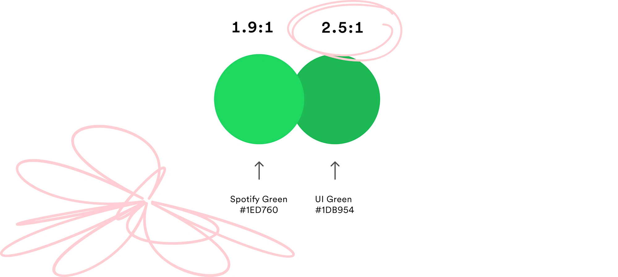
If there's one button you use every time you open Spotify, it’s the play button. Today, we’re updating it significantly for better accessibility.