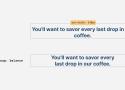
Whitespace Characters — Copy and Paste Invisible Characters

Quickly copy and paste Unicode whitespace characters — and learn how and when to use them.
Learn | Glyphs

Glyphs 3 is a Mac font editor that puts you in control: quickly draw high-precision vectors, efficiently reuse shapes, and easily manage any number of letters, figures and symbols.
Tutorials:
Getting Started
Specimens of printing types made at Bruce's New York Type-Foundry : George Bruce's Son & Co : Free Download, Borrow, and Streaming : Internet Archive
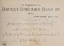
352 leaves : 31 cm
From Fatih Arslan:
I looked into how it was done earlier. If you want to see how type specimens looked across different periods, there are some great examples online. The 1882 Bruce’s New-York Type-Foundry specimen book on Archive.org is a beautiful old example of how foundries presented their typefaces to printers:
Fontastic Space — Find Mathematically Optimal Font Pairings

Compare Google Fonts side-by-side with anatomy overlays, OpenType metrics, pairing scores, and ready-to-use CSS. Free tool for designers and developers.
Polishing your typography with line height units | WebKit

Learn how to use line-height units when setting paragraph margins — creating vertical rhythm in your text.
My favorite thing to do with the lh unit is to set margins on content. Let’s set a new universal margin on paragraphs with:
p { margin-block: 1lh; }
Graphic Design History Resources - We Made This

When I’m not doing graphic design stuff at We Made This, I’m an Associate Lecturer on the Graphic Design BA course at the School of Art, Architecture and Design (previously named The Cass) at London Metropolitan University. It’s a wonderful course, with great connections to industry, and some really brilliant students who regularly create exciting and […]
Ironic Serif: A Brief History of Typographic Snark and the Failed Crusade for an Irony Mark
Nearly half a century later, in 2007, Pan-European type foundry Underware was commissioned to create a special punctuation mark for the occasion and thus the ironieteken was born — a zigzaggy exclamation point denoting irony. But despite significant buzz across Dutch literary circles — including some criticism that, when placed in a row of several, it bore an unfortunate resemblance to the Nazi swastika — the mark quickly fizzled.
Wikipedia: Irony punctuation
https://en.wikipedia.org/wiki/Irony_punctuation
Percontation point
The percontation point, a reversed question mark later referred to as a rhetorical question mark, was proposed by Henry Denham in the 1580s and was used at the end of a question that does not require an answer—a rhetorical question. Its use died out in the 17th century.
This character can be represented using the reversed question mark (⸮) found in Unicode as U+2E2E; another character approximating it is the Arabic question mark (؟), U+061F.
2025 year in review | Sean Voisen
Nice website using Outfit and Source Serif 4
A recap of my year and a brief look at trajectories for 2026.

Problems solved by OpenType | Roel Nieskens | CSS Day 2024
About Roel: https://pixelambacht.nl
Depending on whether the information is technical or not, you might want different font features.
29:20 - "Never grab a Monotype font"
font-variant-numeric: tabular-nums;
@font-face {
size-adjust: 110%;
}
https://wakamaifondue.com/
(what can my font do?)
Hacking Hack — darinhiggins.com
Introducing Hackd
Hackd is based on Hack v3.003, used for most base symbols and upper/lowercase latin glyphs. I then merged in glyphs from FiraCode v6.002 for all ligatures and pretty much all other characters.
Further, I pulled the % glyph from Firacode and tweaked it slightly to look more “Hack”ish.
How I Did It
I used FontForge for all manipulations.
I started with FiraCode-Regular and FiraCode-Bold.
Replaced all the glyphs from ! through ascii 255 with the Hack glyphs.
Then pulled all the powerline glyphs from the Hack NerdFont ttf file.
Keyboard-Design.com - Academic fonts glyph coverage comparison
CSS Text balancing with text-wrap:balance
A look at text wrap balancing in CSS
Have you ever wished there is a native way in CSS to make two lines headlines consistent in the number of words per line? As a designer, I spot that a lot when dealing with varying content lengths while designing a website or a UI.
The Doves Type® – Typespec
The Comprehensive Type Testing Template for Type Designers | Digital templates by TYPEHEIST
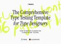
Your 16 page go-to guide for flawless font testing. 16 pages of type layouts, character combinations, symbols and tester paragraphs
How De Gruyter’s New Open Source Font Came to Be - De Gruyter Conversations

https://gitlab.com/degruyter-public/font/de-gruyter-sans_serif
A new font will be used in De Gruyter’s journals and books from now on — one that can be used and shared free of charge, thanks to an open source license. We recently talked to the project managers Franziska Bühring and Florian Ruppenstein about the reasons for the change, which is part of De Gruyter's open research strategy, and about the development process.
Font style matcher
If you're using a web font, you're bound to see a flash of unstyled text (or FOUC), between the initial render of your websafe font and the webfont that you've chosen. This usually results in a jarring shift in layout, due to sizing discrepancies between the two fonts. To minimize this discrepancy, you can try to match the fallback font and the intended webfont’s x-heights and widths [1]. This tool helps you do exactly that.
Better Sales Pages with better Typography - Pimp my Type

Five tips to design a convincing sales page by better using typography.