UX Language | Style & mechanics

A comprehensive set of useful and semi-universal UX copywriting and style guidelines and examples to reference while designing and building products and interfaces.
Time
When writing about a time of the day, use numerals and lowercase am or pm, with a space in between. Use 12- or 24-hour time according to the locale. When writing in 24-hour time, show a 0 before single-digit hours.
Style Guide and Pattern Library Examples
A collaborative collection of resources for creating Front-End Style Guides and Pattern Libraries
GitHub - xz/new.css: A classless CSS framework to write modern websites using only HTML.
new.css
A classless CSS framework to write modern websites using only HTML. It weighs 4.8kb.
All it does is set some sensible defaults and styles your HTML to look reasonable. It's perfect for:
- A dead-simple blog
- Collecting your most used links
- Making a simple "about me" site
- Rendering markdown-generated HTML
javascript/README.md at master · airbnb/javascript · GitHub
A mostly reasonable approach to JavaScript
Note: this guide assumes you are using Babel, and requires that you use babel-preset-airbnb or the equivalent. It also assumes you are installing shims/polyfills in your app, with airbnb-browser-shims or the equivalent.
The Evolution of Material Design’s Text Fields - Google Design - Medium
The results of the two studies showed that these elements of text fields were of most value:
- Enclosed text fields with a rectangular (box) shape performed better than those with a line affordance
- The text field box should be represented with a semi-transparent fill and a bottom line or with a fully transparent fill and an opaque stroke.
- Color contrast of the text field’s lines or strokes met the minimum 3:1 contrast ratios with the background
- Label text should be placed within the bounds of the text field box
- Text fields should have rounded corners
Google HTML/CSS Style Guide
- Specifying type attributes in these contexts is not necessary as HTML5 implies text/css and text/javascript as defaults. This can be safely done even for older browsers.
Breakpoints | Primer | Github Style Guide
Our breakpoints are based on screen widths where our content starts to break. Since most of GitHub is currently a fixed-width with we use pixel widths to make it easy for us to match page widths for responsive and non-responsive pages. Our breakpoints may change as we move more of the product into responsive layouts.
Mineral UI
Mineral UI color provides themes built on inspiring hues and grounded in usable grays. Mineral UI is committed to providing an easy path to creating accessible palettes and themes.
Carbon Design System
Carbon is the design system for IBM Cloud products. It is a series of individual styles, components, and guidelines used for creating unified UI.
Carbon components is supported in the following browsers:
IE11
IE Edge latest
Firefox latest
Chrome latest
Safari latestHow To Create a Style Guide From Scratch. Tips and Tricks
A styleguide is a set of standards, principles and rules every developer or designer should follow in order to improve the digital presence of the product.
In this article we will walk through effective techniques used in designing a reliant style guide.
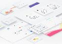
Anatomy of a Design System
I’ve tried to show the relationships between all of these resources in the diagram below. As you can see, a Style Guide is it’s own entity, which overlaps the CSS framework, design principles, design assets, and documentation.
Style Guide Guide
A boilerplate for creating superb style guides
The homepage of a style guide should provide high-level information around what the design system is, what benefits it provides, who it’s for, and how to get started with it. Like any good index page, it should provide clear navigation to key parts of the website.
YOW! West 2017 Andy Clarke - Designing inspired style guides
Lots of style guide examples and inspiration
2017 Design Trends Guide
Each year we learn something new about design and 2016 was no different.
After last year’s article had such a success we decided to make some predictions for 2017, so let's get started!
Design trends are influenced by media, technology, the fashion industry and, lately usability. A trend emerges slowly, gradually, making its way into all design branches, and then disappears in exactly the same way. Basically a design trend's life is no longer than one or two years. Design in 2017 will continue the trends that materialized in 2016 while adding some new influences, but the feeling is well known and familiar and you may have seen it in the past couple of years. The main influencer remains Google's Material Design, that suffers a few changes.
Creating a Design System Language
But how exactly can a product benefit from having a living, breathing design language? I’m going to try break down the very basics so you can understand why it’s needed.
Buttons in Design Systems – EightShapes – Medium
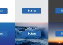
That’s why Buttons are arguably a design system’s most important component. Devilishly simple, they offer a simple label in a defined region I can press. As such, buttons are where you apply a design language’s base attributes in ways that’ll ripple throughout more complex component later.
Here’s 12 lessons I’ve learned when working the primary button, secondary buttons, and a whole host of other button types in an emerging system.
GitHub - alexpate/awesome-design-systems: 💅🏻 ⚒ A collection of awesome design systems

A design system is a collection of documentation on principles and best practices, that helps guide a team to build digital products. They are often embodied in UI libraries and pattern libraries, but can extend to include guides on other areas such as 'Voice and Tone'.