Design Systems for Software Engineers

A comprehensive guide to design system engineering (DSE): when it’s relevant, how AI changes things, and pointers for getting started. From Michael Abernethy, Principal Frontend Engineer at Rubrik
Oat - Ultra-lightweight, semantic, zero-dependency HTML UI component library
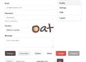
Oat is an ultra-lightweight HTML + CSS, semantic UI component library with zero dependencies. No framework, build, or dev complexity. Just include the tiny CSS and JS files and you are good to go building decent looking web applications with most commonly needed components and elements.
Semantic tags and attributes are styled contextually out of the box without classes, forcing best practices, and reducing markup class pollution. A few dynamic components are WebComponents and use minimal JavaScript.
https://x.com/technmak/status/2022287404128973056?s=43&t=gAZhA3-2h2DvLb-eSzGa5A
How we fixed Skyscanner’s broken colour palette | by Adam Wilson | Skyscanner Experience | Medium
It all started back in 2019 before I was working at Skyscanner. I remember sitting in a cafe in Budapest reading the latest conversations online about the new brand update.
https://www.linkedin.com/posts/vitalyfriedman_ux-design-activity-7242792350903582723-vntQ
✅ Set your base colors: primary, secondary and UI states.
✅ Define core color pairings and extended pairings.
✅ Choose product-specific colors, gradients, patterns.
✅ 4 color groups: neutral, white text, black text, yellow/orange.
🚫 Avoid poetic names: they are difficult to remember and refer to.
✅ Mix black and grey with primary color for a better design fit.
✅ Choose a night color that is slightly lighter than black.
✅ Your colors will need to appear on different backgrounds.
✅ Create color sets with transparency for such cases.
✅ Create tints based on the color contrast against black.
✅ Create shades based on the color contrast against white.
✅ Test for color contrast, colorweakness, colorblindness early.
✅ Double-check the dark yellow problem in your palette.
Design-Pattern Guidelines: Study Guide

Unsure how to design and implement user-interface patterns? Use this collection of links to our content about specific patterns.
- A Note on Interface Guidelines
- Input Controls
- Forms and Wizards
- Tooltips, Dialogs, Instructional Overlay
- Icons and Indicators
- Menu Design
- Site Navigation Elements
- In-Page Navigation
- Search
- Errors
- Privacy and Ethics
UX Language | Style & mechanics
A comprehensive set of useful and semi-universal UX copywriting and style guidelines and examples to reference while designing and building products and interfaces.
Time
When writing about a time of the day, use numerals and lowercase am or pm, with a space in between. Use 12- or 24-hour time according to the locale. When writing in 24-hour time, show a 0 before single-digit hours.
Voice and tone | Zendesk Garden
Garden is the design system by Zendesk. It’s where we grow the components, standards, and tools that product designers use every day.
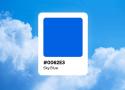
Naming colors in design systems
Spectrum’s colors are mapped to our design tokens, which are all the values needed to construct and maintain a design system—such as spacing, color, typography, object styles, and animation—represented as data. Our naming decisions for Spectrum leverage industry terminology and commonly known terms whenever possible, so we avoid choosing names for colors that wouldn’t be recognizable beyond the design and development community. We also avoid names that are trendy, subjective, or in languages other than U.S. English.
https://spectrum.adobe.com/page/color-system/
https://spectrum.adobe.com/page/color-palette/
https://uxdesign.cc/how-should-you-name-your-colors-in-a-design-system-3086513476df
How to Achieve Soft, Friendly and Consistent UI Design
General visual consistency
How to make our design look sleek and consistent? Start with preparing this:
- Choose colors you want to use
- Choose a font(s) you want to use
- Decide on how deep/blurred you want your shadows to be.
- If you are using icons, decide whether you want to use solid or outlines. Try not to mix them.
By now, you created your little design-system. How cool! 😎
Now you should stick to it.
If you want your shadows to look even more fanciful, make the shadow have the same color as the element that casts it, then lower the opacity. Ideally, the background would have a similar tone, too.
Making gradients look more smooth and delicate
Choose the right color for the font, so it matches the background.
Introducing USWDS 2.0 | United States Web Design System
Public Sans
EOS Design System

The open source solution for cohesive UX/UI across products.
Elevation - Material Design
Elevation is the relative distance between two surfaces along the z-axis.
Elevation in Material Design is measured as the distance between Material surfaces. The distance from the front of one Material surface to the front of another is measured along the z-axis in density-independent pixels (dps) and depicted (by default) using shadows
Mineral UI
Mineral UI color provides themes built on inspiring hues and grounded in usable grays. Mineral UI is committed to providing an easy path to creating accessible palettes and themes.
Carbon Design System
Carbon is the design system for IBM Cloud products. It is a series of individual styles, components, and guidelines used for creating unified UI.
Carbon components is supported in the following browsers:
IE11
IE Edge latest
Firefox latest
Chrome latest
Safari latestAnatomy of a Design System
I’ve tried to show the relationships between all of these resources in the diagram below. As you can see, a Style Guide is it’s own entity, which overlaps the CSS framework, design principles, design assets, and documentation.
Creating a Design System Language
But how exactly can a product benefit from having a living, breathing design language? I’m going to try break down the very basics so you can understand why it’s needed.
How to construct a design system
Tips for designing and building a consistent design system.
Without doubt, I get asked about design systems more than anything else. So, having spent the majority of the past few years thinking about how to design, build and present design systems for products like Marvel, Bantam and Modulz, I figured I’d share some of what I’ve learned along the way.