text + double triangle

Making CSS Animations Feel More Natural
The first thing to look at is the timing function. In the above example, we’re using a linear timing function, which means that the box is constantly moving at the same speed. In some cases, this is desirable; however, in the real world, motion usually doesn’t work like that.
Everything You Need To Know About Alignment In Flexbox

In this article, we take a look at the alignment properties in Flexbox while discovering some basic rules to help remember how alignment on both the main and cross axis works.
The Most Important CSS Concept to Learn
For every inline style that targets an element using the style attribute, 1 goal is assigned to goal post (a).
For every id selector, 1 goal is assigned to post(b).
For every class selector, attribute selector, and pseudo-classes present, 1 goal is assigned to post(c).
For every element selector and pseudo-element, 1 goal is assigned to post (d).
The way I remember this is by using the acronym, SICAPEP:
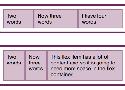
Free Frontend - CSS Menus
Hand-picked HTML and CSS code examples, tutorials and articles
Getting Started With CSS Layout
Whether you’re fairly new to CSS or an experienced developer from elsewhere in the stack who wants to make sure your understanding of layout today is up to date, this guide covers everything you need to know about CSS Layout today.
What Happens When You Create A Flexbox Flex Container? — Smashing Magazine
In a short series of articles, I’m going to spend some time in detailed unpacking of Flexbox — in the same way I have done in the past with grid. We’ll have a look at the things Flexbox was designed for, what it really does well, and why we might not choose it as a layout method. In this article, we will take a detailed look at what actually happens when you add display: flex to your stylesheet.
Understanding CSS Layout And The Block Formatting Context
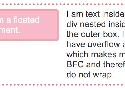
How a Block Formatting Context (BFC) behaves is easiest to understand with a simple float example. In the below example I have a box that contains an image that has been floated left and some text. If we have a good amount of text it wraps around the floated image and the border then runs around the whole lot.
There are two ways in which we ordinarily fix this layout problem. One would be to use a clearfix hack, which has the effect of inserting an element below the text and image and setting it to clear both. The other method is to use the overflow property, with a value other than the default of visible.
.outer {
overflow: auto;
}
Collection of CSS snippets | justmarkup
clearfix, centering, font-size
How to Use CSS Gradients on the Web

In this tutorial you’ll learn about using gradients on the web. I’ll give you some examples, some exercises (such as how to create gradients for borders), and I’ll also throw in some useful resources which will make creating gradients a lot easier.
Pocket Guide to CSS only Drawings and Animations
So I became a bit obsessed about how further we can push the limits of what we can draw with CSS only. Basically, I noticed that you can play around with basic shapes like circles, rectangles and triangles to draw virtually anything. You can even put some drop-shadows and CSS filters to get some pretty cool effects as well.
In this pocket guide I'll write some examples from really easy to more complex things you can do to create cool drawings and animations with CSS.
Using Motion For User Experience On Apps And Websites

Digital experiences are emulating real life more and more every day. This may seem counterintuitive, considering the hate that rains down on skeuomorphic visual design, but there’s a lot more to emulating real life than aesthetics. Interface designers can emulate real-life physics and movement on a digital screen. This type of motion is becoming more common, which is why it’s becoming easier for people to understand computers. We’re not getting better, the interfaces are!
Sass Burger
Carbon - Code image generator
Create and share beautiful images of your source code.
Start typing or drop a file into the text area to get started.
Optimizing SVG Text & Image Delivery with Inline SVG

Each of these illustrations contains the title/name of a membership. There are no actual titles in the HTML to represent these memberships otherwise, which means that the text in each image is the title of that particular membership. This, in turn, means that this text needs to be as searchable, selectable and accessible as real (HTML) text.
In other words, the text inside the images needs to remain real text and not be converted to outlines, for starters. SVG text — wrapped in
Css arrows from codepen
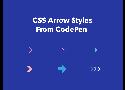
In a website or application, arrows can determine how you navigate them by performing specific actions like “go to next page”, indicating to scroll “top or bottom, left or right” and many other. With the help of CSS pseudo-elements and borders, it’s easy to create different arrow styles that will look great on both mobile and desktop. So if you’re currently using arrow images in your projects you can easily replace them with CSS arrows. Doing so, will reduce the number of requests when loading a website or web app.
Learn CSS Grid in 5 Minutes
Grid layouts are fundamental to the design of websites, and the CSS Grid module is the most powerful and easiest tool for creating it.
The module has also gotten native support by the major browsers (Safari, Chrome, Firefox) this year, so I believe that all front-end developer will have to learn this technology in the not too distant future.